8. Machine learning for structured data - Classification#
This chapter explores traditional machine learning models, reserving our discussion of deep learning for Chapters 9 and 11. Despite all the hype in deep learning, the traditional ML models presented here are crucial to master due to the structure and scale of typical datasets encountered in accounting and finance research. The techniques covered in Chapters 7 and 8 form the foundation of practical data science in accounting and finance contexts.
8.1. Introduction to classification#
Classification means predicting the class of given data points. Sometimes, these classes are called labels or categories. If we want to give a more formal definition of classification, it is the task of estimating a function f from input variables x to discrete output variable y.
Classification is a fundamental machine learning task with many practical applicatons in accounting and finance. These include, for example
Risk Management - Classification models are widely used to identify and mitigate risks. For example:
Bankruptcy Prediction: Models can classify companies as high-risk or low-risk based on financial ratios, helping stakeholders take preventive measures.
Fraud Detection: Classification algorithms can flag suspicious transactions or activities, reducing financial losses and reputational damage.
Decision-Making - Classification provides actionable insights that support strategic decision-making. For instance:
Credit Scoring: Banks use classification models to approve or reject loan applications based on the likelihood of repayment.
Customer Segmentation: Companies can classify customers into groups (e.g., high-value, at-risk) to tailor marketing strategies and improve retention.
Regulatory Compliance - Classification helps organizations adhere to regulatory standards by identifying non-compliant activities or entities. For example:
Anti-Money Laundering: Models can classify transactions as suspicious or legitimate, ensuring compliance with regulations.
Audit Quality: Classification techniques can identify misstatements or irregularities in financial statements, aiding auditors in their assessments.
Efficiency and Automation - Classification models automate repetitive tasks, reducing manual effort and increasing efficiency. For example:
Invoice Categorization: Models can classify invoices into categories (e.g., utilities, supplies) for streamlined accounting processes.
Document Classification: Financial documents like 10-K filings can be automatically categorized for easier analysis and retrieval.
Predictive Insights - By classifying data into meaningful categories, organizations can anticipate future trends and behaviors. For example:
Employee Churn: Models can predict which employees are likely to leave, enabling proactive retention strategies.
Investment Decisions: Classification can help investors identify promising stocks or sectors based on historical performance and market trends.
In summary, classification is a powerful tool that transforms raw data into actionable insights, enabling organizations in accounting and finance to manage risks, make informed decisions, and comply with regulations. Its applications are vast and continue to grow as machine learning techniques evolve.
8.1.1. Supervised and unsupervised classification#
The classification ML models’ training can be divided broadly into two different types, supervised and unsupervised training. The key difference is that there is an outcome variable guiding the learning process in the supervised setting.
In supervised machine learning models, the predictions are based on the already known input-output pairs \((x_1,y_1),...,(x_N,y_N)\). During training, the model presents a prediction \(y_i\) for each input vector \(\bar{x_i}\). The algorithm then informs the model whether the prediction was correct or gives some kind of error associated with the model’s answer. The error is usually characterised by some loss function. For example, if the model gives a probability of a class in a binary setting, the common choice is binary cross-entropy loss: $\(BCE=\frac{1}{N}\sum_{i=1}^N{y_i\cdot\log{\hat{y_i}}+(1-y_i)\cdot\log{(1-\hat{y_i})}}\)$
More formally, supervised learning can be considered as density estimation where the task is to estimate the conditional distribution \(P(y|\vec{x})\). There are two approaches for supervised classification:
Lazy learning, where the training data is stored, and classification is accomplished by comparing a test observation to the training data. The correct class is based on the most similar observation in the training data. K-nearest neighbours -classifier is an example of a lazy learner. Lazy learners do not take much time to train, but the prediction step can be computationally intensive.
Eager learning, where a classification model based on the given training data is constructed and used to predict the correct class of a test observation. The model aims to model the whole input space. An example of an eager learner is a decision tree. Opposite to lazy learners, eager learners can predict with minimal effort, but the training phase is computationally intensive.
In unsupervised learning, there is no training set with correct output values, and we observe only the features. Our task is rather to describe how the data are organised or clustered. More formally, the task is to directly infer the properties of the distribution \(P(\vec{x})\) for the input values \((x_1,x_2,...,x_N)\).
For a low-dimensional problem (only a few features), this is an easy task because there are efficient methods to estimate, for example, 3-dimensional probability distribution from observations. However, things get complicated when the distribution is high-dimensional. Then, the goal is to identify important low-dimensional manifolds within the original high-dimensional space that represent areas of high probability. Another simple option is to use descriptive statistics to identify key characteristics of the distribution. Cluster analysis generalizes this approach and tries to identify areas of high probability within the distribution.
Thus, with supervised learning, things are in some sense easier because we have clear goals. Furthermore, comparing different ML models is easier in the supervised setting, where metrics like prediction accuracy can be used to evaluate the models. Also, the training is more straightforward because, for example, cross-validation can be used to control that the model does not overfit. With unsupervised learning, there is no clear measure of success, and the goodness of the model is much more difficult to estimate. There, the validity of the model predictions is difficult to ascertain, and often heuristic arguments have to be used to motivate the results of the model.
8.1.2. Binary, multi-class and multi-label classification#
The simplest classification model is a binary classifier, which tries to classify elements of a set into two groups. Many classification applications in accounting and finance are binary classification tasks, like bankruptcy or fraud detection. When training a binary classifier model, the easiest situation is when the two groups are of equal size. However, this is often not the case, like, for example, in bankruptcy prediction, where often only a few per cent of the observations are of financially distressed companies. In these cases, overall accuracy is not the best measure of performance. Instead, the relative proportion of different error types is the correct thing to analyse. The mistake of predicting a distressed company when, in reality, it is not and predicting a healthy company when, in reality, it is distressed are not equally serious mistakes.
Multiclass classification aims to identify the correct class for instances from more than two classes. The famous example present in almost every ML book is the MNIST dataset of 28x28 images of handwritten digits and the task of identifying the correct digit from these images. An example from accounting and finance is the task of classifying annual reports (for example, 10-Ks) using natural language processing algorithms. Some binary classifiers are easy to transform as multiclass algorithms, like binary logistic regression.
Multi-label classification changes the multiclass setting so that each instance can have multiple classes (labels). More formally, multi-label classification is the problem of finding a mapping from instance x to a vector of probabilities y. The vector contains a probability for each class.
8.1.3. Integrating Classification Models with Business Tools#
Classification models are powerful tools for making data-driven decisions in accounting and finance, but their true value is realized when they are seamlessly integrated into the workflows and tools that professionals use daily. Tools like Power BI and Tableau provide platforms for visualizing, analyzing, and acting on the predictions generated by classification models. Almost all software include Python integration to embed classification models directly into dashboards. Here are some ideas of integrating these models into BI software: * Predictive Analytics: Visualize the likelihood of customer churn or fraud risk alongside other KPIs. * Dynamic Insights: Create interactive visualizations that update in real-time based on model predictions. For instance, a dashboard could highlight high-risk transactions or companies based on classification results. * Customer segmentation: Classify customers into segments or predict the likelihood of loan defaults directly in a dashboard. * Parameterized Visualizations: Create visualizations that allow users to adjust model parameters (e.g., thresholds) and see the impact on predictions in real-time. * Storytelling with Data: Utilize BI software’s Generative AI features to explain the results of classification models to stakeholders, highlighting key insights and recommendations. * Audit Automation: Integrate a classification model into accounting software to automate the identification of high-risk accounts or transactions for auditing.
Classification models integrated into business tools provide real-time insights that support better decision-making. Automating repetitive tasks (e.g., fraud detection, invoice categorization) saves time and reduces errors. Making model predictions accessible through familiar tools like Power BI or Tableau ensures that insights reach the key personnel. By integrating classification models with BI software, organizations can unlock the full potential of their data, driving efficiency, accuracy, and innovation in accounting and finance.
8.1.4. Emerging Trends in Classification#
Although classification of structured data with ML models is an established field, new innovations and technologies are constantly introduced. Some new trends at the moment are:
Automated Machine Learning (AutoML) - AutoML tools like Google AutoML, H2O.ai, and TPOT can quickly generate high-performing classification models, reducing the time and expertise required. This democratizes machine learning by enabling non-experts to build and deploy classification models for tasks like fraud detection, customer segmentation, and credit scoring. AutoML platforms can also handle large datasets and complex workflows, making them suitable for enterprise-level applications.
Transformer Models for Structured Data - Transformers, originally developed for natural language processing, are now being adapted for structured data tasks like classification. These models leverage self-attention mechanisms to capture complex relationships in the data. Tools like TabNet and FT-Transformer are being used to classify structured data (e.g., financial statements, transaction records) with high accuracy. Feature Interaction: Transformers excel at capturing interactions between features, making them particularly effective for tasks like fraud detection or risk assessment. Moreover, these models are suitable for transfer learning, where pretrained transformer models can be fine-tuned for specific classification tasks, reducing the need for large labeled datasets.
8.2. Logistic Regression#
Logistic regression, also known as the logistic model or logit model, is commonly used to estimate the probability of a binary outcome. However, it can be extended to handle multiple classes by ensuring that the predicted probabilities sum to one.
One of the key challenges in using regression for probability prediction is that standard linear regression does not constrain outputs to the range [0,1]. This limitation makes ordinary regression unsuitable for modeling probabilities. Logistic regression addresses this issue by applying a logistic (sigmoid) function to a linear model, ensuring that predicted values remain within the valid probability range:
A seminal study on bankruptcy prediction by Ohlson (1980) was among the first to apply logistic regression in this domain. His work demonstrated the effectiveness of logistic regression in financial risk assessment.
Reference:
Ohlson, J. A. (1980). Financial ratios and the probabilistic prediction of bankruptcy. Journal of Accounting Research, 18(1), 109-131.
Read the paper.
8.2.1. Simple Example of Logistic Regression#
Let’s explore why logistic regression is a better choice for predicting probabilities.
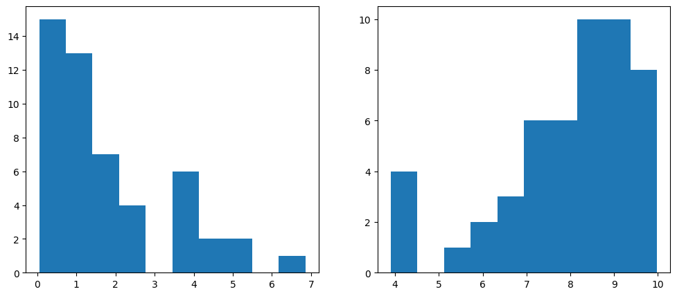
The following code generates random values, with the first 50 centered around zero and the next 50 around ten. These values represent two groups of companies: the first 50 correspond to low-leverage companies, while the last 50 correspond to high-leverage companies. This setup simulates data that is well-suited for modeling with logistic regression.
To combine these two datasets, we use NumPy’s append function. The distribution of the generated values is visualized below.
Show code cell source
import numpy as np  # Import the numpy library
import matplotlib.pyplot as plt # Import the matplotlib library
leverage_metric_np = np.append(np.random.chisquare(2,size=50),-np.random.chisquare(2,size=50)+10)   # Create a numpy array with 100 instances
# Let's visualise the distributions of the first and the last 50 instances.
fig, axs = plt.subplots(1,2,figsize=(12,5)) # Create a figure and a set of subplots
axs[0].hist(leverage_metric_np[0:50])    # Plot a histogram of the first 50 instances
axs[1].hist(leverage_metric_np[50:100]) # Plot a histogram of the last 50 instances
plt.show()                             # Show the plot
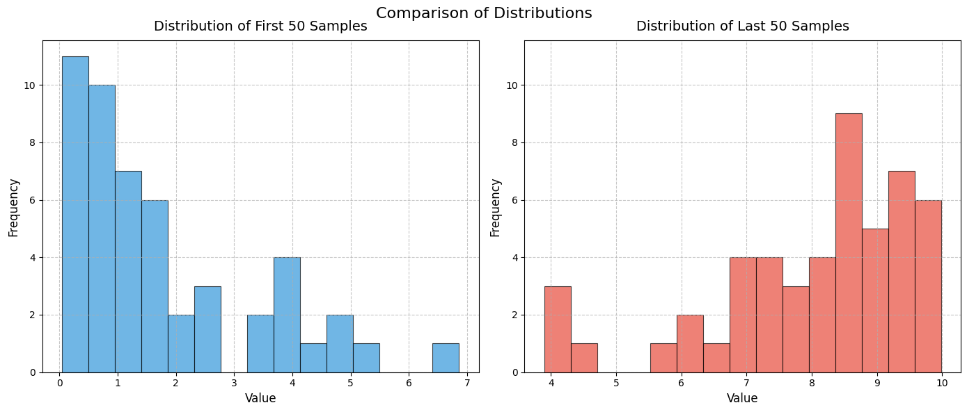
To demonstate the power generative AI, below is code to create similar histograms. I asked Github Copilot to create more beautiful histograms. The code is a bit complicated.
Show code cell source
# Create the figure and subplots
fig, axs = plt.subplots(1, 2, figsize=(14, 6))

# Common parameters for both histograms
bins = 15
color1 = '#3498db'  # Blue
color2 = '#e74c3c'  # Red
alpha = 0.7
edgecolor = 'black'
linewidth = 0.8

# Plot the first histogram
axs[0].hist(leverage_metric_np[0:50], bins=bins, color=color1, alpha=alpha,
            edgecolor=edgecolor, linewidth=linewidth)
axs[0].set_title('Distribution of First 50 Samples', fontsize=14, pad=10)
axs[0].set_xlabel('Value', fontsize=12)
axs[0].set_ylabel('Frequency', fontsize=12)
axs[0].grid(True, linestyle='--', alpha=0.7)

# Plot the second histogram
axs[1].hist(leverage_metric_np[50:100], bins=bins, color=color2, alpha=alpha,
            edgecolor=edgecolor, linewidth=linewidth)
axs[1].set_title('Distribution of Last 50 Samples', fontsize=14, pad=10)
axs[1].set_xlabel('Value', fontsize=12)
axs[1].set_ylabel('Frequency', fontsize=12)
axs[1].grid(True, linestyle='--', alpha=0.7)

# Set the same y-axis limits for both subplots for better comparison
y_max = max(axs[0].get_ylim()[1], axs[1].get_ylim()[1])
axs[0].set_ylim(0, y_max)
axs[1].set_ylim(0, y_max)

# Add a figure title
fig.suptitle('Comparison of Distributions', fontsize=16, y=0.98)

# Adjust layout
plt.tight_layout()
plt.subplots_adjust(top=0.9)

# Show the plot
plt.show()
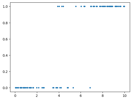
The following code creates a variable that indicates whether a company has gone bankrupt.
distress_np = np.append(np.zeros(50),np.ones(50)) # 0 for non-distressed, 1 for distressed
As we can see from the figure, high-leverage companies have a higher risk of bankruptcy. Thus, we simulated data to reflect a connection between high leverage and an increased risk of bankruptcy.
plt.plot(leverage_metric_np,distress_np,'.')    # Plotting the scatter plot
plt.show()
The following reshape operation is required for Scikit-learn to correctly interpret the data:
leverage_metric_np = leverage_metric_np.reshape(-1, 1) # Reshape the NumPy array to a 2D array
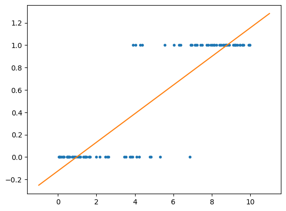
First, let’s fit the data to a standard linear regression model. As mentioned earlier, this is possible, but we will soon observe its limitations.
Implementing linear regression in Scikit-learn is straightforward.
import sklearn.linear_model as sk_lm    # Import the linear_model class from the sklearn library
model = sk_lm.LinearRegression()    # Create a linear regression model
model.fit(leverage_metric_np,distress_np)   # Fit the model to the data
LinearRegression()In a Jupyter environment, please rerun this cell to show the HTML representation or trust the notebook.
On GitHub, the HTML representation is unable to render, please try loading this page with nbviewer.org.
LinearRegression()
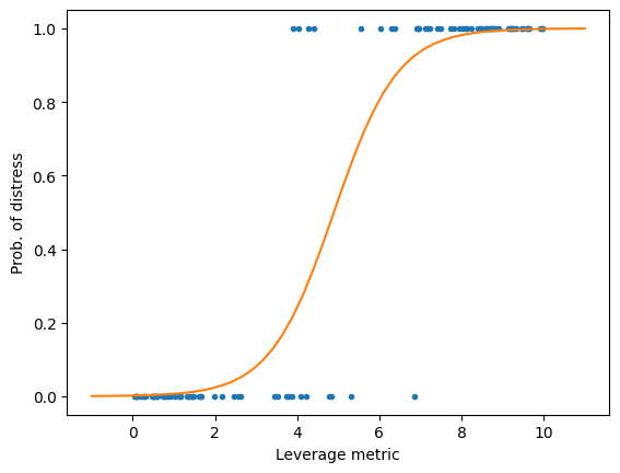
As you can see, we can fit an OLS model to the data, but interpreting the results is challenging. For example, when the leverage metric exceeds 9, the predicted value is greater than 1. What does that imply? It is certainly not a probability.
x = np.linspace(-1,11,50)   # Create a range of values from -1 to 11
plt.plot(leverage_metric_np,distress_np,'.')    # Plot the scatter plot
plt.plot(x,x*model.coef_+model.intercept_)  # Plot the linear regression line
plt.show()  # Show the plot
Next, let’s fit a logistic regression model.
logit_model = sk_lm.LogisticRegression()    # Create a logistic regression model
logit_model.fit(leverage_metric_np,distress_np)  # Fit the model to the data
LogisticRegression()In a Jupyter environment, please rerun this cell to show the HTML representation or trust the notebook.
On GitHub, the HTML representation is unable to render, please try loading this page with nbviewer.org.
LogisticRegression()
Now, the prediction represents the probability of financial distress, constrained within the range of 0 to 1. This makes the results much easier to interpret.
Show code cell source
x = np.linspace(-1,11,50)   # Create a range of values from -1 to 11
plt.plot(leverage_metric_np,distress_np,'.')    # Plot the scatter plot
# Reshape is again needed for Scikit-learn to recognise the data correctly
plt.plot(x,logit_model.predict_proba(x.reshape(-1,1))[:,1]) # Plot the logistic regression line
plt.xlabel('Leverage metric')   # Set the x-axis label
plt.ylabel('Prob. of distress') # Set the y-axis label
plt.show()                # Show the plot
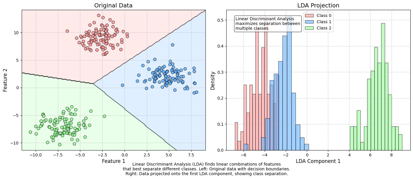
8.3. Linear discrimant analysis#
Linear Discriminant Analysis (LDA) is one of the simplest classification techniques, as it aims to separate classes using a linear combination of features. It can be easily applied to both binary and multi-class classification problems.
Although LDA is primarily used for classification, it is also widely employed for dimensionality reduction. The method was pioneered by R.A. Fisher, one of the most renowned statisticians of the 20th century. Fisher introduced the binary version of LDA in 1936.
Edward Altman’s famous bankruptcy prediction model utilizes Linear Discriminant Analysis.
(Altman, Edward I. (September 1968). “Financial Ratios, Discriminant Analysis, and the Prediction of Corporate Bankruptcy”. Journal of Finance, 23(4), 189–209.)
➡ Read the paper
Show code cell source
import numpy as np
import matplotlib.pyplot as plt
from sklearn.datasets import make_blobs
from sklearn.discriminant_analysis import LinearDiscriminantAnalysis
import matplotlib.patches as mpatches
from matplotlib.colors import ListedColormap

# Set random seed for reproducibility
np.random.seed(42)

# Generate synthetic dataset with 3 classes
X, y = make_blobs(n_samples=300, centers=3, n_features=2, random_state=42, cluster_std=1.5)

# Apply LDA
lda = LinearDiscriminantAnalysis(n_components=2)
X_lda = lda.fit_transform(X, y)

# Create a figure with two subplots
plt.figure(figsize=(14, 6))

# Create custom colormap
colors = ['#ff9999', '#66b3ff', '#99ff99']
cmap = ListedColormap(colors)

# Plot the original data
ax1 = plt.subplot(121)
scatter = ax1.scatter(X[:, 0], X[:, 1], c=y, cmap=cmap, s=50, alpha=0.8, edgecolor='k')
ax1.set_title('Original Data', fontsize=14)
ax1.set_xlabel('Feature 1', fontsize=12)
ax1.set_ylabel('Feature 2', fontsize=12)
ax1.grid(True, linestyle='--', alpha=0.7)

# Get decision boundary
x_min, x_max = X[:, 0].min() - 1, X[:, 0].max() + 1
y_min, y_max = X[:, 1].min() - 1, X[:, 1].max() + 1
xx, yy = np.meshgrid(np.linspace(x_min, x_max, 200),
                     np.linspace(y_min, y_max, 200))
Z = lda.predict(np.c_[xx.ravel(), yy.ravel()])
Z = Z.reshape(xx.shape)

# Plot decision boundary
ax1.contourf(xx, yy, Z, alpha=0.2, cmap=cmap)
ax1.contour(xx, yy, Z, colors='k', linewidths=0.5, alpha=0.5)

# Plot LDA projection
ax2 = plt.subplot(122)

# Fix: Plot each class individually in the histogram
for i, label in enumerate(np.unique(y)):
    ax2.hist(X_lda[y == label, 0], bins=15, alpha=0.6, color=colors[i],
             label=f'Class {label}', density=True, edgecolor='k')

ax2.set_title('LDA Projection', fontsize=14)
ax2.set_xlabel('LDA Component 1', fontsize=12)
ax2.set_ylabel('Density', fontsize=12)
ax2.grid(True, linestyle='--', alpha=0.7)
ax2.legend(loc='best')

# Add a text box with information about LDA
props = dict(boxstyle='round', facecolor='white', alpha=0.7)
ax2.text(0.05, 0.95, 'Linear Discriminant Analysis\nmaximizes separation between\nmultiple classes',
        transform=ax2.transAxes, fontsize=10,
        verticalalignment='top', bbox=props)

# Add explanation text
plt.figtext(0.5, 0.01,
           'Linear Discriminant Analysis (LDA) finds linear combinations of features\n'
           'that best separate different classes. Left: Original data with decision boundaries.\n'
           'Right: Data projected onto the first LDA component, showing class separation.',
           horizontalalignment='center', fontsize=10)

plt.tight_layout()
plt.subplots_adjust(bottom=0.15)
plt.savefig('lda_visualization.png', dpi=300, bbox_inches='tight')
plt.show()
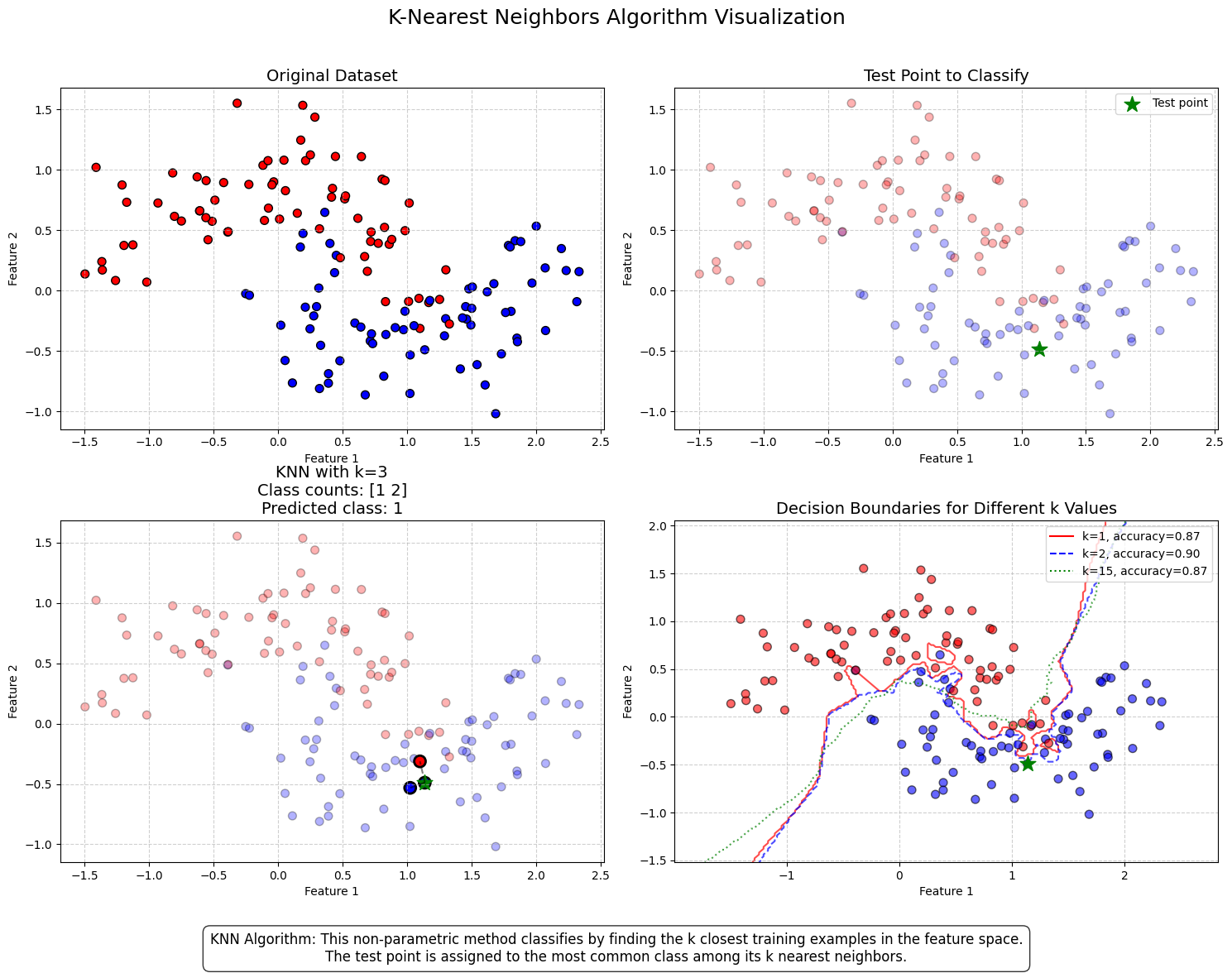
8.4. K-Nearest Neighbors (KNN)#
The K-Nearest Neighbors (KNN) algorithm is a lazy classification method, meaning it does not build an explicit model but instead stores training data and classifies new instances based on their similarity to existing data points. Similarity can be measured in various ways, with cosine similarity being one common approach.
KNN is particularly useful when there is limited knowledge about the underlying model that could describe an accounting dataset. In such cases, the best strategy is to classify a new instance based on the class of the most similar instances in the training data.
The algorithm is highly sensitive to the K parameter, which determines the number of nearest neighbors considered in the prediction:
K = 1: The new instance is assigned the same class as its single nearest neighbor. This often leads to overfitting and makes the model highly sensitive to noise.
K = 10: The predicted class is determined by the majority vote of the ten nearest neighbors.
A very small K can result in overfitting, while a very large K can reduce accuracy by incorporating distant, less relevant observations into the prediction. The figure below demonstrates this.
Huang & Li (2011) applied KNN for multi-label classification of risk factors in SEC 10-K filings.
(Ke-Wei Huang and Zhuolun Li. 2011. “A Multi-Label Text Classification Algorithm for Labeling Risk Factors in SEC Form 10-K.” ACM Transactions on Management Information Systems, 2(3), Article 18.)
➡ Read the paper
Show code cell source
import numpy as np
import matplotlib.pyplot as plt
from matplotlib.colors import ListedColormap
from sklearn.datasets import make_moons
from sklearn.model_selection import train_test_split
from sklearn.neighbors import KNeighborsClassifier
from sklearn.metrics import accuracy_score
from sklearn.inspection import DecisionBoundaryDisplay

# Set random seed for reproducibility
np.random.seed(42)

# Generate a non-linear dataset (half moons)
X, y = make_moons(n_samples=200, noise=0.24, random_state=32)
X_train, X_test, y_train, y_test = train_test_split(X, y, test_size=0.3, random_state=42)

# Select a specific test point to explain the algorithm
test_point_idx = 10
test_point = X_test[test_point_idx].reshape(1, -1)
test_point_class = y_test[test_point_idx]

# Calculate distances from test point to all training points
distances = np.sqrt(np.sum((X_train - test_point)**2, axis=1))
indices_sorted = np.argsort(distances)

# Create figure and subfigures
fig = plt.figure(figsize=(15, 12))
fig.suptitle('K-Nearest Neighbors Algorithm Visualization', fontsize=18, y=0.98)

# Custom colormap
cmap_bold = ListedColormap(['#FF0000', '#0000FF'])

# Subplot 1: Original Dataset
ax1 = fig.add_subplot(2, 2, 1)
ax1.scatter(X_train[:, 0], X_train[:, 1], c=y_train, cmap=cmap_bold, edgecolor='k', s=50)
ax1.set_title('Original Dataset', fontsize=14)
ax1.set_xlabel('Feature 1')
ax1.set_ylabel('Feature 2')
ax1.grid(True, linestyle='--', alpha=0.6)

# Subplot 2: Test Point to Classify
ax2 = fig.add_subplot(2, 2, 2)
ax2.scatter(X_train[:, 0], X_train[:, 1], c=y_train, cmap=cmap_bold, edgecolor='k', s=50, alpha=0.3)
ax2.scatter(test_point[:, 0], test_point[:, 1], marker='*',
            color='green', s=200, label='Test point')
ax2.set_title('Test Point to Classify', fontsize=14)
ax2.set_xlabel('Feature 1')
ax2.set_ylabel('Feature 2')
ax2.grid(True, linestyle='--', alpha=0.6)
ax2.legend()

# Subplot 3: KNN with k=3
k_value = 3
ax3 = fig.add_subplot(2, 2, 3)
ax3.scatter(X_train[:, 0], X_train[:, 1], c=y_train, cmap=cmap_bold, edgecolor='k', s=50, alpha=0.3)

# Highlight the k nearest neighbors
nearest_neighbors = X_train[indices_sorted[:k_value]]
nearest_classes = y_train[indices_sorted[:k_value]]

# For the k nearest neighbors, draw lines to the test point
for i in range(k_value):
    ax3.plot([test_point[0, 0], nearest_neighbors[i, 0]],
             [test_point[0, 1], nearest_neighbors[i, 1]], 'k--', alpha=0.5)

# Plot the nearest neighbors with a thicker edge
ax3.scatter(nearest_neighbors[:, 0], nearest_neighbors[:, 1],
            c=nearest_classes, cmap=cmap_bold, edgecolor='k',
            s=100, linewidth=2)

# Plot the test point
ax3.scatter(test_point[:, 0], test_point[:, 1], marker='*',
            color='green', s=200, label='Test point')

# Count classes among neighbors
class_counts = np.bincount(nearest_classes.astype(int))
predicted_class = np.argmax(class_counts)
prediction_text = f"Class counts: {class_counts}\nPredicted class: {predicted_class}"

ax3.set_title(f'KNN with k={k_value}\n{prediction_text}', fontsize=14)
ax3.set_xlabel('Feature 1')
ax3.set_ylabel('Feature 2')
ax3.grid(True, linestyle='--', alpha=0.6)

# Subplot 4: Decision boundaries for different k values
ax4 = fig.add_subplot(2, 2, 4)

# Define boundaries for the plot
x_min, x_max = X[:, 0].min() - 0.5, X[:, 0].max() + 0.5
y_min, y_max = X[:, 1].min() - 0.5, X[:, 1].max() + 0.5

# Create a mesh grid
h = 0.02  # step size in the mesh
xx, yy = np.meshgrid(np.arange(x_min, x_max, h), np.arange(y_min, y_max, h))

# Initialize the KNN model with different k values
k_values = [1, 2, 15]
line_colors = ['red', 'blue', 'green']
line_styles = ['-', '--', ':']
accuracies = []

# First calculate all accuracies
models = []
for k in k_values:
    knn = KNeighborsClassifier(n_neighbors=k)
    knn.fit(X_train, y_train)
    models.append(knn)

    # Calculate accuracy
    y_pred = knn.predict(X_test)
    accuracy = accuracy_score(y_test, y_pred)
    accuracies.append(accuracy)

# Print for debugging
print(f"K values: {k_values}")
print(f"Accuracies: {accuracies}")

# Plot all data points first
scatter = ax4.scatter(X_train[:, 0], X_train[:, 1], c=y_train,
                     cmap=cmap_bold, edgecolor='k', s=50, alpha=0.6, zorder=2)
ax4.scatter(test_point[:, 0], test_point[:, 1], marker='*',
           color='green', s=200, zorder=3)

# Now create separate decision boundaries
for i, (k, model) in enumerate(zip(k_values, models)):
    # For each model, predict on mesh grid
    Z = model.predict(np.c_[xx.ravel(), yy.ravel()])
    Z = Z.reshape(xx.shape)

    # Plot the contour
    contour = ax4.contour(xx, yy, Z, colors=[line_colors[i]],
                         linestyles=[line_styles[i]], levels=[0.5],
                         alpha=0.7, zorder=1+i)

    # Add to legend with correct accuracy
    ax4.plot([], [], color=line_colors[i], linestyle=line_styles[i],
            label=f'k={k}, accuracy={accuracies[i]:.2f}')

ax4.set_title('Decision Boundaries for Different k Values', fontsize=14)
ax4.set_xlabel('Feature 1')
ax4.set_ylabel('Feature 2')
ax4.set_xlim(x_min, x_max)
ax4.set_ylim(y_min, y_max)
ax4.grid(True, linestyle='--', alpha=0.6)
ax4.legend()

# Add descriptive text box
fig.text(0.5, 0.02,
         "KNN Algorithm: This non-parametric method classifies by finding the k closest training examples in the feature space.\n"
         "The test point is assigned to the most common class among its k nearest neighbors.",
         ha='center', bbox=dict(boxstyle="round,pad=0.5", facecolor='white', alpha=0.8),
         fontsize=12)

plt.tight_layout()
plt.subplots_adjust(top=0.9, bottom=0.12)
plt.show()
K values: [1, 2, 15]
Accuracies: [0.8666666666666667, 0.9, 0.8666666666666667]
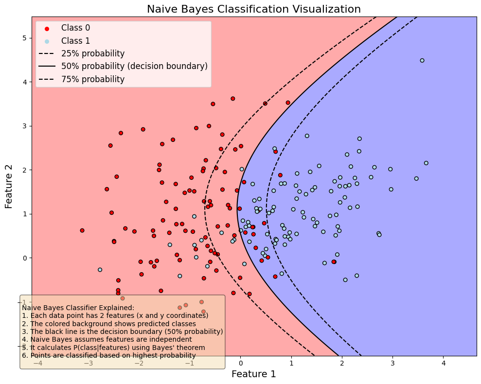
8.5. Naive Bayes#
Naive Bayes classifiers are a collection of classification algorithms based on Bayes’ Theorem $\(P(A|B)=\frac{P(B|A)P(A)}{P(B)}.\)$
The common principle behind all of these algorithms is the assumption that features are independent of each other, and we can classify them separately.
An example of Naive Bayes applications in accounting is Ngai et al. (2011), who compare several classification algorithms for fraud detection. One of the algorithms implemented is the Naive Bayes algorithm. (Ngai, E. W., Hu, Y., Wong, Y. H., Chen, Y., & Sun, X. (2011). The application of data mining techniques in financial fraud detection: A classification framework and an academic review of literature. Decision support systems, 50(3), 559-569.) –> Link to paper
Show code cell source
import numpy as np  # Import the numpy library
import matplotlib.pyplot as plt
from matplotlib.colors import ListedColormap    # Import the ListedColormap class
from sklearn.naive_bayes import GaussianNB
from sklearn.datasets import make_classification
import matplotlib.patches as mpatches

# Create a synthetic dataset
X, y = make_classification(n_samples=200, n_features=2, n_redundant=0,
                          n_informative=2, random_state=42, n_clusters_per_class=1)

# Create the Naive Bayes classifier and fit it
clf = GaussianNB()
clf.fit(X, y)

# Create a mesh grid to visualize the decision boundary
h = 0.02  # step size in the mesh
x_min, x_max = X[:, 0].min() - 1, X[:, 0].max() + 1
y_min, y_max = X[:, 1].min() - 1, X[:, 1].max() + 1
xx, yy = np.meshgrid(np.arange(x_min, x_max, h), np.arange(y_min, y_max, h))

# Get predictions for each point in the mesh
Z = clf.predict(np.c_[xx.ravel(), yy.ravel()])
Z = Z.reshape(xx.shape)

# Create a colormap for the background and scatter points
cmap_light = ListedColormap(['#FFAAAA', '#AAAAFF'])
cmap_bold = ListedColormap(['r', 'lightblue'])

# Plot the decision boundary and the data points
fig, ax = plt.subplots(figsize=(10, 8))
plt.pcolormesh(xx, yy, Z, cmap=cmap_light)
scatter = plt.scatter(X[:, 0], X[:, 1], c=y, cmap=cmap_bold, edgecolor='k', s=30)
plt.title('Naive Bayes Classification Visualization', fontsize=16)
plt.xlabel('Feature 1', fontsize=14)
plt.ylabel('Feature 2', fontsize=14)
plt.xlim(xx.min(), xx.max())
plt.ylim(yy.min(), yy.max())

# Add decision probabilities contour lines
proba = clf.predict_proba(np.c_[xx.ravel(), yy.ravel()])[:, 1]
proba = proba.reshape(xx.shape)
contour = plt.contour(xx, yy, proba, levels=[0.25, 0.5, 0.75], colors='k', linestyles=['--', '-', '--'])

# Add legend for class points
plt.scatter([], [], c='r', s=30, label='Class 0')
plt.scatter([], [], c='lightblue', s=30, label='Class 1')

# Create legend for contour lines using Line2D
from matplotlib.lines import Line2D
contour_legend = [
    Line2D([0], [0], color='black', linestyle='--', label='25% probability'),
    Line2D([0], [0], color='black', linestyle='-', label='50% probability (decision boundary)'),
    Line2D([0], [0], color='black', linestyle='--', label='75% probability')
]

# Combine legends
handles, labels = ax.get_legend_handles_labels()
handles.extend(contour_legend)
plt.legend(handles=handles, loc='upper left', fontsize=12)

# Add educational textbox explaining Naive Bayes
explanation = """
Naive Bayes Classifier Explained:
1. Each data point has 2 features (x and y coordinates)
2. The colored background shows predicted classes
3. The black line is the decision boundary (50% probability)
4. Naive Bayes assumes features are independent
5. It calculates P(class|features) using Bayes' theorem
6. Points are classified based on highest probability
"""

props = dict(boxstyle='round', facecolor='wheat', alpha=0.5)
plt.figtext(0.05, 0.05, explanation, fontsize=10,
            verticalalignment='bottom', bbox=props)

plt.tight_layout()
plt.show()
8.6. Ensemble Methods#
There’s a saying: “Two heads are better than one.” But what about even more heads? In machine learning, the answer is clear: more heads are helpful! (Though with humans, the jury is still out. 😄)
The core idea behind ensemble methods is to combine multiple weak estimators to create a stronger, more accurate model. Even if each weak estimator performs only slightly better than random chance, their combined predictions can lead to significantly improved accuracy.
Example:
Suppose we have a weak estimator that correctly predicts corporate bankruptcy 52% of the time—just slightly better than random guessing (50%).
An ensemble of 100 weak estimators improves accuracy to 69.2%.
An ensemble of 1,000 weak estimators increases accuracy to 90.3%!
By aggregating multiple weak models, ensemble methods reduce variance, improve generalization, and enhance predictive performance—making them a powerful tool in machine learning. 🚀
import scipy.stats as ss   # Import the stats class from the scipy library

binom_rv = ss.binom(100,0.52)   # Create a binomial random variable with 100 trials and a success probability of 0.52
print(sum([binom_rv.pmf(i) for i in range(50,101)]))   # Calculate the probability of getting 50 or more successes

binom_rv = ss.binom(1000,0.52)  # Create a binomial random variable with 1000 trials and a success probability of 0.52
print(sum([binom_rv.pmf(i) for i in range(500,1001)])) # Calculate the probability of getting 500 or more successes
0.6918454716594062
0.9027460086403865
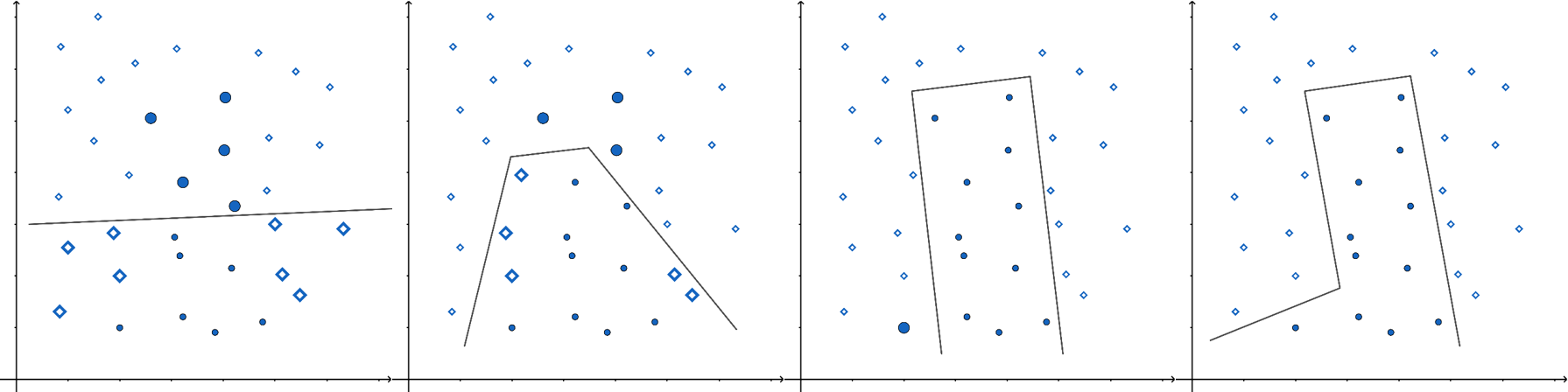
In the figure below, a single ellipse (a weak estimator) would be a poor classifier due to its unsuitable shape for distinguishing the two classes (dots and diamonds). However, by combining multiple weak estimators into an ensemble, we can achieve significantly better classification.
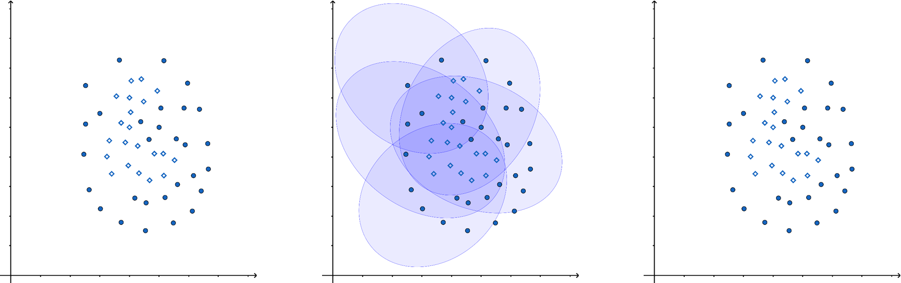
There are various ways to aggregate predictions in ensemble methods, such as weighted averaging or majority voting, depending on the application.
8.6.1. Decision Trees in Ensemble Methods#
A common weak estimator in ensemble methods is the decision tree. A decision tree splits data based on feature values, with each leaf node providing a prediction. Traditional decision trees predict classes, while classification and regression trees (CART) use numerical values in the leaves, making them applicable for both classification and regression tasks.
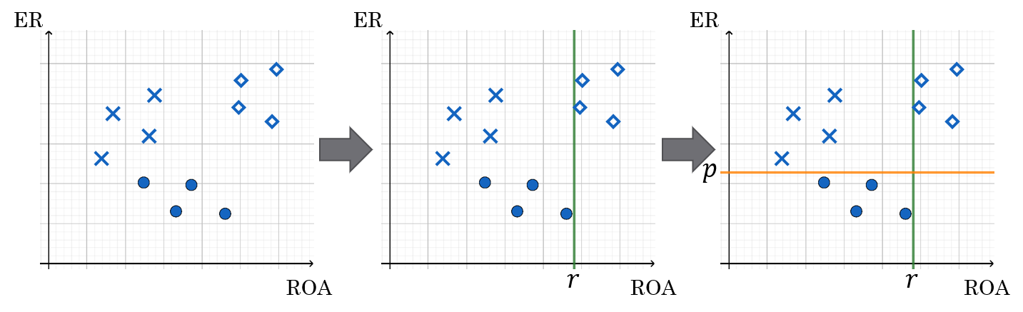
Below is an example of a decision tree constructed using two financial features: equity ratio (ER) and return on assets (ROA).
The companies are first split based on ROA (above or below r).
Those with ROA < r are further split based on their equity ratio (above or below p).
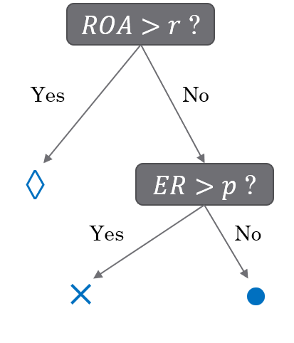
Symbol interpretation:
◇ (Diamond): No bankruptcy risk
✕ (Cross): Low bankruptcy risk
○ (Circle): High bankruptcy risk
8.6.2. Types of Ensemble Methods#
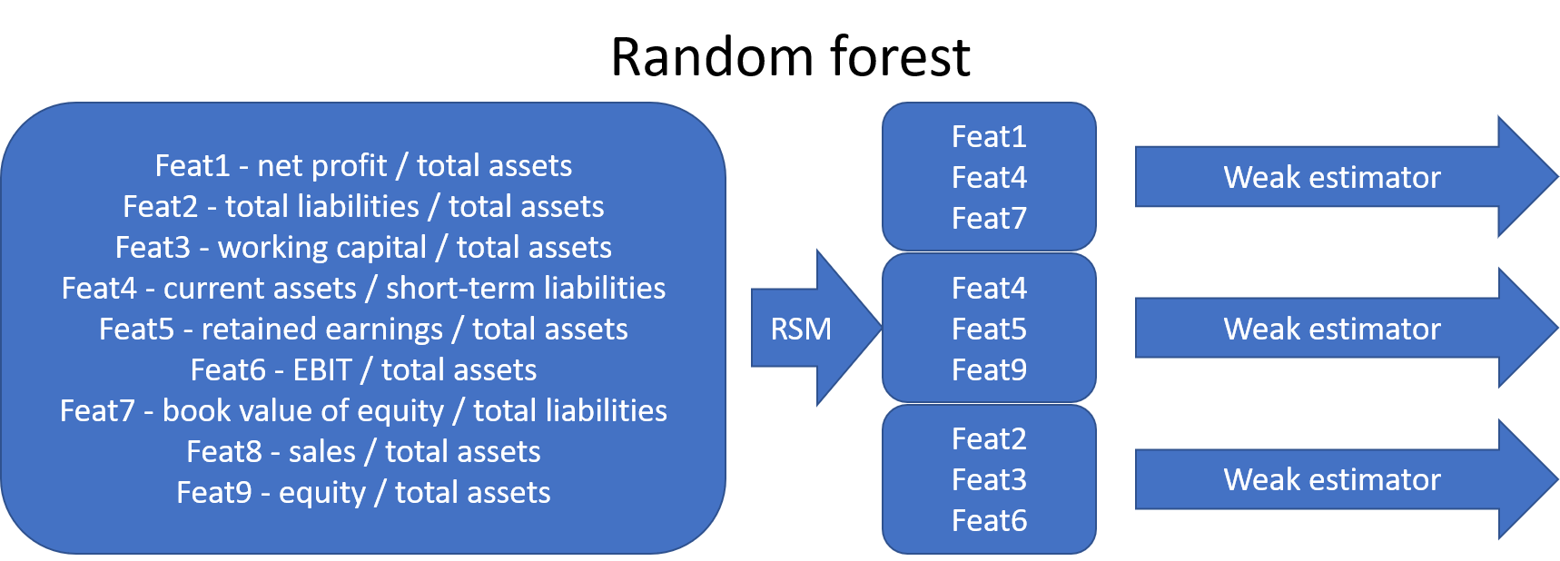
The most common ensemble methods include bagging, random forests, and boosting. They differ in how they reduce correlation between weak estimators, which improves overall model performance.
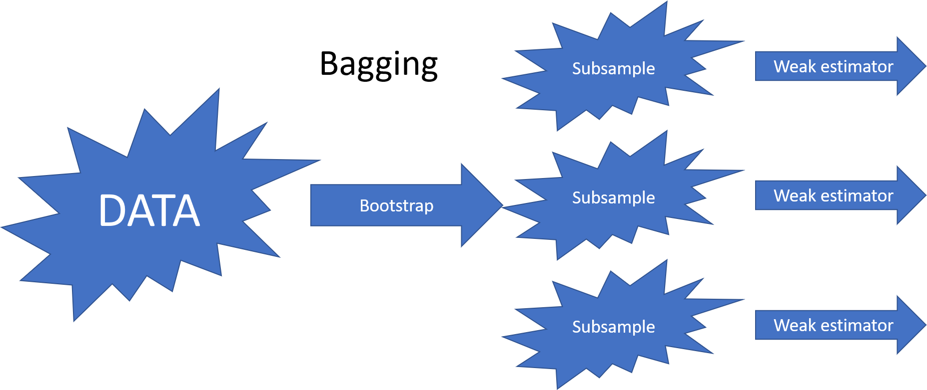
8.6.2.1. Bagging (Bootstrap Aggregating)#
Bagging reduces correlation by training weak estimators on bootstrap samples (randomly selected subsets of training data with replacement).
8.6.2.2. Random Forest#
The random forest algorithm extends bagging by selecting a random subset of features for each weak estimator (random subspace method). Later, bootstrap aggregating was incorporated into random forests.
8.6.2.3. Boosting#
Boosting, particularly gradient boosting, has become one of the most popular ensemble methods in recent years.
In Boosting, weak estimators are trained sequentially.
Each new weak estimator focuses more on misclassified points by increasing their weights.
After training, the final prediction is a weighted mean of all weak estimators, with greater weight given to models with lower error.
8.6.2.4. XGBoost: A Leading Boosting Method#
One of the most successful implementations of gradient boosting is XGBoost, which frequently powers winning solutions in machine learning competitions on Kaggle.
According to the XGBoost GitHub page:
“XGBoost is an optimized distributed gradient boosting library designed to be highly efficient, flexible, and portable. It implements machine learning algorithms under the Gradient Boosting framework. XGBoost provides a parallel tree boosting (also known as GBDT, GBM) that solves many data science problems in a fast and accurate way. The same code runs on major distributed environments (Kubernetes, Hadoop, SGE, MPI, Dask) and can handle datasets with billions of examples.”
Later in this book, we will explore an example using XGBoost.
Real-World Application: Fraud Detection
An example of ensemble methods in accounting applications is Bao et al. (2020), who applied a boosting model for fraud detection in publicly traded U.S. firms.
(Bao, Y., Ke, B., Li, B., Yu, Y. J., & Zhang, J. (2020). Detecting Accounting Fraud in Publicly Traded U.S. Firms Using a Machine Learning Approach. Journal of Accounting Research, 58(1), 199–235.)
➡ Read the paper
8.7. Support Vector Machines (SVM)#
Support Vector Machines (SVMs) were once among the most popular algorithms in modern machine learning, often delivering impressive classification performance on moderately sized datasets. However, SVMs struggle with large datasets since their computational complexity does not scale well with the number of training examples. This limitation has led to neural networks partially replacing SVMs in big data applications.
Despite this, SVMs remain highly effective in fields like accounting, where datasets are often of modest size, making them a strong choice for classification tasks.
8.7.1. Optimal Separation#
One of the key innovations of SVMs is their ability to find optimal decision boundaries for classification.
The image below illustrates this concept: although all three lines separate the classes, the middle boundary is the best choice because it maximizes the margin between the two classes. SVMs automatically select the optimal boundary, whereas many other machine learning models stop training as soon as any valid separation is found.
SVMs achieve this by searching for a separator that is as far as possible from both classes. This is done by maximizing the margin.
8.7.2. Accounting Applications#
A notable application of SVMs in accounting is Öğüt et al. (2009), who used SVMs to predict financial information manipulation.
(Öğüt, H., Aktaş, R., Alp, A., & Doğanay, M. M. (2009). Prediction of financial information manipulation by using support vector machine and probabilistic neural network. Expert Systems with Applications, 36(3), 5419-5423.)
➡ Read the paper
Show code cell source
import numpy as np
import matplotlib.pyplot as plt
from sklearn import svm
from sklearn.datasets import make_blobs

# Generate sample data
X, y = make_blobs(n_samples=50, centers=2, random_state=6, cluster_std=1.05)

# Create a mesh grid to visualize the decision boundary
def plot_decision_boundary(model, X, y):
    # Set min and max values with some padding
    x_min, x_max = X[:, 0].min() - 1, X[:, 0].max() + 1
    y_min, y_max = X[:, 1].min() - 1, X[:, 1].max() + 1

    # Create a mesh grid
    xx, yy = np.meshgrid(np.arange(x_min, x_max, 0.02),
                         np.arange(y_min, y_max, 0.02))

    # Get predictions for each point in the mesh
    Z = model.predict(np.c_[xx.ravel(), yy.ravel()])
    Z = Z.reshape(xx.shape)

    # Create a color plot with the results
    plt.contourf(xx, yy, Z, alpha=0.3)
    plt.scatter(X[:, 0], X[:, 1], c=y, s=50, edgecolors='k')

    # Highlight support vectors
    plt.scatter(model.support_vectors_[:, 0], model.support_vectors_[:, 1],
                s=100, facecolors='none', edgecolors='k')

    # Plot the decision boundary and margins
    plt.xlim(x_min, x_max)
    plt.ylim(y_min, y_max)

    # Get the separating hyperplane
    w = model.coef_[0]
    a = -w[0] / w[1]
    xx = np.linspace(x_min, x_max)
    yy = a * xx - (model.intercept_[0]) / w[1]

    # Plot the hyperplane: w[0]*x + w[1]*y + b = 0
    plt.plot(xx, yy, 'k-', label=f'Decision boundary: {w[0]:.2f}*x + {w[1]:.2f}*y - {-model.intercept_[0]:.2f}=0')

    # Plot the margin boundaries
    margin = 1 / np.sqrt(np.sum(model.coef_**2))
    yy_down = yy - margin
    yy_up = yy + margin
    plt.plot(xx, yy_down, 'k--')
    plt.plot(xx, yy_up, 'k--')

    plt.title('SVM Decision Boundary with Margin')
    plt.xlabel('Feature 1')
    plt.ylabel('Feature 2')
    plt.legend()
    plt.tight_layout()

# Creating and training the SVM model
clf = svm.SVC(kernel='linear', C=1000)
clf.fit(X, y)

# Plotting the decision boundary
plt.figure(figsize=(10, 8))
plot_decision_boundary(clf, X, y)
plt.show()

# Print the hyperplane equation
w = clf.coef_[0]
b = clf.intercept_[0]
print(f"Optimal separating hyperplane equation: {w[0]:.4f}*x1 + {w[1]:.4f}*x2 - {-b:.4f} = 0")
print(f"Support vectors: {clf.support_vectors_.shape[0]}")
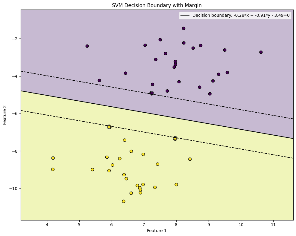
Optimal separating hyperplane equation: -0.2757*x1 + -0.9121*x2 - 3.4878 = 0
Support vectors: 3
8.8. Unsupervised classification#
Unsupervised learning, particularly clustering, is a powerful technique for discovering hidden patterns and structures in data without predefined labels. In accounting and finance, clustering can be applied to a wide range of tasks, enabling organizations to gain insights, improve decision-making, and optimize processes. Here are some key applications:
Segmenting Companies Based on Financial Performance - Clustering can be used to group companies with similar financial characteristics, providing valuable insights for investors, analysts, and regulators. For example:
Risk Profiling: Cluster companies into risk categories (e.g., low-risk, medium-risk, high-risk) based on financial ratios like leverage, liquidity, and profitability.
Industry Benchmarking: Group companies within the same industry to compare performance metrics and identify outliers or best practices.
Investment Strategies: Identify clusters of companies with strong growth potential or undervalued stocks based on financial and market data.
Identifying Patterns in Audit Data - Clustering can help auditors detect anomalies, trends, or patterns in financial data, improving the efficiency and effectiveness of audits. For example:
Fraud Detection: Cluster transactions or accounts to identify unusual patterns that may indicate fraudulent activity.
Audit Sampling: Group similar transactions or accounts to select representative samples for auditing, reducing the workload while maintaining coverage.
Internal Control Analysis: Cluster business units or processes to assess the effectiveness of internal controls and identify areas for improvement.
Customer Segmentation for Financial Services - Clustering can help financial institutions understand their customer base and tailor products or services to different segments. For example:
Credit Scoring: Group customers with similar credit profiles to design targeted lending programs or risk management strategies.
Marketing Campaigns: Segment customers based on spending behavior, saving patterns, or life stage to create personalized marketing campaigns.
Churn Prediction: Identify clusters of customers at risk of leaving and develop retention strategies for each group.
Analyzing Financial Statements - Clustering can be used to analyze and compare financial statements across companies or time periods. For example:
Financial Health Assessment: Group companies into clusters based on their financial health (e.g., healthy, distressed, recovering) using metrics like profitability, liquidity, and solvency.
Trend Analysis: Cluster financial statements over time to identify trends, such as improving or deteriorating financial performance.
Peer Group Analysis: Compare a company’s financial performance to its peers by clustering companies with similar characteristics.
Tax Compliance and Optimization - Clustering can assist in identifying patterns in tax data to improve compliance and optimize tax strategies. For example:
Tax Evasion Detection: Cluster taxpayers based on income, expenses, and deductions to identify anomalies or suspicious patterns.
Tax Planning: Group companies with similar tax profiles to develop tailored tax strategies or identify opportunities for tax savings.
Cost and Expense Analysis - Clustering can be used to analyze costs and expenses, helping organizations identify inefficiencies and optimize spending. For example:
Cost Allocation: Cluster cost centers or departments based on spending patterns to allocate resources more effectively.
Expense Management: Group expenses into categories (e.g., fixed, variable, discretionary) to identify areas for cost reduction.
Supplier Analysis: Cluster suppliers based on pricing, reliability, or performance to improve procurement strategies.
Regulatory Compliance - Clustering can help organizations comply with regulatory requirements by identifying patterns or anomalies in financial data. For example:
Anti-Money Laundering: Cluster transactions to detect unusual patterns that may indicate money laundering or other illicit activities.
Financial Reporting: Group financial data into clusters to ensure consistency and accuracy in regulatory reporting.
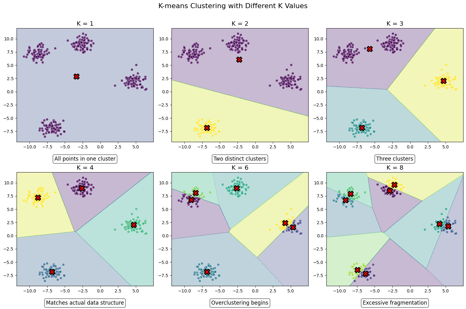
8.8.1. K-means clustering#
K-means clustering algorithm was used initially in signal processing. It aims to partition observations into k clusters without supervision. In the algorithm, observations are assigned to cluster centroids that are the mean values of the cluster. The training algorithm in K-means minimises within-cluster variances (squared Euclidean distances). The instances are moved to other clusters in order to minimise the variance.
An example of the K-means algorithm in accounting is Münnix et al. (2012), who use the algorithm to identify states of a financial market. (Münnix, M. C., Shimada, T., Schäfer, R., Leyvraz, F., Seligman, T. H., Guhr, T., & Stanley, H. E. (2012). Identifying states of a financial market. Scientific reports, 2(1), 1-6.) –> Link_to_paper
Show code cell source
import numpy as np
import matplotlib.pyplot as plt
from sklearn.datasets import make_blobs
from sklearn.cluster import KMeans
import matplotlib.cm as cm
import os

os.environ['OMP_NUM_THREADS'] = '1'
# Set random seed for reproducibility
np.random.seed(42)

# Generate sample data
n_samples = 300
X, _ = make_blobs(n_samples=n_samples, centers=4, cluster_std=0.8, random_state=42)

# K values to display
k_values = [1, 2, 3, 4, 6, 8]
n_k = len(k_values)

# Create figure with subfigures
fig, axes = plt.subplots(2, 3, figsize=(15, 10))
axes = axes.flatten()

# Set up colormap
colormap = cm.viridis

# Function to plot K-means for a specific K
def plot_kmeans(ax, k, index):
    # Perform K-means clustering
    kmeans = KMeans(n_clusters=k, random_state=42, n_init=10)
    kmeans.fit(X)
    labels = kmeans.labels_
    centers = kmeans.cluster_centers_

    # Create a mesh grid for decision boundary visualization
    h = 0.02  # Step size of the mesh
    x_min, x_max = X[:, 0].min() - 1, X[:, 0].max() + 1
    y_min, y_max = X[:, 1].min() - 1, X[:, 1].max() + 1
    xx, yy = np.meshgrid(np.arange(x_min, x_max, h), np.arange(y_min, y_max, h))

    # Predict cluster labels for each point in the mesh
    Z = kmeans.predict(np.c_[xx.ravel(), yy.ravel()])
    Z = Z.reshape(xx.shape)

    # Plot the decision boundary
    ax.contourf(xx, yy, Z, alpha=0.3, cmap=colormap)

    # Plot the data points with their cluster colors
    colors = [colormap(i) for i in np.linspace(0, 1, k)]
    for i in range(k):
        cluster_points = X[labels == i]
        ax.scatter(cluster_points[:, 0], cluster_points[:, 1], c=[colors[i]],
                  edgecolor='w', linewidth=0.5, alpha=0.7)

    # Plot the centroids
    ax.scatter(centers[:, 0], centers[:, 1], marker='X', s=150, linewidth=2,
              c='red', edgecolor='black')

    ax.set_title(f"K = {k}", fontsize=14)
    ax.set_xlim(x_min, x_max)
    ax.set_ylim(y_min, y_max)

    # Add explanation text
    if k == 1:
        explanation = "All points in one cluster"
    elif k == 2:
        explanation = "Two distinct clusters"
    elif k == 3:
        explanation = "Three clusters"
    elif k == 4:
        explanation = "Matches actual data structure"
    elif k == 6:
        explanation = "Overclustering begins"
    else:
        explanation = "Excessive fragmentation"

    ax.text(0.5, -0.15, explanation, transform=ax.transAxes,
           ha='center', va='center', fontsize=12,
           bbox=dict(boxstyle="round,pad=0.3", facecolor='white', alpha=0.7))

# Plot each K value in its own subfigure
for i, k in enumerate(k_values):
    plot_kmeans(axes[i], k, i)

plt.suptitle('K-means Clustering with Different K Values', fontsize=16, y=0.98)
plt.tight_layout()
plt.subplots_adjust(top=0.9)
plt.show()
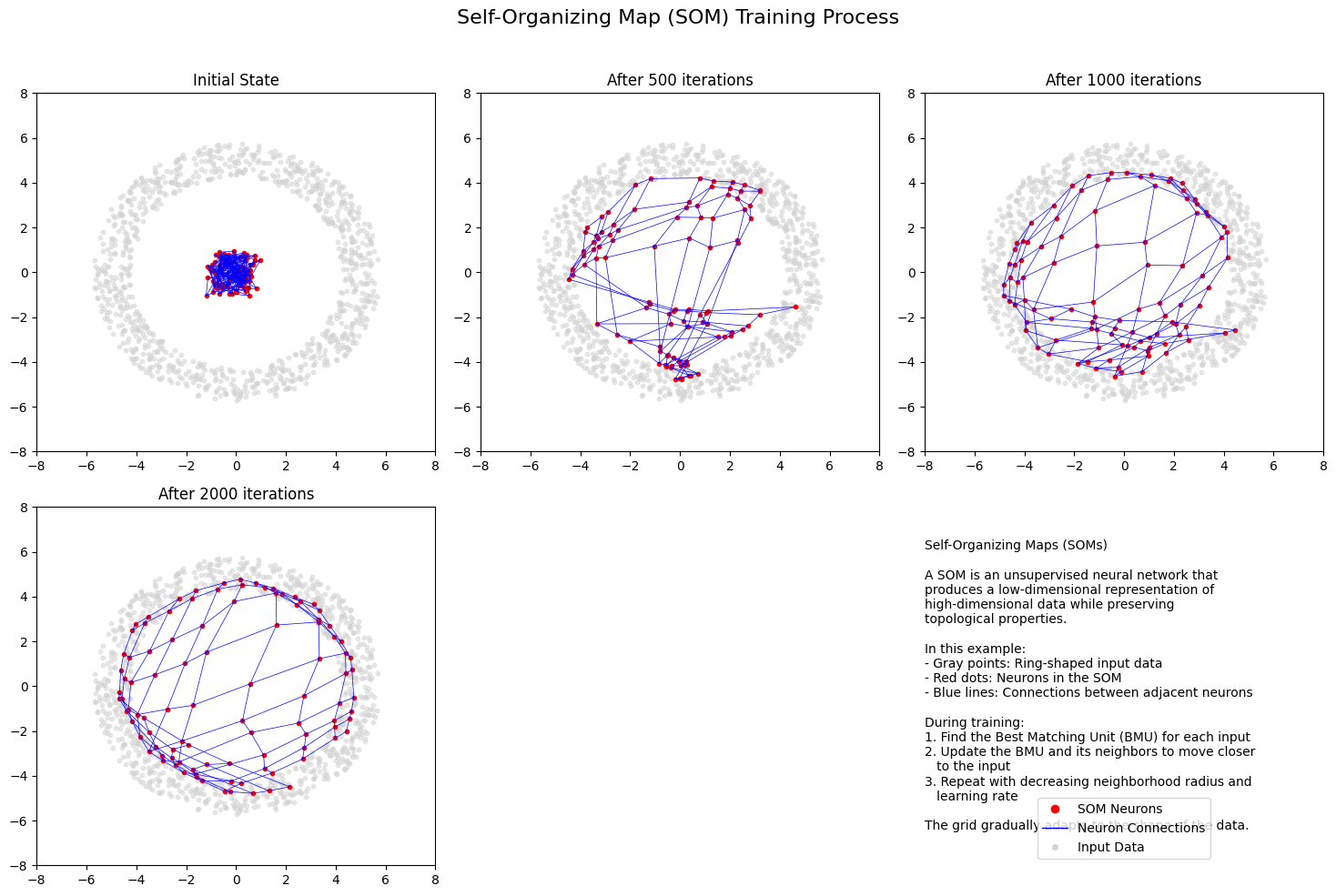
8.8.2. Self organising maps#
The origin of the self-organising maps is also in signal processing. Teuvo Kohonen proposed them in 1988. It is an unsupervised neural network that is based on the idea that the neurons of the network adapt to the features of the input data. The goal is to make different parts of the network to react similarly to specific input data. The animation below shows the training of a SOM in a two-feature setting.
An example of a self-organising map application in accounting research is Haga et al. (2015), who use SOMs for estimating accounting quality measures.(Haga, J., Siekkinen, J., & Sundvik, D. (2015). Initial stage clustering when estimating accounting quality measures with self-organising maps. Expert Systems with Applications, 42(21), 8327-8336.) –> Link to paper
Show code cell source
import numpy as np
import matplotlib.pyplot as plt
from matplotlib.patches import Patch
from matplotlib.lines import Line2D
import matplotlib.gridspec as gridspec

np.random.seed(42)  # For reproducibility

# Generate sample data (distribution in the shape of a ring)
def generate_ring_data(n_samples=1000):
    radius = 5
    width = 1.5
    theta = np.random.uniform(0, 2*np.pi, n_samples)
    r = radius + width * (np.random.rand(n_samples) - 0.5)
    x = r * np.cos(theta)
    y = r * np.sin(theta)
    return np.column_stack((x, y))

# Simple SOM implementation
class SOM:
    def __init__(self, x_size, y_size, input_dim, learning_rate=0.1):
        self.x_size = x_size
        self.y_size = y_size
        self.input_dim = input_dim
        self.learning_rate = learning_rate

        # Initialize weights randomly
        self.weights = np.random.uniform(-1, 1, (x_size, y_size, input_dim))

    def find_bmu(self, x):
        """Find the best matching unit for input vector x"""
        distances = np.zeros((self.x_size, self.y_size))
        for i in range(self.x_size):
            for j in range(self.y_size):
                distances[i, j] = np.linalg.norm(x - self.weights[i, j])

        # Find indices of BMU
        bmu = np.unravel_index(np.argmin(distances), distances.shape)
        return bmu

    def update_weights(self, x, iteration, max_iterations):
        """Update the weights based on the input vector x"""
        bmu = self.find_bmu(x)

        # Calculate learning rate and neighborhood radius (decreasing with time)
        radius = max(1, self.x_size/2 * np.exp(-iteration/max_iterations))
        lr = self.learning_rate * np.exp(-iteration/max_iterations)

        # Update weights for all neurons
        for i in range(self.x_size):
            for j in range(self.y_size):
                # Calculate distance to BMU in the grid
                dist_to_bmu = np.linalg.norm(np.array([i, j]) - np.array(bmu))

                # Calculate neighborhood function (Gaussian)
                if dist_to_bmu <= radius:
                    influence = np.exp(-(dist_to_bmu**2) / (2 * (radius**2)))
                    self.weights[i, j] += lr * influence * (x - self.weights[i, j])

    def train(self, data, iterations, snapshot_intervals=None):
        """Train the SOM on the given data"""
        snapshots = []

        for it in range(iterations):
            # Select a random sample
            sample = data[np.random.randint(len(data))]

            # Update weights
            self.update_weights(sample, it, iterations)

            # Store snapshots if requested
            if snapshot_intervals and it in snapshot_intervals:
                snapshots.append(np.copy(self.weights))

        return snapshots

# Create figure
plt.figure(figsize=(15, 10))
gs = gridspec.GridSpec(2, 3, height_ratios=[1, 1])

# Generate ring-shaped data
data = generate_ring_data(1000)

# Initialize and train SOM
som_size = 10  # 10x10 grid
som = SOM(som_size, som_size, 2)

# Define iterations for snapshots
iterations = 5000
snapshot_iterations = [0, 500, 1000, 2000, 5000]
snapshots = som.train(data, iterations, snapshot_iterations)

# Plot the snapshots
titles = ["Initial State", "After 500 iterations", "After 1000 iterations",
          "After 2000 iterations", "Final State (5000 iterations)"]

for i, (weights, title) in enumerate(zip(snapshots, titles)):
    ax = plt.subplot(gs[i // 3, i % 3])

    # Plot the data points
    ax.scatter(data[:, 0], data[:, 1], c='lightgray', alpha=0.5, s=10)

    # Plot the SOM grid
    for x in range(som_size):
        for y in range(som_size):
            ax.plot(weights[x, y, 0], weights[x, y, 1], 'ro', markersize=3)

    # Plot connections between adjacent neurons
    for x in range(som_size):
        for y in range(som_size):
            if x < som_size-1:
                ax.plot([weights[x, y, 0], weights[x+1, y, 0]],
                        [weights[x, y, 1], weights[x+1, y, 1]], 'b-', linewidth=0.5)
            if y < som_size-1:
                ax.plot([weights[x, y, 0], weights[x, y+1, 0]],
                        [weights[x, y, 1], weights[x, y+1, 1]], 'b-', linewidth=0.5)

    ax.set_title(title)
    ax.set_xlim(-8, 8)
    ax.set_ylim(-8, 8)

# Add an information subplot at the last position
ax = plt.subplot(gs[1, 2])
ax.axis('off')

info_text = """Self-Organizing Maps (SOMs)

A SOM is an unsupervised neural network that
produces a low-dimensional representation of
high-dimensional data while preserving
topological properties.

In this example:
- Gray points: Ring-shaped input data
- Red dots: Neurons in the SOM
- Blue lines: Connections between adjacent neurons

During training:
1. Find the Best Matching Unit (BMU) for each input
2. Update the BMU and its neighbors to move closer
   to the input
3. Repeat with decreasing neighborhood radius and
   learning rate

The grid gradually adapts to the shape of the data."""

ax.text(0, 0., info_text, fontsize=10, va='center')

# Add a legend
legend_elements = [
    Line2D([0], [0], marker='o', color='w', markerfacecolor='r', markersize=8, label='SOM Neurons'),
    Line2D([0], [0], color='b', lw=1, label='Neuron Connections'),
    Line2D([0], [0], marker='o', color='w', markerfacecolor='lightgray', markersize=6, label='Input Data')
]
ax.legend(handles=legend_elements, loc='lower center')

plt.suptitle("Self-Organizing Map (SOM) Training Process", fontsize=16)
plt.tight_layout(rect=[0, 0, 1, 0.96])
#plt.savefig('som_training_process.png', dpi=300)
plt.show()
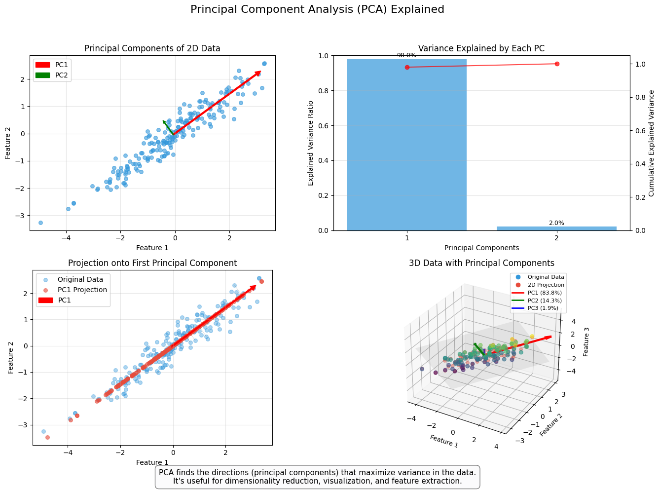
8.8.3. PCA models#
Principal Component Analysis, or PCA, is used to reduce the dimensionality of large data sets by transforming a large set of variables into a smaller one that still contains most of the information (variation) in the large set. Although mapping the data to a lower dimension inevitably loses information and accuracy is decreased, the algorithm is designed so that the loss in accuracy is minimal while the simplicity of the model is maximised.
So, to sum up, the idea of PCA is simple — reduce the number of variables of a data set while preserving as much information as possible.
An example of PCA in accounting/finance applications is Back & Weigend (1997). (Back, A. D., & Weigend, A. S. (1997). A first application of independent component analysis to extracting structure from stock returns. International journal of neural systems, 8(04), 473-484.) –> Link to paper
Show code cell source
import numpy as np
import matplotlib.pyplot as plt
from sklearn.decomposition import PCA
from matplotlib.patches import FancyArrowPatch
from mpl_toolkits.mplot3d import proj3d
import matplotlib.gridspec as gridspec
from matplotlib.colors import LinearSegmentedColormap

# Set random seed for reproducibility
np.random.seed(32)

# Create a figure with multiple subplots
plt.figure(figsize=(14, 10))
gs = gridspec.GridSpec(2, 2, height_ratios=[1, 1], width_ratios=[1, 1])

# 1. Create the first subplot: 2D data with principal components
ax1 = plt.subplot(gs[0, 0])

# Generate correlated data
n_points = 200
mean = [0, 0]
cov = [[2.0, 1.5], [1.5, 1.0]]  # Covariance matrix (correlated data)
data = np.random.multivariate_normal(mean, cov, n_points)

# Apply PCA
pca = PCA(n_components=2)
pca.fit(data)

# Get principal components and variance explained
components = pca.components_
explained_variance = pca.explained_variance_

# Plot the data points
ax1.scatter(data[:, 0], data[:, 1], alpha=0.6, s=30, color='#3498db')

# Plot the principal components
origin = np.mean(data, axis=0)
pc1 = components[0] * np.sqrt(explained_variance[0]) * 2
pc2 = components[1] * np.sqrt(explained_variance[1]) * 2
ax1.arrow(origin[0], origin[1], pc1[0], pc1[1], head_width=0.2, head_length=0.2, fc='red', ec='red', width=0.05, label='PC1')
ax1.arrow(origin[0], origin[1], pc2[0], pc2[1], head_width=0.1, head_length=0.1, fc='green', ec='green', width=0.03, label='PC2')

ax1.set_title('Principal Components of 2D Data', fontsize=12)
ax1.set_xlabel('Feature 1', fontsize=10)
ax1.set_ylabel('Feature 2', fontsize=10)
ax1.grid(alpha=0.3)
ax1.legend()
ax1.set_aspect('equal')

# 2. Create the second subplot: Variance explained
ax2 = plt.subplot(gs[0, 1])

variance_ratio = pca.explained_variance_ratio_
cumulative_variance = np.cumsum(variance_ratio)

bars = ax2.bar(range(1, 3), variance_ratio, alpha=0.7, color='#3498db')
ax2.set_xlabel('Principal Components', fontsize=10)
ax2.set_ylabel('Explained Variance Ratio', fontsize=10)
ax2.set_title('Variance Explained by Each PC', fontsize=12)
ax2.set_xticks([1, 2])
ax2.set_ylim(0, 1)
ax2.grid(axis='y', alpha=0.3)

# Add percentages on top of bars
for i, bar in enumerate(bars):
    height = bar.get_height()
    ax2.text(bar.get_x() + bar.get_width()/2., height + 0.01,
             f'{variance_ratio[i]*100:.1f}%', ha='center', fontsize=9)

# Add a line for cumulative variance
ax_twin = ax2.twinx()
ax_twin.plot(range(1, 3), cumulative_variance, 'ro-', alpha=0.7)
ax_twin.set_ylabel('Cumulative Explained Variance', fontsize=10)
ax_twin.set_ylim(0, 1.05)

# 3. Data projection & dimensionality reduction
ax3 = plt.subplot(gs[1, 0])

# Project the data onto PC1
data_transformed = pca.transform(data)
data_projected = np.zeros_like(data)
data_projected[:, 0] = data_transformed[:, 0]
data_inverse = pca.inverse_transform(data_projected)

# Plot original and projected data
ax3.scatter(data[:, 0], data[:, 1], alpha=0.4, s=30, color='#3498db', label='Original Data')
ax3.scatter(data_inverse[:, 0], data_inverse[:, 1], alpha=0.6, s=30, color='#e74c3c', label='PC1 Projection')

# Draw lines connecting original points to their projections
for i in range(n_points):
    if i % 20 == 0:  # Only draw some lines to avoid clutter
        ax3.plot([data[i, 0], data_inverse[i, 0]], [data[i, 1], data_inverse[i, 1]],
                 'k-', alpha=0.2, linewidth=0.5)

# Plot PC1 again
ax3.arrow(origin[0], origin[1], pc1[0], pc1[1], head_width=0.2, head_length=0.2,
         fc='red', ec='red', width=0.05, label='PC1')

ax3.set_title('Projection onto First Principal Component', fontsize=12)
ax3.set_xlabel('Feature 1', fontsize=10)
ax3.set_ylabel('Feature 2', fontsize=10)
ax3.grid(alpha=0.3)
ax3.legend()
ax3.set_aspect('equal')

# 4. The 3D visualization subplot
ax4 = plt.subplot(gs[1, 1], projection='3d')

# Generate 3D data with correlation
n_points_3d = 100
mean_3d = [0, 0, 0]
cov_3d = [[2.0, 1.5, 0.7], [1.5, 1.0, 0.5], [0.7, 0.5, 0.8]]
data_3d = np.random.multivariate_normal(mean_3d, cov_3d, n_points_3d)

# Apply PCA to 3D data
pca_3d = PCA(n_components=3)
pca_3d.fit(data_3d)

# Get principal components and origin for 3D
components_3d = pca_3d.components_
explained_variance_3d = pca_3d.explained_variance_
origin_3d = np.mean(data_3d, axis=0)

# Plot the data points in 3D
sc = ax4.scatter(data_3d[:, 0], data_3d[:, 1], data_3d[:, 2], c=data_3d[:, 2],
               cmap='viridis', alpha=0.6, s=30)

# Create a custom colormap for PCs
pc_colors = ['red', 'green', 'blue']

# Plot the principal components in 3D - using simpler approach with quiver
# which is more compatible across matplotlib versions
for i in range(3):
    pc = components_3d[i] * 3 * np.sqrt(explained_variance_3d[i])
    ax4.quiver(origin_3d[0], origin_3d[1], origin_3d[2],
              pc[0], pc[1], pc[2],
              color=pc_colors[i], arrow_length_ratio=0.1, linewidth=3)

# Project data onto the first two PCs and visualize in 3D
data_transformed_3d = pca_3d.transform(data_3d)
data_projected_3d = np.zeros_like(data_transformed_3d)
data_projected_3d[:, 0] = data_transformed_3d[:, 0]
data_projected_3d[:, 1] = data_transformed_3d[:, 1]
data_inv_3d = pca_3d.inverse_transform(data_projected_3d)

# Plot the 2D subspace formed by PC1 and PC2
# Create a mesh grid for the subspace
xx, yy = np.meshgrid(np.linspace(-4, 4, 5), np.linspace(-4, 4, 5))
zz = np.zeros_like(xx)

# Convert meshgrid to data points in original space
grid_points = np.column_stack([xx.ravel(), yy.ravel(), zz.ravel()])
dummy = np.zeros((len(grid_points), 3))

# Transform to PC coordinate system
for i, point in enumerate(grid_points):
    dummy[i] = origin_3d + point[0] * components_3d[0] + point[1] * components_3d[1]

# Reshape for plotting
xx_p = dummy[:, 0].reshape(xx.shape)
yy_p = dummy[:, 1].reshape(yy.shape)
zz_p = dummy[:, 2].reshape(zz.shape)

# Plot the 2D plane
ax4.plot_surface(xx_p, yy_p, zz_p, color='gray', alpha=0.1)

# Add projected points
ax4.scatter(data_inv_3d[:, 0], data_inv_3d[:, 1], data_inv_3d[:, 2],
           color='#e74c3c', alpha=0.4, s=20)

# Set labels
ax4.set_xlabel('Feature 1', fontsize=9)
ax4.set_ylabel('Feature 2', fontsize=9)
ax4.set_zlabel('Feature 3', fontsize=9)
ax4.set_title('3D Data with Principal Components', fontsize=12)

# Add a legend for 3D plot using a proxy artist approach
from matplotlib.lines import Line2D
legend_elements = [
    Line2D([0], [0], marker='o', color='w', markerfacecolor='#3498db', markersize=8, label='Original Data'),
    Line2D([0], [0], marker='o', color='w', markerfacecolor='#e74c3c', markersize=8, label='2D Projection'),
    Line2D([0], [0], color=pc_colors[0], lw=2, label=f'PC1 ({pca_3d.explained_variance_ratio_[0]*100:.1f}%)'),
    Line2D([0], [0], color=pc_colors[1], lw=2, label=f'PC2 ({pca_3d.explained_variance_ratio_[1]*100:.1f}%)'),
    Line2D([0], [0], color=pc_colors[2], lw=2, label=f'PC3 ({pca_3d.explained_variance_ratio_[2]*100:.1f}%)')
]
ax4.legend(handles=legend_elements, fontsize=8, loc='upper right')

# Add a title for the entire figure
plt.suptitle('Principal Component Analysis (PCA) Explained', fontsize=16, y=0.98)

# Add explanatory text
fig = plt.gcf()
fig.text(0.5, 0.01,
         "PCA finds the directions (principal components) that maximize variance in the data.\n"
         "It's useful for dimensionality reduction, visualization, and feature extraction.",
         ha='center', fontsize=11, bbox=dict(facecolor='#f8f9fa', alpha=0.5, boxstyle='round,pad=0.5'))

plt.tight_layout(rect=[0, 0.03, 1, 0.95])
plt.show()
C:\Users\mikko\AppData\Local\Temp\ipykernel_24524\830551538.py:23: RuntimeWarning: covariance is not symmetric positive-semidefinite.
  data = np.random.multivariate_normal(mean, cov, n_points)
C:\Users\mikko\AppData\Local\Temp\ipykernel_24524\830551538.py:113: RuntimeWarning: covariance is not symmetric positive-semidefinite.
  data_3d = np.random.multivariate_normal(mean_3d, cov_3d, n_points_3d)
8.8.4. Beyond PCA: Other Dimensionality Reduction Techniques#
While Principal Component Analysis (PCA) is a widely used dimensionality reduction technique, there are other powerful methods that can be particularly useful for visualization and preprocessing of high-dimensional data. Two notable examples are t-SNE and UMAP. Here’s an overview of these techniques and their applications:
t-SNE (t-Distributed Stochastic Neighbor Embedding)
What it Does: t-SNE is a nonlinear dimensionality reduction technique that is particularly effective for visualizing high-dimensional data in 2D or 3D. It focuses on preserving the local structure of the data, meaning that points that are close together in the high-dimensional space remain close in the lower-dimensional representation.
Applications:
Data Visualization: t-SNE is commonly used to visualize clusters or patterns in complex datasets, such as financial data, customer segments, or audit records.
Exploratory Data Analysis: It helps uncover hidden structures or relationships in data that may not be apparent with linear techniques like PCA.
Limitations: t-SNE is computationally expensive and may struggle with very large datasets. The results can be sensitive to hyperparameters like perplexity, and the global structure of the data may not be preserved.
UMAP (Uniform Manifold Approximation and Projection)
What it Does: UMAP is another nonlinear dimensionality reduction technique that is faster and more scalable than t-SNE. It balances preserving both local and global structures of the data, making it versatile for both visualization and preprocessing.
Applications:
Visualization: Like t-SNE, UMAP is excellent for visualizing high-dimensional data in 2D or 3D, often producing clearer and more interpretable results.
Preprocessing: UMAP can be used as a preprocessing step for clustering or classification tasks, reducing the dimensionality of the data while retaining its essential structure.
Advantages: UMAP is faster and more scalable than t-SNE, making it suitable for larger datasets. It preserves both local and global structures, providing a more comprehensive view of the data.
How to Choose the Right Technique
PCA: Use PCA for linear dimensionality reduction when the goal is to maximize variance or reduce computational complexity.
t-SNE: Choose t-SNE for visualizing complex, nonlinear datasets where preserving local structure is critical.
UMAP: Opt for UMAP when you need a balance between local and global structure preservation, especially for larger datasets.
Practical Example Consider a dataset of financial ratios for thousands of companies:
PCA: Can be used to reduce the dimensionality of the data for clustering or classification tasks, focusing on the most important features. t-SNE: Can be used to visualize the data in 2D, revealing clusters of companies with similar financial profiles. UMAP: Can be used for both visualization and preprocessing, helping to identify patterns or reduce dimensionality before applying machine learning algorithms. Integrating Dimensionality Reduction into Workflows Dimensionality reduction techniques like t-SNE and UMAP can be integrated into various stages of the data analysis pipeline:
8.9. Training approaches#
Next we dive deeper into how training of ML classifiers is implemented.
8.9.1. Sampling and hyperparameters#
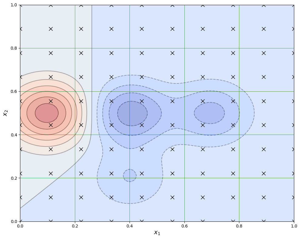
In statistics, sampling is a process of picking up a sample from a population. In the context of ML, we need the tools of sampling to implement efficient training algorithms that control overfitting. There are different approaches to sample values from the training data, and we’ll discuss them soon. But before that, we need to discuss a little bit about hyperparameters.


When training an ML model, we want to optimise its’ hyperparameters so that the model is as efficient as possible. These parameters are such that we can finetune them to control the learning process. Thus, they are separate from ordinary model parameters that are optimised by the training process. In the Bayesian setting, the separation between these two types of parameters is vague because we can redesign the model so that a hyperparameter becomes a parameter that the model optimises. Overall, hyperparameters are related to the model selection task or algorithm nuances that, in principle, do not affect the performance of the model. An example of a model hyperparameter is the depth of decision trees in ensemble methods, and an example of an algorithm hyperparameter is the weight parameter of boosting models.
The number of hyperparameters is related to the complexity of a model. Linear regression has no hyperparameters, but for example, LASSO, which adds regularisation to OLS regression, has one hyperparameter that controls the strength of regularisation. Boosting models that are much more complex than linear regression can have over ten hyperparameters. Finding optimal hyperparameters is a computationally-intensive process and can take a lot of time, especially with the grid-search approach, where all possible values between the specified interval for every hyperparameter are tested.
Show code cell source
import numpy as np
import matplotlib.pyplot as plt
from matplotlib import cm

# Define a 2D function that creates multiple "islands" similar to the image
def multi_peak_function(x1, x2):
    # Create multiple peaks/valleys at different locations
    peak1 = np.exp(-((x1-0.1)**2/0.02 + (x2-0.5)**2/0.02))  # Left peak (red)
    peak2 = np.exp(-((x1-0.4)**2/0.02 + (x2-0.5)**2/0.02))  # Middle peak (blue)
    peak3 = np.exp(-((x1-0.7)**2/0.02 + (x2-0.5)**2/0.02))  # Right peak (blue)
    peak4 = np.exp(-((x1-0.4)**2/0.02 + (x2-0.2)**2/0.02))  # Bottom peak (red)

    # Combine the peaks with different weights to match the color pattern
    result = peak1 - 0.7*peak2 - 0.5*peak3 - 0.3*peak4
    return result

# Create a grid of points
x1 = np.linspace(0, 1, 100)
x2 = np.linspace(0, 1, 100)
X1, X2 = np.meshgrid(x1, x2)

# Calculate function values
Z = multi_peak_function(X1, X2)

# Create the grid points for the "x" markers
grid_x1 = np.linspace(0, 1, 10)
grid_x2 = np.linspace(0, 1, 10)
grid_X1, grid_X2 = np.meshgrid(grid_x1, grid_x2)

# Create the plot
plt.figure(figsize=(10, 8))

# Plot contours
contour = plt.contour(X1, X2, Z, 15, colors='k', alpha=0.3)
contourf = plt.contourf(X1, X2, Z, 15, cmap=cm.coolwarm, alpha=0.5)

# Add the "x" markers
plt.plot(grid_X1, grid_X2, 'kx', markersize=8)

# Set axes labels and limits
plt.xlabel('$x_1$', fontsize=14)
plt.ylabel('$x_2$', fontsize=14)
plt.xlim(0, 1)
plt.ylim(0, 1)

# Add grid
plt.grid(True, color='green', linestyle='-', linewidth=0.5)

plt.tight_layout()
plt.show()
Cross-validation is an efficient approach to test different hyperparameter settings. It can be used to test the (prediction) performance of the model and control overfitting. The basic idea is to divide the training set so that the data used for training is not used to test the performance. Instead, a separate validation set is used for that. In general, when training ML models, the performance of the model when finetuning the hyperparameters, should always be evaluated using the validation part of the data.
Show code cell source
import matplotlib.pyplot as plt
import matplotlib.patches as patches
import numpy as np

def create_cv_diagram():
    # Create figure and axis
    fig, ax = plt.figure(figsize=(12, 8), dpi=100), plt.gca()

    # Number of data points and iterations to show
    n_points = 20
    n_iterations = 4  # We'll show iterations 1, 2, 3, and k

    # Space between iterations
    iteration_spacing = 1.5

    # Create position arrays for circles (data points)
    x_positions = np.linspace(0, n_points-1, n_points)

    # Colors for the circles (red and green alternating)
    colors = ['#e74c3c', '#16a085'] * (n_points // 2)
    if n_points % 2 == 1:
        colors.append('#e74c3c')

    # Draw iterations
    fold_size = n_points // 5  # Size of each fold (validation set)

    # Keep track of validation fold positions for each iteration
    validation_boxes = []

    for i in range(n_iterations):
        # Calculate y position
        y_pos = -(i * iteration_spacing)

        # For the last iteration, label it as "k"
        if i == n_iterations - 1:
            label = "Iteration k"
        else:
            label = f"Iteration {i+1}"

        # Add iteration label
        ax.add_patch(patches.Rectangle((-6, y_pos-0.4), 5, 0.8,
                                      facecolor='#3498db', alpha=0.3,
                                      edgecolor='#3498db', linewidth=2))
        ax.text(-3.5, y_pos, label, ha='center', va='center', fontsize=12)

        # Add data points (circles)
        validation_start = (i % 5) * fold_size
        validation_end = validation_start + fold_size

        for j, x_pos in enumerate(x_positions):
            # Determine if this point is in validation set
            is_validation = validation_start <= j < validation_end

            # Circle attributes
            circle_color = colors[j]
            alpha = 0.5 if is_validation else 1.0

            # Draw the circle
            circle = plt.Circle((x_pos, y_pos), 0.4, color=circle_color, alpha=alpha)
            ax.add_patch(circle)

        # Add box around validation set
        val_box = patches.Rectangle((validation_start-0.5, y_pos-0.5),
                                     fold_size, 1.0, fill=False,
                                     edgecolor='black', linewidth=2)
        ax.add_patch(val_box)
        validation_boxes.append((validation_start, validation_end, y_pos))

    # Add "Training data" and "Test data" labels
    ax.add_patch(patches.Rectangle((n_points//2-0.5, 1.), 4, 0.8,
                                  facecolor='#3498db', alpha=0.3,
                                  edgecolor='#3498db', linewidth=2))
    ax.text(n_points//2+1.5, 1.4, "Training data",
            ha='center', va='center', fontsize=12)

    ax.add_patch(patches.Rectangle((n_points//4-5.5, 1.), 4, 0.8,
                                  facecolor='#3498db', alpha=0.3,
                                  edgecolor='#3498db', linewidth=2))
    ax.text(n_points//4-3.5, 1.4, "Test data",
            ha='center', va='center', fontsize=12)

    # Add arrows from labels
    ax.arrow(n_points//2-1, 1.4, -5, 0,
             head_width=0.15, head_length=0.3, fc='#3498db', ec='#3498db',
             linewidth=2, alpha=0.8)
    ax.arrow(n_points//2+4, 1.4, 5, 0,
             head_width=0.15, head_length=0.3, fc='#3498db', ec='#3498db',
             linewidth=2, alpha=0.8)

    # Setup axes
    ax.set_xlim(-7, n_points+1)
    ax.set_ylim(-n_iterations*iteration_spacing-2, 3)
    ax.axis('off')

    plt.tight_layout()
    return fig

create_cv_diagram()
plt.show()
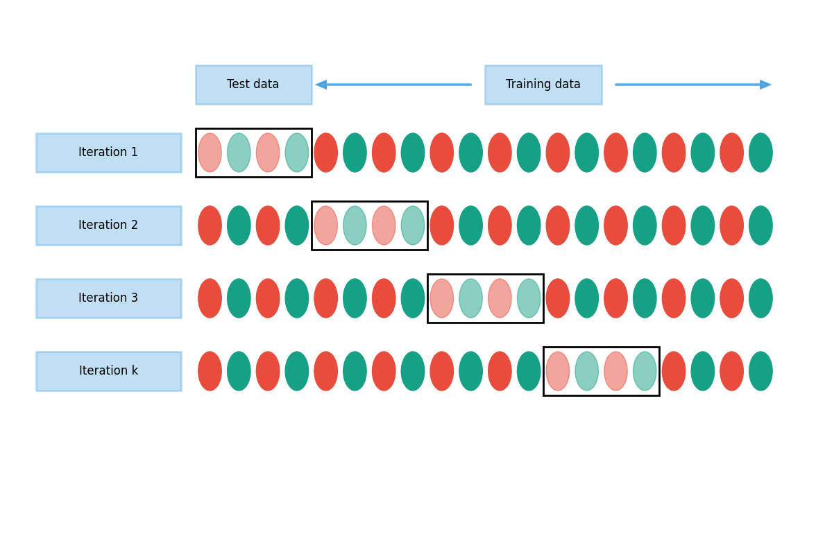
8.9.2. Testing#
Alongside training and validation sets, we should also separate part of the data for testing. This test dataset should not be used in any way during the training phase. Otherwise, there is a danger that hyperparameters are optimised for the testing set, and the model would not generalise well to new data. A test set should only be used to assess the performance of a fully specified classifier.
Therefore, a test set is a set of examples used only to assess the performance (i.e. generalisation) of a fully specified classifier. The final model is used to predict the classifications of examples in the test set. Those predictions are compared to the examples’ proper classifications to assess the model’s accuracy.
8.10. Analysing classification models#
Analysing the performance of classifiers is not trivial. There are numerous ways to measure the performance, and the correct metric depends on the context where the classifier is used.
8.10.1. Performance measures#
The following figures will help to understand the different metrics that we will discuss in the following. In the figure, we have the following numbers that are related to binary classifiers:
True positives (TP): The number of predictions of the “positive” class that truly are “positive”.
True negatives (TN): The number of predictions of the “negative” class that truly are “negative”.
False positives (FP): The number of cases where the model predicted the “positive” class, although the instance belongs to the “negative” class. This is known as “Type I error”.
False negatives (FN): The number of cases where the model predicted the “negative” class, although the instance belongs to the “positive” class. This is known as “Type II error”.
Show code cell source
import numpy as np
import matplotlib.pyplot as plt
import seaborn as sns
from sklearn.datasets import make_classification
from sklearn.model_selection import train_test_split
from sklearn.linear_model import LogisticRegression
from sklearn.metrics import confusion_matrix, classification_report
from matplotlib.colors import ListedColormap
from sklearn.inspection import DecisionBoundaryDisplay

# Set random seed for reproducibility
np.random.seed(42)

# Generate synthetic classification data
X, y = make_classification(
    n_samples=100,
    n_features=2,  # Use 2 features for easy visualization
    n_informative=2,
    n_redundant=0,
    n_clusters_per_class=1,
    weights=[0.5, 0.5],  # Equal class probability
    flip_y=0.1,  # Add some noise
    random_state=42
)

# Split the data into training and testing sets
X_train, X_test, y_train, y_test = train_test_split(X, y, test_size=0.3, random_state=42)

# Train a logistic regression model
model = LogisticRegression()
model.fit(X_train, y_train)

# Make predictions on the test set
y_pred = model.predict(X_test)

# Calculate the confusion matrix
cm = confusion_matrix(y_test, y_pred)
tn, fp, fn, tp = cm.ravel()

# Set up the figure and axes for our visualizations
plt.figure(figsize=(15, 10))

# 1. Create a confusion matrix heatmap
plt.subplot(2, 2, 1)
sns.heatmap(cm, annot=True, fmt='d', cmap='Blues', cbar=False,
            xticklabels=['Negative', 'Positive'],
            yticklabels=['Negative', 'Positive'])
plt.xlabel('Predicted Labels')
plt.ylabel('True Labels')
plt.title('Confusion Matrix')

# 2. Visualize classification results as a scatter plot
plt.subplot(2, 2, 2)

# Create a meshgrid for decision boundary visualization
h = 0.02  # step size in the mesh
x_min, x_max = X[:, 0].min() - 1, X[:, 0].max() + 1
y_min, y_max = X[:, 1].min() - 1, X[:, 1].max() + 1
xx, yy = np.meshgrid(np.arange(x_min, x_max, h), np.arange(y_min, y_max, h))

# Plot the decision boundary
Z = model.predict(np.c_[xx.ravel(), yy.ravel()])
Z = Z.reshape(xx.shape)
plt.contourf(xx, yy, Z, alpha=0.3, cmap=ListedColormap(['#FFAAAA', '#AAAAFF']))

# Get indices for different prediction categories
test_indices = np.arange(len(y_test))
tp_indices = test_indices[(y_pred == 1) & (y_test == 1)]
tn_indices = test_indices[(y_pred == 0) & (y_test == 0)]
fp_indices = test_indices[(y_pred == 1) & (y_test == 0)]
fn_indices = test_indices[(y_pred == 0) & (y_test == 1)]

# Plot each category with different colors and markers
plt.scatter(X_test[tp_indices, 0], X_test[tp_indices, 1], c='blue', marker='^', edgecolor='k', s=100, label='True Positive')
plt.scatter(X_test[tn_indices, 0], X_test[tn_indices, 1], c='green', marker='o', edgecolor='k', s=100, label='True Negative')
plt.scatter(X_test[fp_indices, 0], X_test[fp_indices, 1], c='red', marker='p', edgecolor='k', s=100, label='False Positive')
plt.scatter(X_test[fn_indices, 0], X_test[fn_indices, 1], c='orange', marker='s', edgecolor='k', s=100, label='False Negative')

plt.legend()
plt.title('Classification Results')
plt.xlabel('Feature 1')
plt.ylabel('Feature 2')

# 4. Create a bar plot of the metrics
plt.subplot(2, 2, 4)
metrics = ['True Positive (TP)', 'True Negative (TN)', 'False Positive (FP)', 'False Negative (FN)']
values = [tp, tn, fp, fn]
colors = ['blue', 'green', 'red', 'orange']
bars = plt.bar(metrics, values, color=colors)

# Add text descriptions
descriptions = [
    'Correctly predicted \nas positive',
    'Correctly predicted \nas negative',
    'Incorrectly predicted \nas positive (Type I error)',
    'Incorrectly predicted \nas negative (Type II error)'
]

# Add descriptions inside or above bars
for i, (bar, desc) in enumerate(zip(bars, descriptions)):
    height = bar.get_height()
    plt.text(bar.get_x() + bar.get_width()/2., height + 0.1,
             desc, ha='center', va='bottom', fontsize=9, wrap=True)

plt.ylabel('Count')
plt.title('Classification Metrics Breakdown')
plt.xticks(rotation=45, ha='right')


# Add some statistics
acc = (tp + tn) / (tp + tn + fp + fn)
precision = tp / (tp + fp) if (tp + fp) > 0 else 0
recall = tp / (tp + fn) if (tp + fn) > 0 else 0
f1 = 2 * (precision * recall) / (precision + recall) if (precision + recall) > 0 else 0

stats_text = (f"Model Statistics:\n"
              f"Accuracy: (tp + tn) / (tp + tn + fp + fn) ={acc:.2f}\n"
              f"Precision: tp / (tp + fp) if (tp + fp) > 0 else 0 ={precision:.2f}\n"
              f"Recall: tp / (tp + fn) if (tp + fn) > 0 else 0 ={recall:.2f}\n"
              f"F1 Score: 2 * (precision * recall) / (precision + recall) if (precision + recall) > 0 else 0 ={f1:.2f}")

plt.figtext(.25, .15, stats_text, ha="center", fontsize=12,
            bbox={"facecolor":"lightgray", "alpha":0.5, "pad":5})

plt.tight_layout()
plt.show()
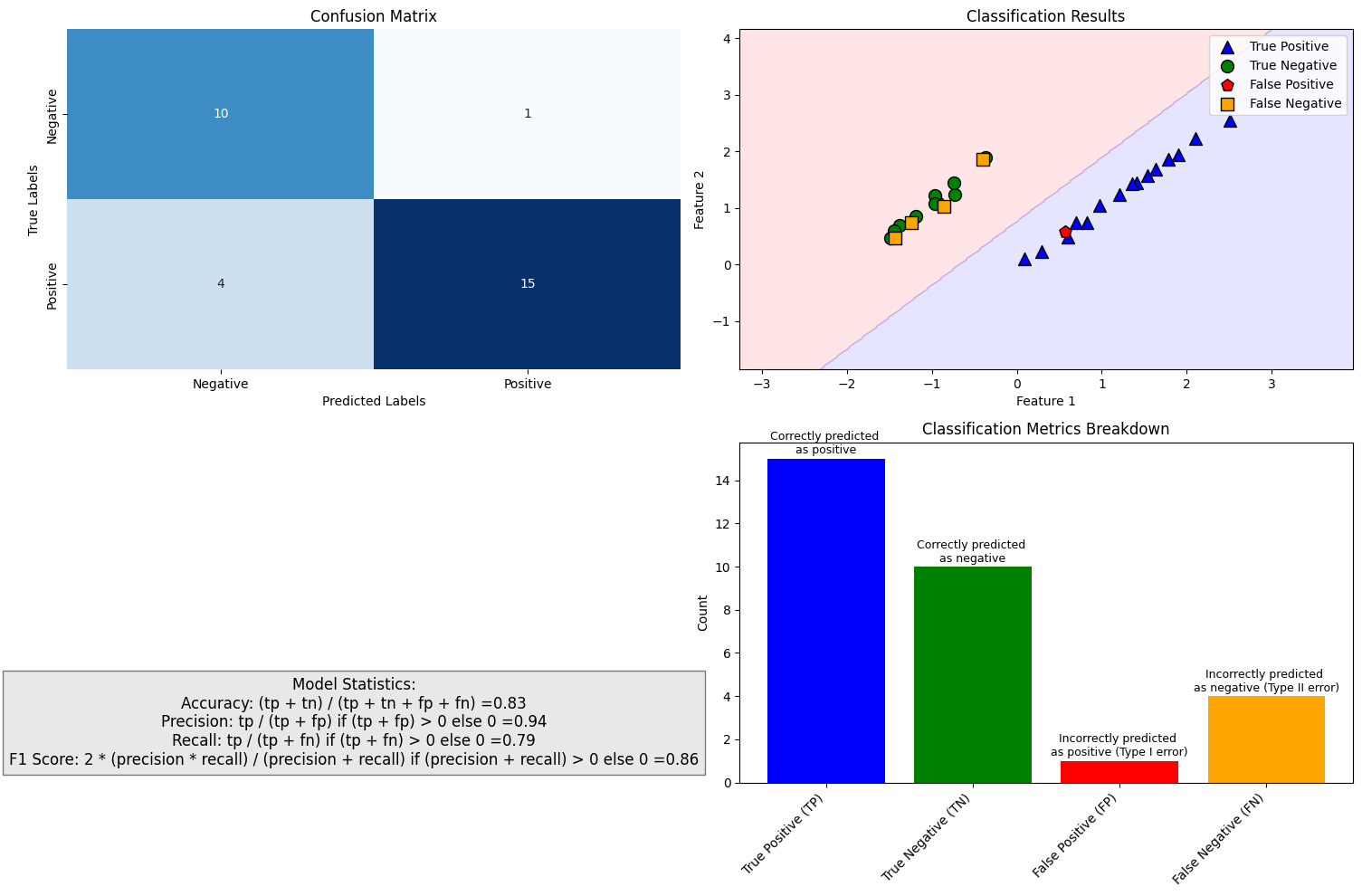
Accuracy Accuracy is the most common performance metric and can be used for binary and multiclass classification. Accuracy is defined to be the proportion of correct predictions.
\(ACC=\frac{TP+TN}{TP+TN+FP+FN}\)
Accuracy works well as a performance metric when the data is balanced, and there is an approximately equal amount of observations in each class. It is not working well for imbalanced data. For example, if we are predicting financial distress and 99 % of our data is healthy companies, the model that always predicts that a company is healthy gets an accuracy of 99 %. However, this model is quite useless for practical applications.
Precision Precision is defined to be the proportion of true positives from all the positives predicted by the model. Precision is crucial when the cost of false positives is high
\(PREC=\frac{TP}{TP+FP}\)
In the bankruptcy example above, the precision of the model is zero because it never predicted bankruptcy. Precision is a useful metric when we want to be sure about our predictions of positive cases. In the example above, the model that predicts bankruptcy only for companies that truly are bankrupt gets a precision of 1. On the downside, if we predict only bankruptcy for certain cases, we miss many bankrupt companies. So, for example, banks should not use this metric when deciding loan applications. It is better to reject a loan application too often than too seldom. When to Use:
Fraud Detection: Incorrectly flagging a legitimate transaction as fraudulent (false positive) can lead to customer dissatisfaction and operational inefficiencies.
Credit Scoring: Approving a loan to an unqualified applicant (false positive) can result in financial losses.
Recall (sensitivity) Recall, also called True positive rate is closely related to precision. It is the proportion of correctly predicted positives from all the positive values in the data. Recall is important when the cost of false negatives is high.
\(REC=\frac{TP}{TP+FN}\)
In the bankrupt example, we always predicted that a company is healthy, so \(TP=0\) and recall is zero. Recall is the best metric when we want to maximise the number of identified positive cases. So this metric is better for banks because they want to catch all the companies that might bankrupt, even if it is not certain. The problem with recall is that it gets a value one if we always predict the “positive” class. Thus, if banks only use recall as their metric, the best model would predict that all companies will bankrupt. When to Use:
Bankruptcy Prediction: Failing to identify a company at risk of bankruptcy (false negative) can lead to significant financial losses for investors or creditors.
Medical Diagnosis: Missing a disease diagnosis (false negative) can have severe consequences for the patient.
F1 score Both precision and recall have good features, but only relying on one of them is not wise. The F1 score tries to combine these metrics and is the harmonic mean of precision and recall. It is a number that is always between 0 and 1.
Let’s think about how the F1 score will work with our bankruptcy problem. If we always predict a healthy company, precision is 0, and recall is 0, so the F1 score is also 0. However, accuracy would be 0.99. But we all know a predictor such as this is worthless. What if we always predict a company will bankrupt? Recall was not working because it is now 1. Accuracy is much more meaningful because it is now 0.01. What about precision? The model always predicts that a company will bankrupt, and for 1 % of the cases, this is true. Thus, precision is 0.01, and the F1 score is the harmonic mean of precision and recall:
\(F1=\frac{2}{\frac{1}{PREC}+\frac{1}{REC}}=0.198\)
The F1 score is a good metric if we want to have both good precision and recall. When to Use:
Customer Churn Prediction: Both correctly identifying at-risk customers (recall) and avoiding false alarms (precision) are important for effective retention strategies.
Spam Detection: Ensuring that most spam emails are caught (recall) while minimizing the misclassification of legitimate emails as spam (precision) is critical.
Log Loss/Binary Crossentropy Binary cross-entropy is a completely different type of performance metric. It is also used as an optimisation objective for some ML classifiers. It evaluates models that give probabilities for categories and takes into account how close probabilities are to the true value, thus giving a more detailed view of the performance of our classifier. Binary cross-entropy is defined with the equation
\(H_p(q)=-\frac{1}{2}(y_0\cdot\log{p(y_0)}+(1-y_0)\cdot\log{1-p(y_0)}+y_1\cdot\log{p(y_1)}+(1-y_1)\cdot\log{1-p(y_1)})\)
When a classifier is giving probabilities as predictions, binary cross-entropy is a good option as an evaluation metric. It also generalises easily to more than two classes. Categorical cross-entropy is a loss function and an evaluation metric that can be used to evaluate multiclass ML models.
When to Use: Log loss is ideal for evaluating models that output probabilities, as it penalizes incorrect predictions more heavily when the model is confident but wrong.
Although we have already defined quite many metrics to evaluate ML classifiers, things are much more complicated. Below are some additional metrics that are in use.
Error Rate: Overall, how often a classifier model is wrong?
\(ER=\frac{FP+FN}{TP+TN+FP+FN}=1-ACC\)
False Positive Rate: When the true value is negative, how often a model predicts yes?
\(FPR=\frac{FP}{TN+FP}\)
True Negative Rate: When the true value is negative, how often a model predicts negative? Also known as specificity.
\(TNR=\frac{TN}{TN+FP}=1-FPR\)
Prevalence: The number of positive occurrences in our sample?
\(PREV=\frac{TP+FN}{TP+TN+FP+FN}\)
8.10.2. ROC and others#
A receiver operating characteristic curve, or ROC curve, is a graphical plot that illustrates a binary classifier model’s performance. The ROC curve is created by plotting the recall against the false positive rate at various threshold settings. The ROC curve is thus the recall as a function of the false-positive rate. ROC analysis can be used to evaluate models. The more the curve bends to the top-left corner, the better the classifier. ROC analysis is related directly and naturally to cost/benefit analysis of diagnostic decision making.
The Area Under the Curve (AUC) is a single scalar value that summarizes the ROC curve. It represents the model’s ability to distinguish between positive and negative classes across all possible thresholds. The AUC ranges from 0 to 1, where:
AUC = 1: The model has perfect classification ability, achieving 100% TPR and 0% FPR at some threshold. AUC ≥ 0.9: Excellent performance. The model has a high ability to distinguish between classes. 0.8 ≤ AUC < 0.9: Good performance. The model performs well but may have room for improvement. 0.7 ≤ AUC < 0.8: Fair performance. The model has some predictive power but may not be reliable for critical applications. AUC < 0.7: Poor performance. The model struggles to distinguish between classes and may not be suitable for the task. AUC = 0.5: The model performs no better than random guessing. AUC < 0.5: The model performs worse than random guessing (this is rare and often indicates a problem with the model or data).
Why is ROC-AUC Important?
Threshold Independence: Unlike accuracy, precision, or recall, which depend on a specific threshold, ROC-AUC evaluates model performance across all thresholds, providing a more comprehensive assessment.
Imbalanced Data: ROC-AUC is particularly useful for imbalanced datasets, where accuracy can be misleading. It focuses on the model’s ability to correctly classify the minority class.
Model Comparison: ROC-AUC allows for easy comparison of different models, as it provides a single metric that summarizes overall performance.
While ROC-AUC is a powerful metric, it has some limitations. It may not reflect performance at a specific threshold of interest (e.g., a threshold optimized for business needs). In highly imbalanced datasets, the ROC curve may appear overly optimistic due to the large number of true negatives.
Show code cell source
import numpy as np
import matplotlib.pyplot as plt
from sklearn.metrics import roc_curve, auc
from sklearn.datasets import make_classification
from sklearn.model_selection import train_test_split
from sklearn.linear_model import LogisticRegression
from sklearn.ensemble import RandomForestClassifier
from sklearn.dummy import DummyClassifier
import matplotlib.patheffects as path_effects

# Set random seed for reproducibility
np.random.seed(42)

def plot_roc_curves():
    # Create figure
    plt.figure(figsize=(10, 8))

    # Create a perfect classifier (synthetic)
    fpr_perfect = [0, 0, 1]
    tpr_perfect = [0, 1, 1]

    # Create a random classifier (diagonal line)
    fpr_random = [0, 1]
    tpr_random = [0, 1]

    # Generate synthetic data for the other classifiers
    X, y = make_classification(n_samples=1000, n_features=20, n_informative=10,
                             n_redundant=5, random_state=42)

    X_train, X_test, y_train, y_test = train_test_split(X, y, test_size=0.3, random_state=42)

    # Train different classifiers with varying performance
    # Good classifier (Random Forest)
    good_clf = RandomForestClassifier(n_estimators=100, random_state=42)
    good_clf.fit(X_train, y_train)
    good_probs = good_clf.predict_proba(X_test)[:, 1]
    fpr_good, tpr_good, _ = roc_curve(y_test, good_probs)
    auc_good = auc(fpr_good, tpr_good)

    # Medium classifier (Logistic Regression)
    medium_clf = LogisticRegression(random_state=42)
    medium_clf.fit(X_train, y_train)
    medium_probs = medium_clf.predict_proba(X_test)[:, 1]
    fpr_medium, tpr_medium, _ = roc_curve(y_test, medium_probs)
    auc_medium = auc(fpr_medium, tpr_medium)

    # Poor classifier (Logistic Regression with limited features)
    X_limited = X[:, :3]  # Use only first 3 features
    X_limited_train, X_limited_test = X_limited[:700], X_limited[700:]
    y_limited_train, y_limited_test = y[:700], y[700:]
    poor_clf = LogisticRegression(random_state=42)
    poor_clf.fit(X_limited_train, y_limited_train)
    poor_probs = poor_clf.predict_proba(X_limited_test)[:, 1]
    fpr_poor, tpr_poor, _ = roc_curve(y_limited_test, poor_probs)
    auc_poor = auc(fpr_poor, tpr_poor)

    # Style configuration
    plt.style.use('default')

    # Plot the curves
    plt.plot(fpr_good, tpr_good, color='#1f77b4', lw=3, label=f'Better classifier (AUC = {auc_good:.2f})')
    plt.plot(fpr_medium, tpr_medium, color='#ff7f0e', lw=3, label=f'Medium classifier (AUC = {auc_medium:.2f})')
    plt.plot(fpr_poor, tpr_poor, color='#2ca02c', lw=3, label=f'Poorer classifier (AUC = {auc_poor:.2f})')
    plt.plot(fpr_random, tpr_random, color='#d62728', lw=3, linestyle='--', label='Random classifier (AUC = 0.50)')

    # Plot the perfect classifier point
    plt.scatter([0], [1], color='blue', s=100, label='Perfect classifier', zorder=10)

    # Add text annotations
    plt.figtext(0.5, 1., 'ROC CURVE', fontsize=24, ha='center', weight='bold')

    # Add arrow and label for the perfect classifier
    plt.annotate('PERFECT CLASSIFIER',
                xy=(0, 1),
                xytext=(0.1, 0.9),
                fontsize=14,
                color='blue',
                weight='bold',
                arrowprops=dict(arrowstyle='->', color='blue', lw=2))

    # Add "RANDOM CLASSIFIER" text along the diagonal line
    txt = plt.text(0.5, 0.45, 'RANDOM CLASSIFIER',
             color='#d62728',
             fontsize=14,
             weight='bold',
             rotation=38,
             transform=plt.gca().transData)
    txt.set_path_effects([path_effects.withStroke(linewidth=2, foreground='white')])

    # Add "BETTER" and "WORSE" text with arrows
    plt.annotate('BETTER',
                xy=(0.5, 0.55),
                xytext=(0.25, 0.75),
                fontsize=14,
                color='black',
                weight='bold',
                arrowprops=dict(arrowstyle='<-', color='black', lw=2))

    plt.annotate('WORSE',
                xy=(0.59, 0.44),
                xytext=(0.73, 0.22),
                fontsize=14,
                color='black',
                weight='bold',
                arrowprops=dict(arrowstyle='<-', color='black', lw=2))

    # Configure the plot
    plt.xlim([-0.05, 1.05])
    plt.ylim([-0.05, 1.05])
    plt.xlabel('FALSE POSITIVE RATE', fontsize=14, weight='bold')
    plt.ylabel('TRUE POSITIVE RATE', fontsize=14, weight='bold')

    # Add a thick border around the entire plot
    ax = plt.gca()
    for spine in ax.spines.values():
        spine.set_linewidth(2)

    plt.tight_layout()

    return plt.gcf()

# Create and display the visualization
fig = plot_roc_curves()
plt.show()
8.10.3. Imbalanced data and other challenges#
An imbalanced classification problem means a situation where the distribution of examples across the known classes is skewed. In the extreme imbalance case, there is one example in the minority class for hundreds, thousands, or millions of examples in the majority class or classes. In accounting applications, bankruptcy or fraud detection are such that the training data is heavily imbalanced. Usually, ML algorithms and standard metrics are designed for balanced data. These models will be very poor at predicting the minority class. This is problematic because often, the minority class is more important. For example, we would specifically like to identify fraud or a distressed company. Identifying healthy companies is of much less importance.
Show code cell source
import numpy as np
import matplotlib.pyplot as plt
import seaborn as sns
from sklearn.datasets import make_blobs, make_moons
import matplotlib.patches as mpatches

# Set the style
plt.style.use('seaborn-v0_8-whitegrid')
sns.set_context("notebook", font_scale=1.2)

# Create a figure and axes
plt.figure(figsize=(12, 8))

# Generate imbalanced dataset
# Option 1: Using make_blobs for more separated clusters
X_majority, y_majority = make_blobs(n_samples=300, centers=[[2, 2]], cluster_std=1.2, random_state=42)
X_minority, y_minority = make_blobs(n_samples=30, centers=[[0, 0]], cluster_std=0.5, random_state=42)

# Option 2: Using make_moons for a more complex dataset structure
# X_majority, y_majority = make_moons(n_samples=300, noise=0.1, random_state=42)
# X_majority = X_majority[y_majority == 0]  # Keep only one class
# y_majority = np.zeros(X_majority.shape[0])
# X_minority, y_minority_temp = make_moons(n_samples=30, noise=0.1, random_state=24)
# X_minority = X_minority[y_minority_temp == 1]  # Keep only one class
# y_minority = np.ones(X_minority.shape[0])

# Combine datasets
X = np.vstack([X_majority, X_minority])
y = np.hstack([y_majority, np.ones(len(y_minority))])

# Create custom colormap
colors = ['#3498db', '#e74c3c']  # Blue for majority, Red for minority

# Plot the data
plt.scatter(X[y == 0, 0], X[y == 0, 1], c=colors[0], label='Majority Class',
            alpha=0.7, s=80, edgecolor='white', linewidth=0.6)
plt.scatter(X[y == 1, 0], X[y == 1, 1], c=colors[1], label='Minority Class',
            alpha=0.9, s=100, edgecolor='white', linewidth=0.8, marker='D')

# Add a background color to highlight regions
x_min, x_max = X[:, 0].min() - 1, X[:, 0].max() + 1
y_min, y_max = X[:, 1].min() - 1, X[:, 1].max() + 1
xx, yy = np.meshgrid(np.arange(x_min, x_max, 0.1),
                     np.arange(y_min, y_max, 0.1))

# Add title and labels
plt.title('Imbalanced Dataset Visualization', fontsize=18, pad=20)
plt.xlabel('Feature 1', fontsize=14)
plt.ylabel('Feature 2', fontsize=14)

# Add annotation for class distribution
majority_count = sum(y == 0)
minority_count = sum(y == 1)
total_count = len(y)
annotation_text = f"Class Distribution:\n" \
                  f"Majority Class: {majority_count} samples ({100*majority_count/total_count:.1f}%)\n" \
                  f"Minority Class: {minority_count} samples ({100*minority_count/total_count:.1f}%)"

plt.annotate(annotation_text, xy=(0.02, 0.02), xycoords='axes fraction',
             bbox=dict(boxstyle="round,pad=0.5", fc='white', alpha=0.8),
             fontsize=12, ha='left', va='bottom')

# Add a legend
plt.legend(loc='upper right', fontsize=12)

# Adjust plot appearance
plt.tight_layout()
plt.grid(True, alpha=0.3)

# Show the plot
plt.show()
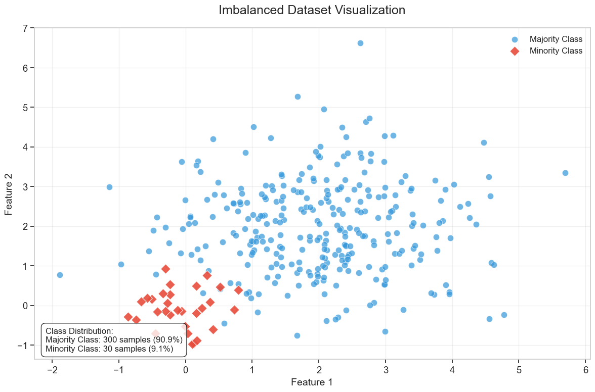
The precision-recall curve is similar to the ROC curve. It is a plot of the precision (y-axis) and the recall (x-axis) for different probability thresholds. Now for the optimal model, the curve would bend to the top-right corner of the image. As the precision-recall curve focuses on the minority class, it is an effective diagnostic for imbalanced binary classification models. This is because neither precision nor recall is calculated using true negatives. They both focus on the prediction of the minority class.
Show code cell source
import numpy as np
import matplotlib.pyplot as plt
from sklearn.metrics import precision_recall_curve, average_precision_score
from sklearn.datasets import make_classification
from sklearn.model_selection import train_test_split
from sklearn.linear_model import LogisticRegression
from sklearn.ensemble import RandomForestClassifier

def create_improved_precision_recall_curve():
    # Set random seed for reproducibility
    np.random.seed(42)

    # Create figure
    plt.figure(figsize=(10, 8), facecolor='white')
    ax = plt.gca()
    ax.set_facecolor('white')

    # Generate synthetic data with same imbalance as shown (15%)
    X, y = make_classification(n_samples=1000, n_features=20, n_informative=10,
                            n_redundant=5, weights=[0.85, 0.15], random_state=42)

    X_train, X_test, y_train, y_test = train_test_split(X, y, test_size=0.3, random_state=42)

    # Calculate baseline precision
    baseline = np.sum(y_test) / len(y_test)

    # Create classifiers with varying performance
    # Good classifier (Blue curve)
    good_clf = RandomForestClassifier(n_estimators=100, random_state=42)
    good_clf.fit(X_train, y_train)
    good_probs = good_clf.predict_proba(X_test)[:, 1]
    precision_good, recall_good, _ = precision_recall_curve(y_test, good_probs)

    # Medium classifier (Orange curve)
    medium_clf = LogisticRegression(C=0.5, random_state=42)
    medium_clf.fit(X_train, y_train)
    medium_probs = medium_clf.predict_proba(X_test)[:, 1]
    precision_medium, recall_medium, _ = precision_recall_curve(y_test, medium_probs)

    # Poor classifier (Green curve)
    poor_clf = LogisticRegression(C=0.1, random_state=42)
    poor_clf.fit(X_train, y_train)
    poor_probs = poor_clf.predict_proba(X_test)[:, 1]
    precision_poor, recall_poor, _ = precision_recall_curve(y_test, poor_probs)

    # Random classifier (horizontal line at baseline)
    recall_random = [0, 1]
    precision_random = [baseline, baseline]

    # Plot the curves
    plt.plot(recall_good, precision_good, color='#1E90FF', lw=2.5)     # Blue curve
    plt.plot(recall_medium, precision_medium, color='#FF8C00', lw=2.5) # Orange curve
    plt.plot(recall_poor, precision_poor, color='#2E8B57', lw=2.5)     # Green curve
    plt.plot(recall_random, precision_random, color='#FF4136', lw=2.5, linestyle='--')  # Red dashed line

    # Plot the perfect classifier point
    plt.scatter([1], [1], color='blue', s=120, zorder=10)

    # Add title
    plt.figtext(0.5, 0.98, 'PRECISION-RECALL CURVE', fontsize=24, ha='center', weight='bold')

    # Add arrow and label for the perfect classifier
    plt.annotate('PERFECT CLASSIFIER',
                xy=(1, 1),
                xytext=(0.85, 0.85),
                fontsize=14,
                color='blue',
                weight='bold',
                arrowprops=dict(arrowstyle='->', color='blue', lw=2))

    # Add "RANDOM CLASSIFIER" text along the horizontal line
    plt.text(0.7, baseline + 0.02, 'RANDOM CLASSIFIER',
             color='#FF4136',
             fontsize=14,
             weight='bold')

    # Add "BETTER" and "WORSE" with clearer arrows
    plt.annotate('BETTER',
                xy=(0.8, 0.8),
                xytext=(0.6, 0.65),
                fontsize=14,
                color='black',
                weight='bold',
                arrowprops=dict(arrowstyle='->', color='black', lw=2))

    plt.annotate('WORSE',
                xy=(0.38, 0.4),
                xytext=(0.48, 0.55),
                fontsize=14,
                color='black',
                weight='bold',
                arrowprops=dict(arrowstyle='->', color='black', lw=2))

    # Configure the plot
    plt.xlim([-0.05, 1.05])
    plt.ylim([-0.05, 1.05])
    plt.xlabel('RECALL', fontsize=14, weight='bold')
    plt.ylabel('PRECISION', fontsize=14, weight='bold')

    # Set up tick labels
    plt.xticks([0.0, 0.2, 0.4, 0.6, 0.8, 1.0])
    plt.yticks([0.0, 0.2, 0.4, 0.6, 0.8, 1.0])

    # Add a thick border around the entire plot
    for spine in ax.spines.values():
        spine.set_linewidth(3)

    # Add a note about baseline precision - positioned to match your image
    plt.text(0.05, baseline - 0.03, f'Baseline Precision = {baseline:.2f}',
             fontsize=12, style='italic')

    plt.tight_layout(rect=[0, 0, 1, 0.95])

    return plt.gcf()

# Create and display the visualization
fig = create_improved_precision_recall_curve()
plt.show()
8.11. Classification examples#
Let’s look next how ML models can be used for classification tasks with accounting datasets.
8.11.1. Scikit-learn#
Scikit-learn is a versatile machine learning library that provides a wide range of algorithms for various tasks. While it may not be the absolute best in any single machine learning domain, it offers consistently strong performance across many areas. One of its key advantages is its unified workflow—once you learn how to perform one type of machine learning analysis in Scikit-learn, you can easily apply the same approach to others.
The library includes modules for classification, regression, clustering, dimensionality reduction, and model selection. Additionally, it offers an extensive suite of data preprocessing tools to prepare datasets effectively.
One particularly powerful feature in Scikit-learn is the pipeline, which allows you to construct complete machine learning workflows. Pipelines help streamline preprocessing, model training, and evaluation, making your code more modular and reproducible.
Installing Scikit-learn is straightforward. If you’re using Python with Pip, simply run pip install scikit-learn. For Anaconda users, Scikit-learn is included by default, but if needed, you can install it via the Anaconda menu or by running conda install scikit-learn
The best way to learn Scikit-learn is by exploring real-world examples. In the following sections, we’ll dive into practical use cases to help you get hands-on experience.
import pandas as pd
import matplotlib.pyplot as plt
plt.style.use('bmh') # Use the Bayesian Methods for Hackers style
Example data from www.kaggle.com/c/companies-bankruptcy-forecast
The link has an explanation for all the variables. The original data has 65 variables, but we are here using a subsample of 10 variables. With rename(), we can rename the variables to be more informative.
table_df = pd.read_csv('ml_data.csv')[['Attr1','Attr8','Attr21','Attr4',
                                       'Attr5','Attr29','Attr20',
                                       'Attr15','Attr6','Attr44']]  # Load the data

table_df.rename({'Attr1' : 'ROA','Attr8' : 'Leverage','Attr21' : 'Sales-growth',
                 'Attr4' : 'Current ratio','Attr5' : 'Quick ratio','Attr29' : 'Log(Total assets)',
                 'Attr20' : 'Inventory*365/sales','Attr15' : 'Total_liab*365/(gross_prof+depr)',
                 'Attr6' : 'Ret_earnings/TA','Attr44' : 'Receiv*365/sales'},axis=1,inplace=True)    # Rename the columns
table_df # Display the data
| ROA | Leverage | Sales-growth | Current ratio | Quick ratio | Log(Total assets) | Inventory*365/sales | Total_liab*365/(gross_prof+depr) | Ret_earnings/TA | Receiv*365/sales | |
|---|---|---|---|---|---|---|---|---|---|---|
| 0 | -0.031545 | 0.641242 | -0.016440 | -0.013529 | 0.007406 | -0.631107 | -0.070344 | -0.005305 | -0.016047 | -0.009084 |
| 1 | -0.231729 | 0.074710 | -0.016961 | -0.080975 | 0.007515 | -1.168550 | -0.047947 | -0.119627 | -0.016047 | -0.009659 |
| 2 | -0.058602 | -0.456287 | -0.017504 | -0.189489 | 0.006572 | 0.096212 | 0.001761 | 0.009484 | -0.016047 | -0.016517 |
| 3 | -0.069376 | -0.462971 | -0.016114 | -0.140032 | 0.007477 | 0.296277 | -0.006430 | 0.045912 | -0.010915 | 0.020758 |
| 4 | 0.236424 | 0.097183 | -0.016046 | -0.014680 | 0.007879 | -0.501471 | -0.043107 | -0.021015 | -0.016047 | -0.011036 |
| ... | ... | ... | ... | ... | ... | ... | ... | ... | ... | ... |
| 9995 | -0.079533 | -0.374739 | -0.016179 | -0.189873 | 0.006687 | 0.162211 | 0.002114 | 0.081838 | -0.006462 | 0.006482 |
| 9996 | -0.081046 | 0.689695 | -0.016507 | 0.021280 | 0.007497 | 0.630702 | -0.022646 | -0.018260 | -0.034968 | -0.017303 |
| 9997 | -0.230571 | -0.471830 | -0.016167 | -0.222373 | 0.006716 | 1.249499 | -0.034307 | -0.059516 | -0.013742 | -0.006031 |
| 9998 | -0.108156 | -0.355796 | -0.016352 | -0.042692 | 0.008123 | -0.640261 | -0.059005 | 0.021498 | -0.018374 | 0.001036 |
| 9999 | -0.068674 | 0.293253 | -0.016174 | 0.039538 | 0.007850 | 0.564555 | -0.062083 | -0.012039 | 0.001952 | -0.015710 |
10000 rows × 10 columns
With the clip() method, you can winsorise the data. Here extreme values are moved to 1 % and 99 % quantiles.
table_df = table_df.clip(lower=table_df.quantile(0.01),upper=table_df.quantile(0.99),axis=1) # Clip the data to remove outliers
With hist() you can check the distributions quickly. The most problematic outliers have been removed by winsorisation.
table_df.hist(figsize=(14,14),grid=False, edgecolor='black')    # Plot the histograms
plt.show()
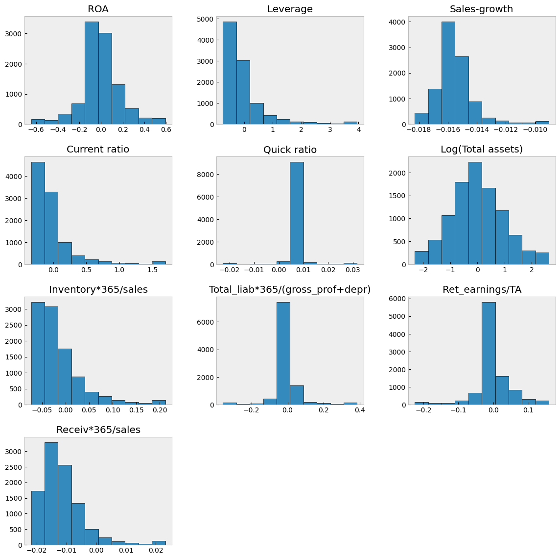
With corr() you can check the correlations.
table_df.corr() # Calculate the correlation matrix
| ROA | Leverage | Sales-growth | Current ratio | Quick ratio | Log(Total assets) | Inventory*365/sales | Total_liab*365/(gross_prof+depr) | Ret_earnings/TA | Receiv*365/sales | |
|---|---|---|---|---|---|---|---|---|---|---|
| ROA | 1.000000 | 0.253631 | 0.198471 | 0.239780 | 0.073774 | -0.022929 | -0.199351 | 0.031788 | 0.482101 | -0.088218 |
| Leverage | 0.253631 | 1.000000 | -0.062703 | 0.678369 | 0.137512 | 0.092470 | 0.017957 | -0.088598 | 0.277234 | -0.007704 |
| Sales-growth | 0.198471 | -0.062703 | 1.000000 | -0.050987 | 0.008612 | 0.124345 | -0.080525 | 0.005148 | 0.008116 | -0.018546 |
| Current ratio | 0.239780 | 0.678369 | -0.050987 | 1.000000 | 0.175938 | -0.055648 | 0.143823 | -0.059035 | 0.169986 | 0.097054 |
| Quick ratio | 0.073774 | 0.137512 | 0.008612 | 0.175938 | 1.000000 | -0.009259 | -0.067865 | -0.067402 | 0.071122 | 0.026820 |
| Log(Total assets) | -0.022929 | 0.092470 | 0.124345 | -0.055648 | -0.009259 | 1.000000 | 0.065786 | 0.009114 | 0.199229 | 0.116596 |
| Inventory*365/sales | -0.199351 | 0.017957 | -0.080525 | 0.143823 | -0.067865 | 0.065786 | 1.000000 | 0.026625 | -0.109237 | 0.154436 |
| Total_liab*365/(gross_prof+depr) | 0.031788 | -0.088598 | 0.005148 | -0.059035 | -0.067402 | 0.009114 | 0.026625 | 1.000000 | 0.005612 | 0.018199 |
| Ret_earnings/TA | 0.482101 | 0.277234 | 0.008116 | 0.169986 | 0.071122 | 0.199229 | -0.109237 | 0.005612 | 1.000000 | -0.052223 |
| Receiv*365/sales | -0.088218 | -0.007704 | -0.018546 | 0.097054 | 0.026820 | 0.116596 | 0.154436 | 0.018199 | -0.052223 | 1.000000 |
The following code adds an indicator variable to the dataframe, assigning a value of 1 if a company’s Return on Assets (ROA) is greater than zero and 0 otherwise. In the upcoming models, we will use this variable to classify companies into these two categories.
table_df['ROA_ind'] = table_df['ROA']>0 # Create a binary target variable
We use as predictors everything else except ROA and ROA_ind.
X_class = table_df.drop(['ROA','ROA_ind'],axis=1) # Create the feature matrix
The predicted variable is the indicator variable ROA_ind. (ROA > 0 –> 1, ROA < 0 –> 0)
y_class = table_df['ROA_ind'] # Create the target variable
train_test_split() can be used to easily divide a dataset to training and testing parts.
from sklearn.model_selection import train_test_split # Import the train_test_split function
Let’s use a 80%/20% split for training and testing.
# Split data into training and test sets
X_train, X_test , y_train, y_test = train_test_split(X_class, y_class, test_size=0.2, random_state=1)
The workflow in Scikit-learn follows a consistent pattern: define a model object, fit it to the data, and analyze the results using the model’s built-in functions. With this approach in mind, let’s begin exploring different machine learning classifiers, starting with Linear Discriminant Analysis (LDA).
8.11.2. Linear discriminant analysis#
Linear discriminant analysis was the method Edward Altman used in his seminal bankruptcy prediction paper.
from sklearn.discriminant_analysis import LinearDiscriminantAnalysis    # Import the model

LDA_class = LinearDiscriminantAnalysis()    # Create the model
Fit the data to the model using the fit function of the object.
LDA_class.fit(X_train,y_train) # Fit the model to the data
LinearDiscriminantAnalysis()In a Jupyter environment, please rerun this cell to show the HTML representation or trust the notebook.
On GitHub, the HTML representation is unable to render, please try loading this page with nbviewer.org.
LinearDiscriminantAnalysis()
score() measures the correct prediction rate. 73.35 % of the companies in the test data are catgorised correctly.
LDA_class.score(X_test,y_test) # Calculate the accuracy of the model
0.7335
classification_report() is a convenient tool to quickly calculate many popular classification metrics.
from sklearn.metrics import classification_report
print(classification_report(y_test,LDA_class.predict(X_test))) # Print the classification report
              precision    recall  f1-score   support

       False       0.72      0.85      0.78      1094
        True       0.76      0.60      0.67       906

    accuracy                           0.73      2000
   macro avg       0.74      0.72      0.72      2000
weighted avg       0.74      0.73      0.73      2000
log_loss() is the same as binary cross-entropy we discussed in the theory part of this chapter.
from sklearn.metrics import log_loss
log_loss(y_test,LDA_class.predict(X_test))
9.60563362819972
A ROC curve for the LDA model. Remember, the more it bends to the top-left corner, the better.
from sklearn.metrics import RocCurveDisplay    # Import the RocCurveDisplay function
from sklearn.metrics import PrecisionRecallDisplay    # Import the PrecisionRecallDisplay function
RocCurveDisplay.from_estimator(LDA_class,X_test,y_test)   # Plot the ROC curve
plt.show()
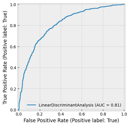
As we discussed, precision-recall curve is especially suitable for imbalanced data (the sizes of the categories are not equal). The more the line bends to the upper-right corner, the better.
PrecisionRecallDisplay.from_estimator(LDA_class,X_test,y_test)  # Plot the precision-recall curve
plt.show()
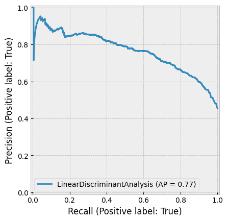
8.11.3. K nearest neigbours#
Let’s next investigate the KNN method. Overall the model appears to perform little worse than the LDA model. However, the recall metric for the ROA > 0 class is better. n_neighbors=3 defines that the classification is based on the three closest samples in the training set.
from sklearn.neighbors import KNeighborsClassifier
neigh_cls = KNeighborsClassifier(n_neighbors=3)   # Create the model
neigh_cls.fit(X_train, y_train) # Fit the model to the data
KNeighborsClassifier(n_neighbors=3)In a Jupyter environment, please rerun this cell to show the HTML representation or trust the notebook.
On GitHub, the HTML representation is unable to render, please try loading this page with nbviewer.org.
KNeighborsClassifier(n_neighbors=3)
neigh_cls.score(X_test,y_test) # Calculate the accuracy of the model
0.691
print(classification_report(y_test,neigh_cls.predict(X_test))) # Print the classification report
              precision    recall  f1-score   support

       False       0.72      0.71      0.71      1094
        True       0.66      0.67      0.66       906

    accuracy                           0.69      2000
   macro avg       0.69      0.69      0.69      2000
weighted avg       0.69      0.69      0.69      2000
log_loss(y_test,neigh_cls.predict(X_test)) # Calculate the log loss
11.1374888972372
RocCurveDisplay.from_estimator(neigh_cls,X_test,y_test)  # Plot the ROC curve
plt.show()
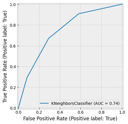
PrecisionRecallDisplay.from_estimator(neigh_cls,X_test,y_test)  # Plot the precision-recall curve
plt.show()
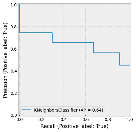
Let’s see how results change when change the n_neighbors parameter to 5. There are only minor changes in the results. The precision metric and the F1 score are slightly better.
neigh_cls = KNeighborsClassifier(n_neighbors=5)  # Create the model
neigh_cls.fit(X_train, y_train) # Fit the model to the data
KNeighborsClassifier()In a Jupyter environment, please rerun this cell to show the HTML representation or trust the notebook.
On GitHub, the HTML representation is unable to render, please try loading this page with nbviewer.org.
KNeighborsClassifier()
neigh_cls.score(X_test,y_test) # Calculate the accuracy of the model
0.6935
print(classification_report(y_test,neigh_cls.predict(X_test)))
              precision    recall  f1-score   support

       False       0.72      0.71      0.72      1094
        True       0.66      0.67      0.67       906

    accuracy                           0.69      2000
   macro avg       0.69      0.69      0.69      2000
weighted avg       0.69      0.69      0.69      2000
log_loss(y_test,neigh_cls.predict(X_test))
11.047379763764406
RocCurveDisplay.from_estimator(neigh_cls,X_test,y_test)
plt.show()
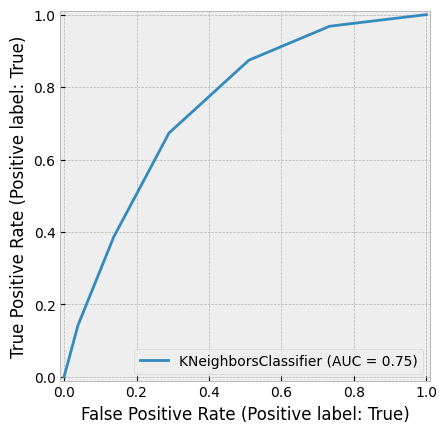
PrecisionRecallDisplay.from_estimator(neigh_cls,X_test,y_test)
plt.show()
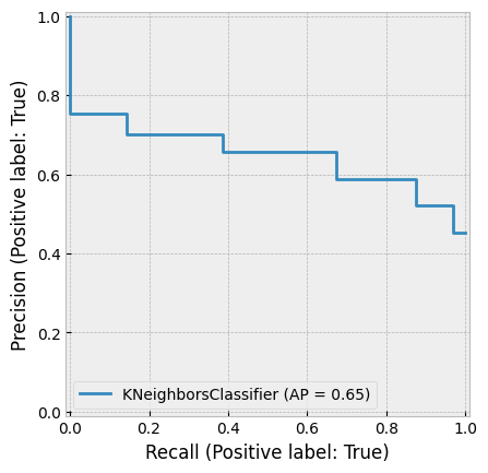
8.11.4. Logistic regression#
Let’s continue with the logistic regression model. This was an another classic method used in bankruptcy prediction (Ohlson, 1980).
import sklearn.linear_model as sk_lm
logit_model = sk_lm.LogisticRegression()
logit_model.fit(X_train,y_train)
LogisticRegression()In a Jupyter environment, please rerun this cell to show the HTML representation or trust the notebook.
On GitHub, the HTML representation is unable to render, please try loading this page with nbviewer.org.
LogisticRegression()
Based on accuracy, the performance is better than KNN but worse than LDA.
logit_model.score(X_test,y_test)
0.7005
Interestinly, the performance is very similar to the two previous models, but the recall metric is better for the (ROA < 0) -class and worse for the (ROA > 0) -class, making the average recall to be approximately the same.
print(classification_report(y_test,logit_model.predict(X_test)))
              precision    recall  f1-score   support

       False       0.68      0.86      0.76      1094
        True       0.75      0.51      0.61       906

    accuracy                           0.70      2000
   macro avg       0.71      0.68      0.68      2000
weighted avg       0.71      0.70      0.69      2000
log_loss(y_test,logit_model.predict(X_test))
10.795074190040587
RocCurveDisplay.from_estimator(logit_model,X_test,y_test)
plt.show()
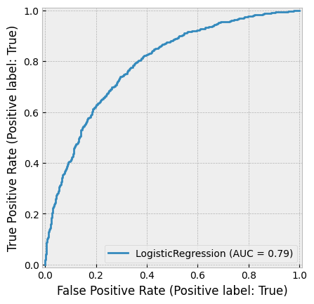
PrecisionRecallDisplay.from_estimator(logit_model,X_test,y_test)
plt.show()
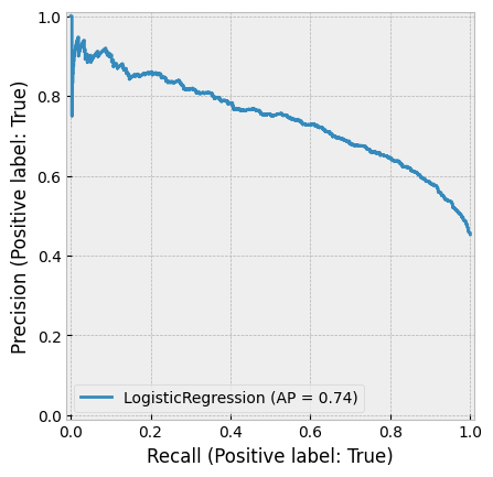
8.11.5. Support vector machines#
Usually SVMs are powerfull classifiers, but for this data, they do not perform better than the previous models.
from sklearn import svm
Kernel can be thought of as a type of the separation zone between the categories. Linear is the simplest.
svm_classifier = svm.SVC(kernel='linear')
svm_classifier.fit(X_train,y_train)
svm_classifier.score(X_test,y_test)
0.6915
Again, the average metrics are close to the performance of the previous models. However, the recall metric has poor performance for the (ROA > 0) class and good performance for the (ROA < 0) class.
print(classification_report(y_test,svm_classifier.predict(X_test)))
              precision    recall  f1-score   support

       False       0.66      0.91      0.76      1094
        True       0.79      0.43      0.56       906

    accuracy                           0.69      2000
   macro avg       0.73      0.67      0.66      2000
weighted avg       0.72      0.69      0.67      2000
log_loss(y_test,svm_classifier.predict(X_test))
11.119467070542642
RocCurveDisplay.from_estimator(svm_classifier,X_test,y_test)
plt.show()
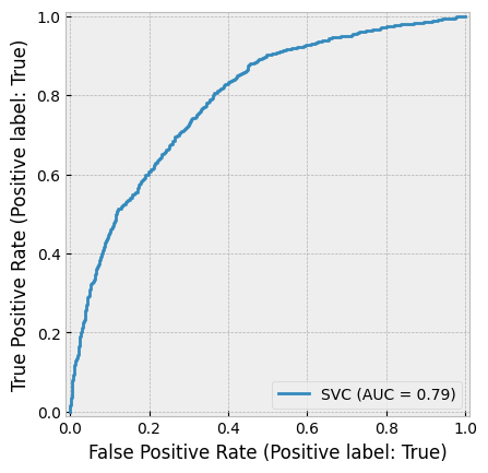
Area under the precision-recall curve is the best so far (0.75).
PrecisionRecallDisplay.from_estimator(svm_classifier,X_test,y_test)
plt.show()
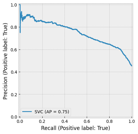
Radial basis function is a more powerful kernel for SVMs. It slightly improves the results.
svm_classifier = svm.SVC(kernel='rbf')
svm_classifier.fit(X_train,y_train)
SVC()In a Jupyter environment, please rerun this cell to show the HTML representation or trust the notebook.
On GitHub, the HTML representation is unable to render, please try loading this page with nbviewer.org.
SVC()
The results improve slightly but are still not as good as with the LDA model.
svm_classifier.score(X_test,y_test)
0.725
print(classification_report(y_test,svm_classifier.predict(X_test)))
              precision    recall  f1-score   support

       False       0.71      0.85      0.77      1094
        True       0.76      0.58      0.65       906

    accuracy                           0.72      2000
   macro avg       0.73      0.71      0.71      2000
weighted avg       0.73      0.72      0.72      2000
log_loss(y_test,svm_classifier.predict(X_test))
9.912004682007217
RocCurveDisplay.from_estimator(svm_classifier,X_test,y_test)
plt.show()
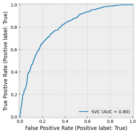
PrecisionRecallDisplay.from_estimator(svm_classifier,X_test,y_test)
plt.show()
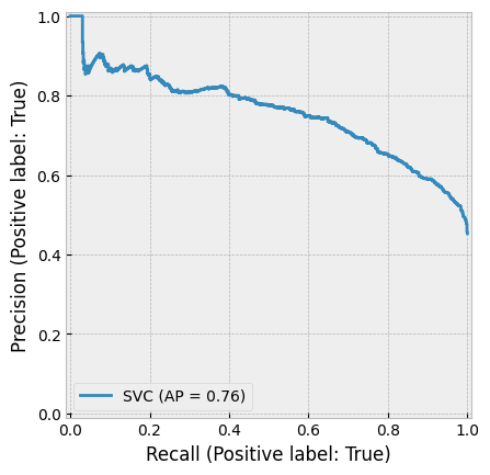
8.11.6. Decision trees#
Decision tree uses features to categorise companies to different branches.
from sklearn import tree
max_depth defines how many times new branches are created in the tree (see the figure below).
tree_class = tree.DecisionTreeClassifier(max_depth=3)
tree_class.fit(X_train, y_train)
DecisionTreeClassifier(max_depth=3)In a Jupyter environment, please rerun this cell to show the HTML representation or trust the notebook.
On GitHub, the HTML representation is unable to render, please try loading this page with nbviewer.org.
DecisionTreeClassifier(max_depth=3)
plt.figure(figsize=(15,15))
tree.plot_tree(tree_class,feature_names=X_train.columns,fontsize=12,filled=True)
plt.show()
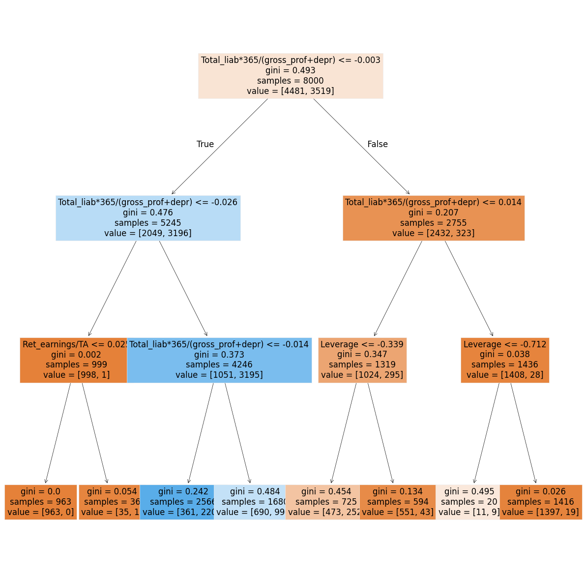
The decision tree model has the best performance so far.
tree_class.score(X_test,y_test)
0.839
print(classification_report(y_test,tree_class.predict(X_test)))
              precision    recall  f1-score   support

       False       0.91      0.79      0.84      1094
        True       0.78      0.90      0.84       906

    accuracy                           0.84      2000
   macro avg       0.84      0.84      0.84      2000
weighted avg       0.85      0.84      0.84      2000
log_loss(y_test,tree_class.predict(X_test))
5.803028195647861
RocCurveDisplay.from_estimator(tree_class,X_test,y_test)
plt.show()
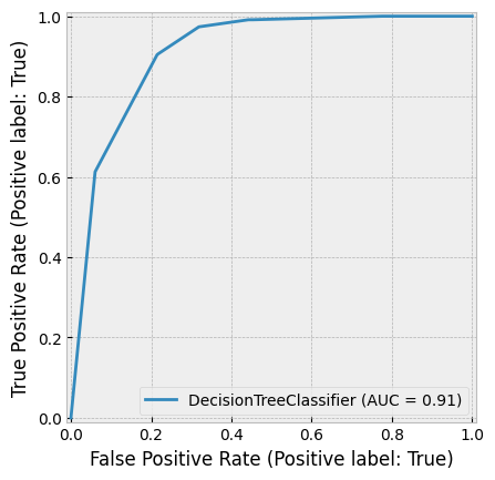
PrecisionRecallDisplay.from_estimator(tree_class,X_test,y_test)
plt.show()

8.11.7. Naive Bayes#
Let’s continue with a Naive Bayes model. We use the Gaussian Naive Bayes model in Scikit-learn.
from sklearn.naive_bayes import GaussianNB
naive_clf = GaussianNB()
naive_clf.fit(X_train, y_train)
GaussianNB()In a Jupyter environment, please rerun this cell to show the HTML representation or trust the notebook.
On GitHub, the HTML representation is unable to render, please try loading this page with nbviewer.org.
GaussianNB()
The results are almost as good as the results of the decision tree model.
naive_clf.score(X_test,y_test)
0.8005
print(classification_report(y_test,naive_clf.predict(X_test)))
              precision    recall  f1-score   support

       False       0.91      0.71      0.80      1094
        True       0.72      0.91      0.81       906

    accuracy                           0.80      2000
   macro avg       0.81      0.81      0.80      2000
weighted avg       0.82      0.80      0.80      2000
log_loss(y_test,naive_clf.predict(X_test))
7.190708851128871
RocCurveDisplay.from_estimator(naive_clf,X_test,y_test)
plt.show()
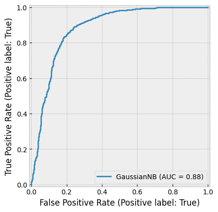
PrecisionRecallDisplay.from_estimator(naive_clf,X_test,y_test)
plt.show()
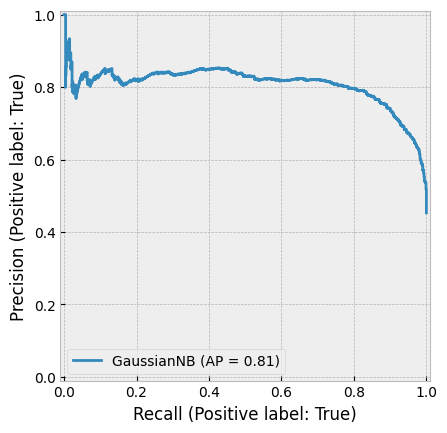
8.11.8. Random forest#
If the decision tree model was performing so well, we could anticipate that many decision trees (= random forest) would perform even better.
from sklearn.ensemble import RandomForestClassifier
rf_class = RandomForestClassifier()
rf_class.fit(X_train,y_train)
RandomForestClassifier()In a Jupyter environment, please rerun this cell to show the HTML representation or trust the notebook.
On GitHub, the HTML representation is unable to render, please try loading this page with nbviewer.org.
RandomForestClassifier()
With the random forest classifier, there is an additonal possibility to rank the improtance of the features. The calculated importance is called Gini importance.
pd.DataFrame([X_train.columns,rf_class.feature_importances_]).transpose().sort_values(1,ascending=False)
| 0 | 1 | |
|---|---|---|
| 6 | Total_liab*365/(gross_prof+depr) | 0.407618 |
| 7 | Ret_earnings/TA | 0.138804 |
| 0 | Leverage | 0.108099 |
| 1 | Sales-growth | 0.07121 |
| 2 | Current ratio | 0.068459 |
| 3 | Quick ratio | 0.060871 |
| 5 | Inventory*365/sales | 0.051551 |
| 4 | Log(Total assets) | 0.050858 |
| 8 | Receiv*365/sales | 0.042531 |
The performance is clearly the best one so far when measured using all the metrics.
rf_class.score(X_test,y_test)
0.8955
print(classification_report(y_test,rf_class.predict(X_test)))
              precision    recall  f1-score   support

       False       0.90      0.91      0.90      1094
        True       0.89      0.88      0.88       906

    accuracy                           0.90      2000
   macro avg       0.89      0.89      0.89      2000
weighted avg       0.90      0.90      0.90      2000
RocCurveDisplay.from_estimator(rf_class,X_test,y_test)
plt.show()
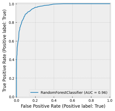
PrecisionRecallDisplay.from_estimator(rf_class,X_test,y_test)
plt.show()
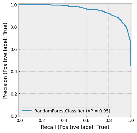
8.11.9. Boosting classifier#
The boosting classifier model is very similar to the random forest model. For example, they both use decision trees as weak classifiers. Thus, the performance is probably very close to the performance of the random forest model.
from sklearn.ensemble import GradientBoostingClassifier
boosting_clf = GradientBoostingClassifier()
boosting_clf.fit(X_train,y_train)
GradientBoostingClassifier()In a Jupyter environment, please rerun this cell to show the HTML representation or trust the notebook.
On GitHub, the HTML representation is unable to render, please try loading this page with nbviewer.org.
GradientBoostingClassifier()
pd.DataFrame([X_train.columns,boosting_clf.feature_importances_]).transpose().sort_values(1,ascending=False)
| 0 | 1 | |
|---|---|---|
| 6 | Total_liab*365/(gross_prof+depr) | 0.779354 |
| 0 | Leverage | 0.101361 |
| 7 | Ret_earnings/TA | 0.074998 |
| 1 | Sales-growth | 0.024371 |
| 4 | Log(Total assets) | 0.006376 |
| 3 | Quick ratio | 0.005162 |
| 2 | Current ratio | 0.003522 |
| 5 | Inventory*365/sales | 0.002566 |
| 8 | Receiv*365/sales | 0.00229 |
The boosting model has the best performance of all the models.
boosting_clf.score(X_test,y_test)
0.898
print(classification_report(y_test,boosting_clf.predict(X_test)))
              precision    recall  f1-score   support

       False       0.91      0.91      0.91      1094
        True       0.89      0.89      0.89       906

    accuracy                           0.90      2000
   macro avg       0.90      0.90      0.90      2000
weighted avg       0.90      0.90      0.90      2000
log_loss(y_test,boosting_clf.predict(X_test))
3.6764526456899493
RocCurveDisplay.from_estimator(boosting_clf,X_test,y_test)
plt.show()
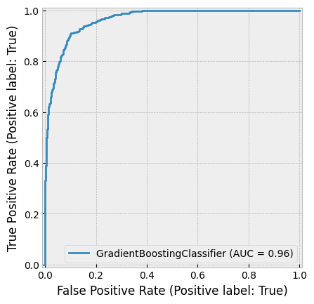
PrecisionRecallDisplay.from_estimator(boosting_clf,X_test,y_test)
plt.show()
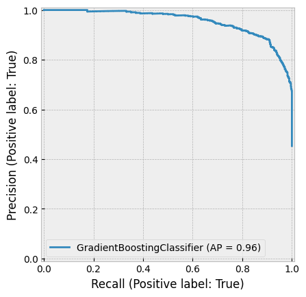
8.12. Unsupervised approach#
It is difficult to design a meaningful unsupervised classification (clustering) example from the data at hand. Thus, we investigate unsupervised methods using the Iris dataset included in Scikit-learn. We will encounter more accounting and finance related unsupervised methods in Chapter 10, where we discuss ML text analysis methods.
from sklearn.datasets import load_iris # Import the dataset
The Iris dataset consists of 50 samples from each of three species of Iris (Iris setosa, Iris virginica and Iris versicolor). Four features are included: the length and the width of the sepals and petals. Our aim is to use an unsupervised method to separate these three flower types using the four features.
iris_data = load_iris()     # Load the dataset
iris_data.target_names  # Display the target names
array(['setosa', 'versicolor', 'virginica'], dtype='<U10')
iris_df = pd.DataFrame(iris_data['data'],columns=iris_data['feature_names'])    # Create a dataframe
iris_df['Flower'] = iris_data['target']   # Add the target variable
iris_df
| sepal length (cm) | sepal width (cm) | petal length (cm) | petal width (cm) | Flower | |
|---|---|---|---|---|---|
| 0 | 5.1 | 3.5 | 1.4 | 0.2 | 0 |
| 1 | 4.9 | 3.0 | 1.4 | 0.2 | 0 |
| 2 | 4.7 | 3.2 | 1.3 | 0.2 | 0 |
| 3 | 4.6 | 3.1 | 1.5 | 0.2 | 0 |
| 4 | 5.0 | 3.6 | 1.4 | 0.2 | 0 |
| ... | ... | ... | ... | ... | ... |
| 145 | 6.7 | 3.0 | 5.2 | 2.3 | 2 |
| 146 | 6.3 | 2.5 | 5.0 | 1.9 | 2 |
| 147 | 6.5 | 3.0 | 5.2 | 2.0 | 2 |
| 148 | 6.2 | 3.4 | 5.4 | 2.3 | 2 |
| 149 | 5.9 | 3.0 | 5.1 | 1.8 | 2 |
150 rows × 5 columns
As you can see from the figure below, Setosa should be easy to separate. Versicolor and Virginica are probably more difficult.
Show code cell source
ax = plt.subplots(figsize=(10,10))
plt.scatter(iris_df['petal length (cm)'][iris_df['Flower'] == 0],
            iris_df['sepal length (cm)'][iris_df['Flower'] == 0],label='Setosa',edgecolor='black')
plt.scatter(iris_df['petal length (cm)'][iris_df['Flower'] == 1],
            iris_df['sepal length (cm)'][iris_df['Flower'] == 1],label='Versicolor',edgecolor='black')
plt.scatter(iris_df['petal length (cm)'][iris_df['Flower'] == 2],
            iris_df['sepal length (cm)'][iris_df['Flower'] == 2],label='Virginica',edgecolor='black')
plt.xlabel('sepal length')
plt.ylabel('sepal width')
plt.legend()
plt.show()
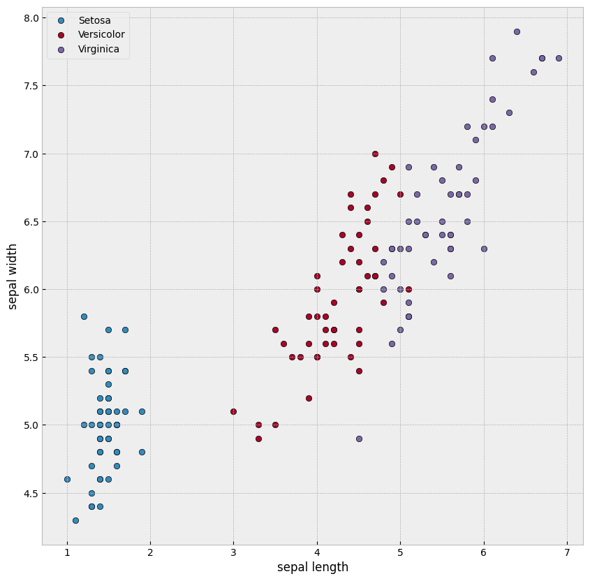
Let’s construct a K-means clustering model and fit it to the data. There is only one parameter, how many clusters we want to have.
from sklearn.cluster import KMeans
kmeans = KMeans(n_clusters=3, random_state=0)
In the following, we try to learn the clusters using only two features, the petal length and the sepal length.
import os
os.environ['OMP_NUM_THREADS'] = '1'   # Set the environment variable, which prevents a weird error in the K-means algorithm.
results  = kmeans.fit(iris_df[['petal length (cm)','sepal length (cm)']])
iris_df['clusters']= results.labels_
centers = results.cluster_centers_
The cluster centers learned by the model are quite good. The learned clustes are almost the same as the correct categories in the previous figure.
Show code cell source
ax = plt.subplots(figsize=(10,10))
plt.scatter(iris_df['petal length (cm)'][iris_df['clusters'] == 0],
            iris_df['sepal length (cm)'][iris_df['clusters'] == 0],label='Cluster 1',edgecolor='black')
plt.scatter(iris_df['petal length (cm)'][iris_df['clusters'] == 1],
            iris_df['sepal length (cm)'][iris_df['clusters'] == 1],label='Cluster 0',edgecolor='black')
plt.scatter(iris_df['petal length (cm)'][iris_df['clusters'] == 2],
            iris_df['sepal length (cm)'][iris_df['clusters'] == 2],label='Cluster 2',edgecolor='black')
plt.scatter(centers[:,0],centers[:,1],s=200,color='k',marker='x',label='Cluster center')
plt.xlabel('sepal length')
plt.ylabel('sepal width')
plt.legend()
plt.show()
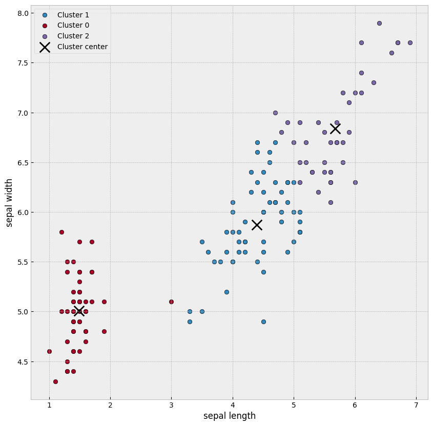
The bar plots below can be used to check how many misclassified observations we have.
Show code cell source
import seaborn as sns

# Create DataFrame
df = iris_df

# Function to plot both count and percentage views
def plot_cluster_distribution(view_type='count'):
    plt.figure(figsize=(12, 7))

    # Get unique flower types and clusters
    flowers = sorted(df['Flower'].unique())
    clusters = sorted(df['clusters'].unique())

    # Calculate the width of the bars
    bar_width = 0.8 / len(clusters)

    # Process data for visualization
    for i, cluster in enumerate(clusters):
        counts = []
        percentages = []

        for flower in flowers:
            flower_samples = df[df['Flower'] == flower]
            total = len(flower_samples)
            count = len(flower_samples[flower_samples['clusters'] == cluster])
            counts.append(count)
            percentages.append(count / total * 100 if total > 0 else 0)

        # Position for this set of bars
        x = np.arange(len(flowers))
        offset = (i - len(clusters) / 2 + 0.5) * bar_width

        # Plot data based on view type
        if view_type == 'count':
            bars = plt.bar(x + offset, counts, width=bar_width, color=colors(i),
                           label=f'Cluster {cluster}', edgecolor='white', linewidth=1)

            # Add counts as text on bars
            for bar, count in zip(bars, counts):
                if count > 0:  # Only add text for non-zero counts
                    plt.text(bar.get_x() + bar.get_width()/2, bar.get_height()/2,
                             str(count), ha='center', va='center', color='white', fontweight='bold')
        else:  # percentage view
            bars = plt.bar(x + offset, percentages, width=bar_width, color=colors(i),
                           label=f'Cluster {cluster}', edgecolor='white', linewidth=1)

            # Add percentages as text on bars
            for bar, pct in zip(bars, percentages):
                if pct > 5:  # Only add text for bars with enough space
                    plt.text(bar.get_x() + bar.get_width()/2, bar.get_height()/2,
                             f"{pct:.1f}%", ha='center', va='center', color='white', fontweight='bold')

    # Add labels and title
    plt.xlabel('True Flower Types', fontsize=12)

    if view_type == 'count':
        plt.ylabel('Number of Flowers', fontsize=12)
        plt.title('Distribution of Flowers by Cluster Assignment (Count)', fontsize=14, fontweight='bold')
    else:
        plt.ylabel('Percentage of Flowers (%)', fontsize=12)
        plt.title('Distribution of Flowers by Cluster Assignment (Percentage)', fontsize=14, fontweight='bold')

    # Set x-ticks
    plt.xticks(range(len(flowers)), [f'Flower {flower}' for flower in flowers])

    # Add grid for better readability
    plt.grid(axis='y', linestyle='--', alpha=0.7)

    # Add legend
    plt.legend(title='Assigned Clusters')

    # Tight layout
    plt.tight_layout()

    return plt

# Create visualizations
count_plot = plot_cluster_distribution('count')
count_plot.show()
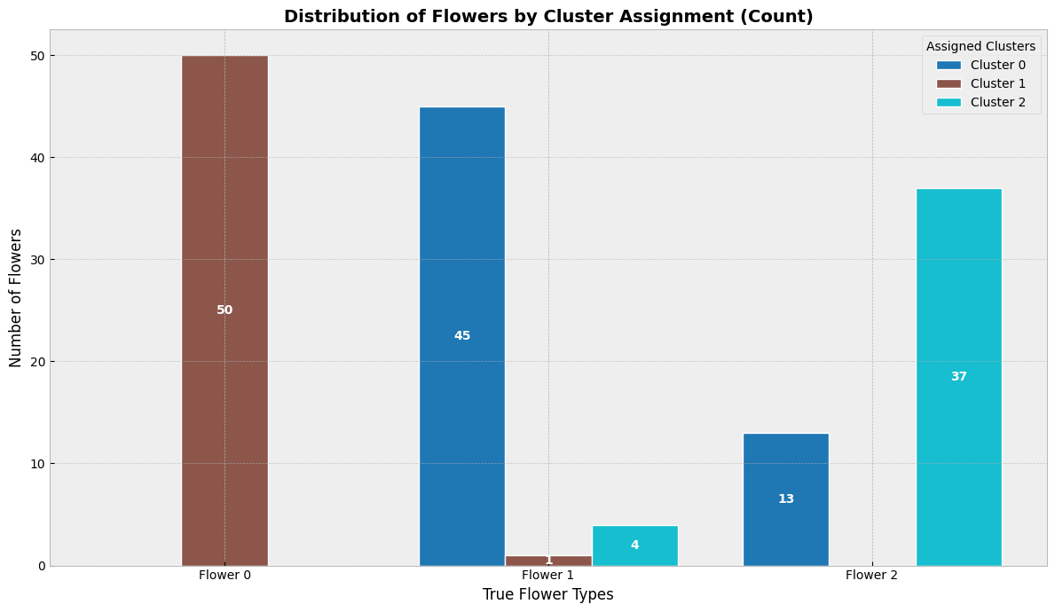
Let’s now use all the variables in the clustering model.
Show code cell source
from sklearn.cluster import KMeans
kmeans = KMeans(n_clusters=3, random_state=0)
results  = kmeans.fit(iris_df[['sepal length (cm)', 'sepal width (cm)', 'petal length (cm)',
       'petal width (cm)']])
iris_df['clusters']= results.labels_
centers = results.cluster_centers_

ax = plt.subplots(figsize=(10,10))
plt.scatter(iris_df['petal length (cm)'][iris_df['clusters'] == 0],
            iris_df['sepal length (cm)'][iris_df['clusters'] == 0],label='Cluster 0',edgecolor='black')
plt.scatter(iris_df['petal length (cm)'][iris_df['clusters'] == 1],
            iris_df['sepal length (cm)'][iris_df['clusters'] == 1],label='Cluster 1',edgecolor='black')
plt.scatter(iris_df['petal length (cm)'][iris_df['clusters'] == 2],
            iris_df['sepal length (cm)'][iris_df['clusters'] == 2],label='Cluster 2',edgecolor='black')
plt.scatter(centers[:,2],centers[:,0],s=200,color='k',marker='x',label='Cluster center')
plt.xlabel('sepal length')
plt.ylabel('sepal width')
plt.legend()
plt.show()
The results slightly improve.
df = iris_df
count_plot = plot_cluster_distribution('count')
count_plot.show()
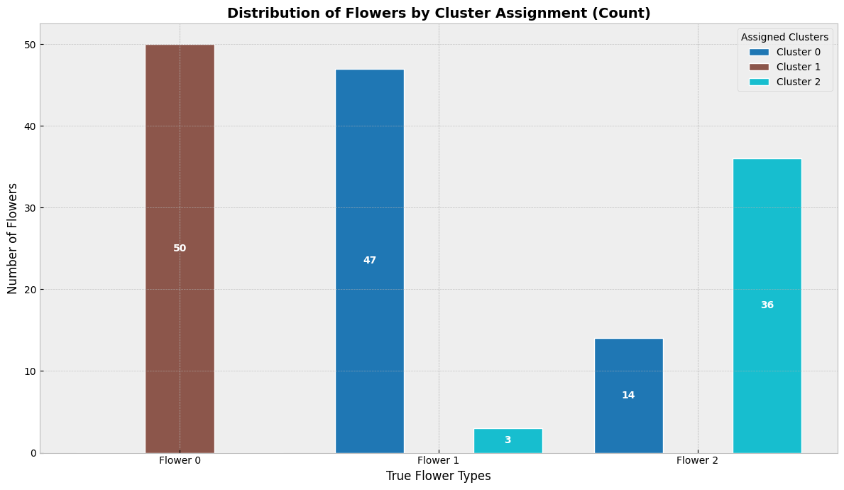
8.13. Practice problems#
Binary Classification with Logistic Regression:
Use a dataset of financial ratios (e.g., leverage, profitability, liquidity) to build a logistic regression model that predicts whether a company will go bankrupt. you can use a publicly available dataset like the Polish Bankruptcy Dataset in Kaggle.
Preprocess the data (e.g., handle missing values, normalize features).
Train a logistic regression model and evaluate its performance using accuracy, precision, recall, and F1 score.
Interpret the coefficients of the model to identify the most important predictors of bankruptcy.
Multiclass Classification with Decision Trees:
Classify companies into different risk categories (e.g., low, medium, high) based on financial performance metrics.
Build a decision tree classifier and visualize the tree structure.
Evaluate the model using metrics like accuracy, confusion matrix, and ROC-AUC.
Experiment with different tree depths to see how it affects performance.
Imbalanced Data Handling
Build a fraud detection model using an imbalanced dataset where fraudulent transactions are rare.
Use the Credit Card Fraud Detection Dataset in Kaggle.
Apply techniques like oversampling (e.g., SMOTE) or class weighting to handle the imbalance.
Compare the performance of models with and without imbalance handling using precision, recall, and F1 score.
Interpret the results to understand the trade-offs between false positives and false negatives.
Customer Churn Prediction
Build a classification model to predict which customers are likely to churn (stop using a service) based on their usage patterns and demographics.
Use the Telco Customer Churn Dataset.
Preprocess the data (e.g., encode categorical variables, handle missing values).
Train and compare multiple classification models (e.g., logistic regression, random forest, gradient boosting).
Evaluate the models using metrics like ROC-AUC, precision, and recall.
Provide actionable insights for reducing churn based on the model’s predictions.
Credit Scoring Model
Develop a credit scoring model to predict whether a loan applicant is likely to default.
Use the German Credit Dataset.
Perform feature engineering to create meaningful predictors (e.g., debt-to-income ratio).
Train a classification model (e.g., logistic regression, SVM, or XGBoost).
Evaluate the model using metrics like accuracy, precision, recall, and ROC-AUC.
Interpret the results to understand the key factors influencing credit risk.
Clustering Financial Data
Use clustering techniques to segment companies based on their financial performance.
Use a dataset like the Polish Bankruptcy Dataset or Yahoo Finance data.
Preprocess the data (e.g., normalize features, handle missing values).
Apply clustering algorithms like K-Means, hierarchical clustering, or DBSCAN.
Visualize the clusters using techniques like PCA, t-SNE, or UMAP.
Interpret the clusters to identify patterns or trends in financial performance.
Fraud Detection with Ensemble Methods
Build an ensemble model to detect fraudulent transactions in a dataset of financial transactions.
Use the Credit Card Fraud Detection Dataset.
Train and compare ensemble methods like random forests, gradient boosting, and bagging.
Evaluate the models using metrics like precision, recall, and F1 score.
Interpret feature importance to identify the key indicators of fraud.
Visualizing Financial Data with t-SNE and UMAP
Use t-SNE and UMAP to visualize high-dimensional financial data and identify clusters or patterns.
Use a dataset like the Polish Bankruptcy Dataset or UCI Default of Credit Card Clients Dataset.
Apply t-SNE and UMAP to reduce the dimensionality of the data to 2D or 3D.
Visualize the results and interpret the clusters or patterns.
Compare the results of t-SNE and UMAP with PCA.