9. Machine learning for structured data - Regression#
9.1. Introduction#
9.1.1. Practical Example - Predicting Company Profitability Using Financial Ratios#
In the field of accounting and finance, regression analysis is a powerful tool for predicting key financial metrics and making data-driven decisions. One common application, for example, is predicting a company’s Return on Assets (ROA), a critical measure of profitability that indicates how efficiently a company is using its assets to generate earnings.
Why is this important? ROA is widely used by investors, analysts, and stakeholders to evaluate a company’s financial health and performance. By predicting ROA, analysts can identify companies likely to perform well in the future, detect early signs of financial distress, and provide actionable insights for strategic planning.
How does regression help? Regression models can analyze historical financial data to identify the relationship between ROA and various financial ratios. For example:
Leverage: High debt levels might negatively impact profitability.
Current Ratio: Strong liquidity could indicate better financial health, potentially improving ROA.
Sales Growth: Increasing sales might lead to higher profitability.
Retained Earnings: Higher retained earnings could signal reinvestment in growth, boosting ROA.
Practical Application: Using regression, analysts can build a predictive model that estimates future ROA based on current financial ratios. For instance, a linear regression model might take the form: $\( \text{ROA} = b_0 + b_1 \times \text{Leverage} + b_2 \times \text{Current Ratio} + b_3 \times \text{Sales Growth} + b_4 \times \text{Retained Earnings} \)$
Where:
\( b_0 \) is the intercept,
\( b_1, b_2, b_3, b_4 \) are the coefficients for Leverage, Current Ratio, Sales Growth, and Retained Earnings, which quantify the impact of each financial ratio on ROA.
Why This Matters? This approach allows analysts to:
Identify high-performing companies: Predict which companies are likely to achieve strong profitability.
Assess financial risk: Detect companies at risk of underperformance or financial distress.
Support decision-making: Provide data-driven insights for investment, lending, and strategic planning.
This example illustrates how regression analysis can transform structured financial data into actionable insights, making it an indispensable tool in accounting and finance. In this chapter, we’ll explore the fundamentals of regression, advanced techniques like regularized regression and ensemble methods, and practical applications for financial and accounting data.
The Importance of Regression in Data Analytics
Regression analysis is one of the most foundational and versatile tools in data analytics, enabling professionals to uncover relationships between variables and make data-driven predictions. Its importance stems from its ability to model complex real-world phenomena in a simple, interpretable way. Regression allows us to predict outcomes based on historical data. For example, predicting sales based on advertising spend or forecasting stock prices using financial indicators. It helps quantify the strength and direction of relationships between variables. For instance, understanding how changes in interest rates impact housing prices. Applications Across Industries:
Classification vs. regression
Regression and classification are usually considered as two types of supervised machine learning. They both aim to utilise a training dataset to make predictions. Basically, the only difference is that the output variable in a regression model is numerical. The aim in regression is to build a function that models the connection between the input values and the output value (values).
9.2. Regression models#
9.2.1. Linear regression#
A linear regression model assumes that the regression function \(E(Y|X)\) is linear in the inputs \(x_1,...,x_k\). The basic model is of the form $\(\hat{y}=b_0+b_1x_1+...+b_kx_k,\)\( where the training data is used to learn the optimal parameters \)b_0,…,b_k$. Linear models are very old and were the most important prediction tools in the precomputer era. However, they are still useful today as they are simple and often provide an adequate and interpretable description of how the inputs affect the output. Furthermore, they sometimes outperform nonlinear models in prediction, especially when the number of training cases is low. Their scope can be considerably expanded if we apply these methods to the transformation of the inputs.
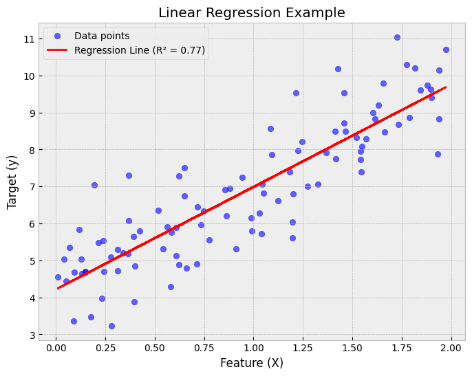
Show code cell source
import numpy as np
import matplotlib.pyplot as plt
from sklearn.linear_model import LinearRegression
from sklearn.metrics import r2_score

# Generate synthetic data
np.random.seed(42)  # For reproducibility
X = 2 * np.random.rand(100, 1)  # Feature values
y = 4 + 3 * X + np.random.randn(100, 1)  # Linear relationship with noise

# Train a linear regression model
model = LinearRegression()
model.fit(X, y)
y_pred = model.predict(X)

# Compute R² score
r2 = r2_score(y, y_pred)

# Plot the data and the regression line
plt.figure(figsize=(8, 6))
plt.scatter(X, y, color="blue", alpha=0.6, label="Data points")
plt.plot(X, y_pred, color="red", linewidth=2, label=f"Regression Line (R² = {r2:.2f})")
plt.xlabel("Feature (X)")
plt.ylabel("Target (y)")
plt.title("Linear Regression Example")
plt.legend()
plt.grid(True)

# Show the plot
plt.show()
9.2.2. Assumptions of Linear Regression#
Linear regression is a powerful and widely used method, but its effectiveness relies on several key assumptions. Violations of these assumptions can lead to unreliable or misleading results. Here are the main assumptions to consider:
Linearity:
Assumption: The relationship between the independent variables and the dependent variable is linear.
Violation Impact: If the relationship is non-linear, the model will fail to capture the true pattern, leading to poor predictions.
Solution: Use transformations (e.g., log, polynomial) or consider non-linear models.
Independence:
Assumption: The residuals (errors) are independent of each other.
Violation Impact: If residuals are correlated (e.g., in time series data), the model may underestimate uncertainty, leading to incorrect confidence intervals and p-values.
Solution: Use techniques like autoregressive models or include lagged variables.
Homoscedasticity:
Assumption: The residuals have constant variance across all levels of the independent variables.
Violation Impact: If the variance of residuals is not constant (heteroscedasticity), the model may give unequal weight to different observations, affecting the reliability of predictions.
Solution: Use weighted least squares or transform the dependent variable.
Normality of Residuals:
Assumption: The residuals are normally distributed, especially for small sample sizes.
Violation Impact: Non-normal residuals can affect the validity of hypothesis tests and confidence intervals. *Solution: Transform the dependent variable or use robust regression methods.
No Multicollinearity:
Assumption: Independent variables are not highly correlated with each other.
Violation Impact: Multicollinearity can inflate the variance of coefficient estimates, making them unstable and difficult to interpret.
Solution: Remove or combine correlated variables, or use regularized regression (e.g., ridge or LASSO).
Understanding and checking these assumptions is critical for building a reliable linear regression model. Violations can lead to biased estimates, incorrect inferences, and poor predictive performance. Tools like residual plots, variance inflation factor (VIF), and statistical tests can help diagnose and address these issues.
9.2.3. Regularised regression#
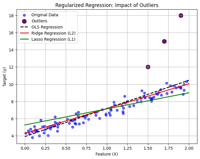
One way to expand the scope of linear models is to include regularisation to them. This method constrains the coefficient estimates and forces them towards zero. It can be easily proven that this approach is an efficient way to counter overfitting and makes more robust models. The two best-known regularisation techniques are ridge regression and the LASSO.
The Need for Regularization in Regression Regularization techniques like ridge and LASSO regression are essential tools for improving the performance and reliability of regression models. They address two common challenges in data analysis: multicollinearity and overfitting.
Multicollinearity: When independent variables are highly correlated, it becomes difficult for the model to determine the individual effect of each variable. This leads to unstable and unreliable coefficient estimates.
Solution: Regularization introduces a penalty term that shrinks the coefficients of correlated variables, reducing their impact and stabilizing the model.
Overfitting: When a model is too complex (e.g., includes too many variables), it may fit the training data extremely well but perform poorly on unseen data. This is because the model captures noise rather than the underlying pattern.
Solution: Regularization penalizes large coefficients, discouraging the model from becoming overly complex and improving its ability to generalize to new data.
How Regularization Works? Regularization adds a penalty term to the regression equation, balancing the trade-off between fitting the data and keeping the model simple. The two most common techniques are:
Ridge Regression: Adds a penalty proportional to the square of the coefficients:
shrinking them but not setting any to zero.
LASSO Regression: Adds a penalty proportional to the absolute value of the coefficients:
which can shrink some coefficients to zero, effectively performing variable selection.
Why This Matters? Regularization improves the robustness and interpretability of regression models, making them more reliable for real-world applications. It is particularly useful when dealing with high-dimensional data (many variables) or when multicollinearity and overfitting are concerns.
Show code cell source
import numpy as np
import matplotlib.pyplot as plt
from sklearn.linear_model import LinearRegression, Ridge, Lasso

# Generate synthetic data with some noise
np.random.seed(42)
X = 2 * np.random.rand(100, 1)  # Feature values
y = 4 + 3 * X + np.random.randn(100, 1) * 0.5  # Linear relationship with noise

# Introduce outliers (extreme values)
X_outliers = np.array([[1.5], [1.7], [1.9]])  # Outlier feature values
y_outliers = np.array([[12], [15], [18]])  # Outlier target values

# Combine normal data with outliers
X_combined = np.vstack((X, X_outliers))
y_combined = np.vstack((y, y_outliers))

# Train different regression models
lin_reg = LinearRegression()
ridge_reg = Ridge(alpha=5.0)  # Increased L2 Regularization
lasso_reg = Lasso(alpha=0.5)  # Increased L1 Regularization

lin_reg.fit(X_combined, y_combined)
ridge_reg.fit(X_combined, y_combined)
lasso_reg.fit(X_combined, y_combined)

# Predictions
X_pred = np.linspace(0, 2, 100).reshape(-1, 1)
y_lin_pred = lin_reg.predict(X_pred)
y_ridge_pred = ridge_reg.predict(X_pred)
y_lasso_pred = lasso_reg.predict(X_pred)

# Plot the results
plt.figure(figsize=(8, 6))
plt.scatter(X, y, color="blue", alpha=0.6, label="Original Data")
plt.scatter(X_outliers, y_outliers, color="purple", s=100, edgecolors="black", label="Outliers")

plt.plot(X_pred, y_lin_pred, color="black", linestyle="dashed", linewidth=2, label="OLS Regression")
plt.plot(X_pred, y_ridge_pred, color="red", linewidth=2, label="Ridge Regression (L2)")
plt.plot(X_pred, y_lasso_pred, color="green", linewidth=2, label="Lasso Regression (L1)")

plt.xlabel("Feature (X)")
plt.ylabel("Target (y)")
plt.title("Regularized Regression: Impact of Outliers")
plt.legend()
plt.grid(True)

# Save the figure (Optional: for publishing)
plt.savefig("regularized_regression_with_outliers.png", dpi=300, bbox_inches="tight")

# Show the plot
plt.show()
9.2.4. Ridge regression#
In the ordinary least squares regression, we aim to minimise residual sum of squares. $\(\sum_{i=1}^n{(y_i-\hat{y_i})}\)\( In ridge regression, we minimise a slightly different quantity \)\(\sum_{i=1}^n{(y_i-\hat{y_i})}+\lambda\sum_{j=1}^k{\beta_j^2}\)\( Thus, there is a penalty term that can be decreased by decreasing the size of the parameters. The lambda \)\lambda\( in the model is a hyperparameter that needs to be selected beforehand. For example, cross-validation can be used to select the optimal lambda value. If we increase lambda, the second term becomes more important, decreasing the size of the parameters. This will decrease the variance of the predictions but increase the bias (bias-variance tradeoff will be discussed later). Thus, the solution of ridge regression depends on the lambda parameter. One thing to remember is that the intercept \)b_o$ should not be included in the regularisation term.
Usually, ridge regression is useful when the number of variables is almost as large as the number of observations. In these situations, the OLS estimates will be extremely variable. Ridge regression works even when the number of parameters is larger than the number of observations.
Moradi & Badrinarayanan (2021) use ridge regression as one of the models to analyse the effects of brand prominence and narrative features on crowdfunding success for entrepreneurial aftermarket enterprises (Moradi, M., & Badrinarayanan, V. (2021). The effects of brand prominence and narrative features on crowdfunding success for entrepreneurial aftermarket enterprises. Journal of Business Research, 124, 286–298.)
9.2.5. LASSO regression#
Although ridge regression decreases the size of the parameters, it is not decreasing them to zero. Thus, the complexity of the model is not decreasing. Lasso regression solves this issue with a small change. In the penalty term, the lasso uses the parameters’ absolute values instead of the squared values $\(\sum_{i=1}^n{y_i-\hat{y_i}}+\lambda\sum_{j=1}^k{|\beta_j|}\)\( As with ridge regression, the lasso shrinks the coefficient estimates towards zero. However, the small change in the penalty term can force some of the coefficients to zero if the lambda parameter is large enough. Hence, the lasso performs also variable selection making the interpretation of the model easier. Depending on the value of \)\lambda$, the lasso can produce a model involving any number of variables.
Lasso can be used as a preliminary step for variable selection, like in the reseaarch of Sheehan et al. (2020) (Sheehan, M., Garavan, T. N., & Morley, M. J. (2020). Transformational leadership and work unit innovation: A dyadic two-wave investigation. Journal of Business Research, 109, 399–412.)
9.2.6. Ensemble methods for regression#
We already discussed ensemble methods in the previous chapter, and the details of these methods can be read there. They can also be used for regression. As ensemble methods often use decision trees as weak estimators, and for regression purposes, we only need to use Classification and Regression Trees (CART) instead of ordinary decision trees.
Some examples of accounting/finance research that use ensemble methods:
Ranta, M., Ylinen, M., & Järvenpää, M. (2023). Machine Learning in Management Accounting Research: Literature Review and Pathways for the Future. European Accounting Review, 32(3), 607–636. https://doi.org/10.1080/09638180.2022.2137221
Ranta, M., & Ylinen, M. (2024). Employee benefits and company performance: Evidence from a high-dimensional machine learning model. Management Accounting Research, 64, 100876. https://doi.org/10.1016/j.mar.2023.100876
Ylinen, M., & Ranta, M. (2024). Employer ratings in social media and firm performance: Evidence from an explainable machine learning approach. Accounting & Finance, 64(1), 247–276. https://doi.org/10.1111/acfi.13146
Bao, Y., Ke, B., Li, B., Yu, Y. J., & Zhang, J. (2020). Detecting Accounting Fraud in Publicly Traded U.S. Firms Using a Machine Learning Approach. Journal of Accounting Research, 58(1), 199–235.
Jones, S. (2017). Corporate bankruptcy prediction: A high dimensional analysis. Review of Accounting Studies, 22(3), 1366–1422.
Gregory, B. (2018). Predicting Customer Churn: Extreme Gradient Boosting with Temporal Data. ArXiv:1802.03396
Barboza, F., Kimura, H., & Altman, E. (2017). Machine learning models and bankruptcy prediction. Expert Systems with Applications, 83, 405–417.
Carmona, P., Climent, F., & Momparler, A. (2019). Predicting failure in the U.S. banking sector: An extreme gradient boosting approach. International Review of Economics & Finance, 61, 304–323.
Chang, Y.-C., Chang, K.-H., & Wu, G.-J. (2018). Application of eXtreme gradient boosting trees in the construction of credit risk assessment models for financial institutions. Applied Soft Computing, 73, 914–920.
Pierdzioch, C., Risse, M., & Rohloff, S. (2015). Forecasting gold-price fluctuations: A real-time boosting approach. Applied Economics Letters, 22(1), 46–50.
9.2.7. Shallow neural network#
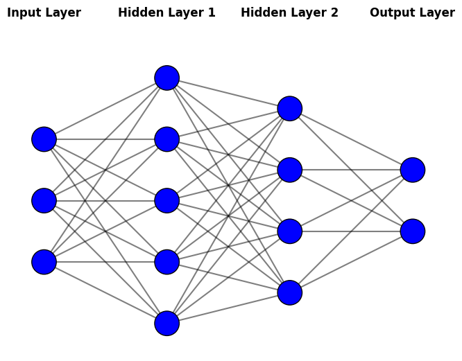
Although we will mainly discuss neural networks in the following chapters, I will shortly introduce shallow neural networks as they can be used for regression with structured data. They were already used 30 years ago and often in similar situations where other methods of this chapter are used. As structured data is an essential form of accounting and finance data, it is important to know neural network architectures often used to analyse them.
Neural networks are a type of machine learning model inspired by the structure and function of the human brain. While they can seem complex at first, their core idea is straightforward: they learn patterns in data by combining simple building blocks called neurons.
Building blocks of neural networks
Neurons: These are the basic units of a neural network. Each neuron takes one or more inputs, applies a mathematical operation, and produces an output.
Layers: Neurons are organized into layers:
Input Layer: Receives the raw data (e.g., financial ratios, customer features).
Hidden Layers: Perform complex transformations on the data to extract useful patterns.
Output Layer: Produces the final prediction (e.g., a number for regression or a category for classification).
Learning: During training, the network adjusts the connections between neurons to minimize errors in its predictions. This process is called backpropagation.
Why Use Neural Networks?
Flexibility: They can model complex, non-linear relationships in data.
Performance: They often achieve state-of-the-art results in tasks like image recognition, natural language processing, and financial forecasting.
Scalability: They can handle large datasets with many features.
Neural networks are powerful but not always necessary. They are best suited for complex problems with large amounts of data, tasks where traditional methods (e.g., linear regression) struggle to capture patterns. However, they are not necessarily the best option for traditional regression with structured data. Traditional feed-forward neural network architecture is sometimes used for these applications.
Feed-forward Neural networks Neural networks are a large class of models and learning methods. The most traditional is the single hidden layer back-propagation network or a single layer perceptron, which belongs to a class of networks called feed-forward neural networks. The name comes from the fact that we calculate linear combinations of inputs at different layers, pass the results to a non-linear activation function and feed the value forward. By combining these non-linear functions of linear combinations into a network, we get a very powerful non-linear estimator. We will use feed-forward neural networks in this chapter.
Deep neural networks behind the AI revolution basically means that we add many more layers and neurons to the network. (The paradigm of deep learning is a little bit deeper than that, but we do not go into details at this point.)
Show code cell source
import numpy as np
import matplotlib.pyplot as plt

def draw_neural_network(ax, layer_sizes):
    """
    Draws a neural network diagram with the given layer sizes.

    Parameters:
    - ax: Matplotlib axis to draw on
    - layer_sizes: List containing the number of neurons in each layer
    """
    v_spacing = 1  # Vertical spacing between neurons
    h_spacing = 2  # Horizontal spacing between layers

    # Compute positions of neurons
    node_positions = []
    max_neurons = max(layer_sizes)
    for i, layer_size in enumerate(layer_sizes):
        x = i * h_spacing
        y_start = (max_neurons - layer_size) / 2 * v_spacing
        positions = [(x, y_start + j * v_spacing) for j in range(layer_size)]
        node_positions.append(positions)

    # Draw connections
    for i in range(len(layer_sizes) - 1):
        for a in node_positions[i]:  # Neurons in layer i
            for b in node_positions[i + 1]:  # Neurons in layer i+1
                ax.plot([a[0], b[0]], [a[1], b[1]], 'k-', alpha=0.5)

    # Draw neurons
    for layer in node_positions:
        for (x, y) in layer:
            circle = plt.Circle((x, y), 0.2, color='b', ec='k', zorder=3)
            ax.add_patch(circle)

    # Add layer labels
    layer_names = ["Input Layer", "Hidden Layer 1", "Hidden Layer 2", "Output Layer"]
    for i, name in enumerate(layer_names[:len(layer_sizes)]):
        ax.text(i * h_spacing, max_neurons * v_spacing, name, fontsize=12, ha='center', fontweight='bold', color='black')

    # Set limits and aspect
    ax.set_xlim(-0.5, len(layer_sizes) * h_spacing - 1.5)
    ax.set_ylim(-0.5, max_neurons * v_spacing - 0.5)
    ax.set_aspect('equal')
    ax.axis('off')

# Define the neural network structure (input layer, hidden layers, output layer)
layer_sizes = [3, 5, 4, 2]  # Example: 3 neurons in input, 5 in hidden, 4 in hidden, 2 in output

# Create figure and axis
fig, ax = plt.subplots(figsize=(8, 6))
draw_neural_network(ax, layer_sizes)

# Show the figure
plt.show()
Some examples of accounting/finance research that use neural networks:
Agapova, A., King, T., & Ranta, M. (2024). Navigating transparency: The interplay of ESG disclosure and voluntary earnings guidance1. International Review of Financial Analysis, 103813. https://doi.org/10.1016/j.irfa.2024.103813
Barboza, F., Kimura, H., & Altman, E. (2017). Machine learning models and bankruptcy prediction. Expert Systems with Applications, 83, 405–417.
Gu, S., Kelly, B., & Xiu, D. (2020). Empirical Asset Pricing via Machine Learning. The Review of Financial Studies, 33(5), 2223–2273.
Hosaka, T. (2019). Bankruptcy prediction using imaged financial ratios and convolutional neural networks. Expert Systems with Applications, 117, 287–299.
Kumar, M., & Thenmozhi, M. (2014). Forecasting stock index returns using ARIMA-SVM, ARIMA-ANN, and ARIMA-random forest hybrid models. International Journal of Banking, Accounting and Finance, 5(3), 284–308.
Mai, F., Tian, S., Lee, C., & Ma, L. (2019). Deep learning models for bankruptcy prediction using textual disclosures. European Journal of Operational Research, 274(2), 743–758.
9.3. Performance of regression models#
Evaluating the performance of regression models is crucial, as no single method consistently outperforms all others in every scenario. Therefore, determining which model yields the best results for a given dataset is an essential task.
Selecting the optimal model is far from straightforward and is often one of the most challenging aspects of a practical machine learning project.
In this section, we will briefly explore key concepts related to the performance analysis of regression models.
9.3.1. Coefficient of determination#
One of the ways to measure the contribution of input values \(x\) in predicting \(y\) is to consider how much the prediction errors were reduced by using the information provided by the variables \(x\). The coefficient of determination \(R^2\) is a value between zero and one that can be interpreted to be the proportion of variability explained by the regression model.
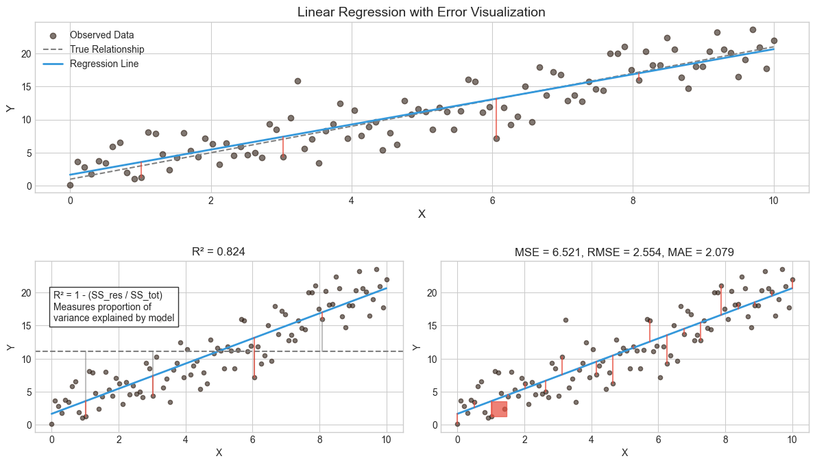
\(R^2\) = 1 - (Sum of Squared Residuals / Total Sum of Squares)
Thus, a value of \(R^2=0.75\) means that the model explains 75 % of the variation of \(y\). So, the best model is the one that has the highest \(R^2\) and thus, explains most of the predicted variables’ variation.
9.3.2. MSE#
To evaluate the performance of a statistical learning method on a given data set, we need some way to measure how well its predictions match the observed data. We need to quantify the extent to which the predicted response value for a given observation is close to the true response value for that observation. The coefficient of determination is the standard way to evaluate models in the traditional statistics community. However, the machine learning community prefers using the mean squared error. The MSE is the theoretically correct approach to evaluate models. It is defined as $\(MSE=\frac{1}{n}\sum_{i=1}^n{(y_i-\hat{y_i})^2}\)$ The MSE will be small if the predicted responses are very close to the correct responses and will be large if the predicted and true responses differ substantially for some of the observations
The MSE can be computed using the training data, and then it is called the in-sample MSE. However, more important for practical applications is the out-of-sample MSE. In general, we do not care how well the method works on the training data. Instead, we are interested in the accuracy of the predictions we obtain when applying our method to previously unseen test data. For example, if we are developing an algorithm to predict a stock’s price based on the previous values, we do not care how well our method predicts last week’s stock price because we already know that. We instead care about how well it will predict tomorrow’s price or next month’s price. Therefore, when comparing models, we should always compare them with the out-of-sample MSE using a test set.
In some settings, we may have a test data set available. We can then evaluate the MSE on the test observations and select the learning method for which the test MSE is the smallest. If there are no test observations available, one might think that the second-best option would be to use the in-sample MSE for model comparison. Unfortunately, there is no guarantee that the method with the lowest training MSE will also have the lowest test MSE. This is related to the fact that many ML models specifically optimise the coefficients so that the in-sample MSE is minimised.
As model flexibility increases, training MSE will decrease, but the test MSE may not. When a given method yields a small training MSE but a large test MSE, we are said to be overfitting the data. This happens because our statistical learning procedure is picking up some patterns that are just caused by random chance rather than by real associations between the predictors and the predicted value. When we overfit the training data, the test MSE can grow to very large values, because the algorithm tries to model complex patterns caused by pure chance. Overfitting refers specifically to the case in which a less flexible model would have yielded a smaller test MSE.
While \(R^2\) MSE are commonly used, other metrics like Root Mean Squared Error (RMSE), Mean Absolute Error (MAE), and Adjusted \(R^2\) offer additional insights. Here’s a breakdown of these metrics and when to use them: $\(RMSE=\sqrt{MSE}\)$
MSE=\frac{1}{n}\sum_{i=1}^n{(y_i-\hat{y_i})^2}$$$\(MSE=\frac{1}{n}\sum_{i=1}^n{(y_i-\hat{y_i})^2}\)$
\(R^2\) (Coefficient of Determination):
What it measures: The proportion of variance in the dependent variable explained by the model.
Range: 0 to 1 (higher is better).
Interpretation: Proportion of variance explained by the model
When to use: To assess the overall goodness of fit of the model.
Limitation: Increases with more predictors, even if they are irrelevant.
Adjusted \(R^2\):
What it measures: Similar to \(R^2\), but penalizes the addition of unnecessary predictors.
Range: 0 to 1 (higher is better).
When to use: To compare models with different numbers of predictors.
MSE (Mean Squared Error):
What it measures: The average squared difference between predicted and actual values.
Range: 0 to ∞ (lower is better).
Interpretation: Average squared difference between predictions and actual values
Units: Squared units of the target variable
When to use: To emphasize larger errors (sensitive to outliers).
RMSE (Root Mean Squared Error):
What it measures: The square root of MSE, providing error in the same units as the dependent variable.
Range: 0 to ∞ (lower is better).
Interpretation: Standard deviation of prediction errors
Units: Same as the target variable
When to use: To interpret error magnitude in a more intuitive way.
MAE (Mean Absolute Error):
What it measures: The
Interpretation: Average absolute difference between predictions and actual values
Units: Same as the target variable average absolute difference between predicted and actual values.
Range: 0 to ∞ (lower is better).
When to use: When you want to treat all errors equally (less sensitive to outliers).
Show code cell source
import numpy as np
import matplotlib.pyplot as plt
from sklearn.linear_model import LinearRegression
from sklearn.metrics import r2_score, mean_squared_error, mean_absolute_error
import matplotlib.gridspec as gridspec
from matplotlib.patches import Rectangle
import matplotlib.colors as mcolors

# Set random seed for reproducibility
np.random.seed(32)

# Generate sample data with controlled noise
x = np.linspace(0, 10, 100)
y_true = 2 * x + 1
noise = np.random.normal(0, 2.5, size=len(x))
y_noisy = y_true + noise

# Reshape for sklearn
X = x.reshape(-1, 1)

# Create and train the model
model = LinearRegression()
model.fit(X, y_noisy)

# Make predictions
y_pred = model.predict(X)

# Calculate metrics
r2 = r2_score(y_noisy, y_pred)
mse = mean_squared_error(y_noisy, y_pred)
rmse = np.sqrt(mse)
mae = mean_absolute_error(y_noisy, y_pred)

# Create a figure
plt.figure(figsize=(12, 10))
gs = gridspec.GridSpec(3, 2, height_ratios=[1, 1, 1])

# Colors
main_color = '#3498db'
error_color = '#e74c3c'
highlight_color = '#2ecc71'
pale_error_color = mcolors.to_rgba(error_color, alpha=0.3)

# Main regression plot
ax1 = plt.subplot(gs[0, :])
ax1.scatter(x, y_noisy, alpha=0.6, label='Observed Data')
ax1.plot(x, y_true, '--', color='gray', label='True Relationship')
ax1.plot(x, y_pred, color=main_color, linewidth=2, label='Regression Line')

# Highlight a few error lines
indices = [10, 30, 60, 80]
for i in indices:
    ax1.plot([x[i], x[i]], [y_noisy[i], y_pred[i]], color=error_color, alpha=0.7)

ax1.set_xlabel('X', fontsize=12)
ax1.set_ylabel('Y', fontsize=12)
ax1.set_title('Linear Regression with Error Visualization', fontsize=14)
ax1.legend(fontsize=10)

# R² explanation
ax2 = plt.subplot(gs[1, 0])
# Just for visualization purposes
y_mean = np.mean(y_noisy) * np.ones_like(y_noisy)
ss_tot_data = np.array([[x[i], y_noisy[i], x[i], y_mean[i]] for i in range(len(x))])
ss_res_data = np.array([[x[i], y_noisy[i], x[i], y_pred[i]] for i in range(len(x))])

# Plot the data points and regression line
ax2.scatter(x, y_noisy, alpha=0.6, s=20)
ax2.plot(x, y_pred, color=main_color, linewidth=2)
ax2.axhline(y=np.mean(y_noisy), color='gray', linestyle='--', label='Mean')

# Show a few lines for SS_tot and SS_res
for i in indices:
    # SS_tot (vertical distance to mean)
    ax2.plot([x[i], x[i]], [y_noisy[i], y_mean[i]], color='gray', alpha=0.5)
    # SS_res (vertical distance to regression line)
    ax2.plot([x[i], x[i]], [y_noisy[i], y_pred[i]], color=error_color, alpha=0.7)

ax2.set_xlabel('X', fontsize=10)
ax2.set_ylabel('Y', fontsize=10)
ax2.set_title(f'R² = {r2:.3f}', fontsize=12)
ax2.text(0.05, 0.65,
         "R² = 1 - (SS_res / SS_tot)\nMeasures proportion of\nvariance explained by model",
         transform=ax2.transAxes, fontsize=10,
         bbox=dict(facecolor='white', alpha=0.8))

# MSE/RMSE/MAE explanation
ax3 = plt.subplot(gs[1, 1])
ax3.scatter(x, y_noisy, alpha=0.6, s=20)
ax3.plot(x, y_pred, color=main_color, linewidth=2)

# Create a sample subset to visualize errors more clearly
sample_indices = np.linspace(0, len(x)-1, 20).astype(int)
squared_errors = (y_noisy - y_pred)**2
abs_errors = np.abs(y_noisy - y_pred)

# Draw error lines and squares for MSE visualization
for i in sample_indices:
    # Error line
    ax3.plot([x[i], x[i]], [y_noisy[i], y_pred[i]], color=error_color, alpha=0.7)

    # Small square to represent squared error (MSE)
    if i in indices:
        side_length = np.sqrt(squared_errors[i])
        rect = Rectangle((x[i], min(y_noisy[i], y_pred[i])), side_length/5, side_length,
                         facecolor=pale_error_color, edgecolor=error_color, alpha=0.7)
        ax3.add_patch(rect)

ax3.set_xlabel('X', fontsize=10)
ax3.set_ylabel('Y', fontsize=10)
ax3.set_title(f'MSE = {mse:.3f}, RMSE = {rmse:.3f}, MAE = {mae:.3f}', fontsize=12)

plt.tight_layout()
plt.subplots_adjust(hspace=0.4)
plt.show()
9.3.3. Bias-Variance tradeoff#
Mean square error measures, on average, how close a model comes to the true values. Hence, this could be used as a criterion for determining the best model. It can proven that MSE is a composition of two parts, bias and variance.
Variance refers to the sensitivity of the model if we estimated it using a different training data set. Even if sampling is perferct, different training sets will results in a slightly different model. But ideally the model should not vary too much between training sets. However, if a model has high variance then small changes in the training data can result in large changes. In general, more flexible models (what machine learning models usually are) have higher variance.
On the other hand, bias refers to the error that is introduced by approximating an association, which may be extremely complicated, by a much simpler model. For example, linear regression assumes that there is a linear relationship between the predicted value and the predictors. It is unlikely that any association truly has a simple linear relationship, and so linear regressiom models will always have some bias in the estimates. Generally, more flexible methods result in less bias.
To conclude, as we use more flexible methods, the variance will increase and the bias will decrease. The relative rate of change of these two quantities determines whether the test MSE increases or decreases. As we increase the flexibility of a model, the bias tends to initially decrease faster than the variance increases. Consequently, the expected test MSE declines. However, at some point increasing flexibility does not decrease bias any more but variance continues to increase, thus, increasing also the overall MSE.
This phenomenon is referred as the bias-variance trade-off, because it is easy to obtain a model with extremely low bias but high variance (for instance, by drawing a curve that passes through every single training observation) or a model with very low variance but high bias (by fitting a horizontal line to the data). The challenge lies in finding a method for which both the variance and the squared bias are low. Machine learning methods are usually extremely flexible and hence can essentially eliminate bias. However, this does not guarantee that they will outperform a much simpler method such as linear regression due to higher variance. Cross-validation, which we discussed in the previous chapter, is a way to estimate the test MSE using the training data, and search for the best model.
Show code cell source
import numpy as np
import matplotlib.pyplot as plt
from sklearn.pipeline import Pipeline
from sklearn.preprocessing import PolynomialFeatures
from sklearn.linear_model import LinearRegression
from sklearn.metrics import mean_squared_error
from sklearn.model_selection import train_test_split
import matplotlib.gridspec as gridspec
import seaborn as sns

# Set the style for the plots
plt.style.use('seaborn-v0_8-whitegrid')
sns.set_palette("copper")

# Create some synthetic data with noise
np.random.seed(42)
n_samples = 80
true_fun = lambda X: np.cos(1.5 * np.pi * X)
X = np.sort(np.random.rand(n_samples))
y = true_fun(X) + np.random.randn(n_samples) * 0.1

# Split the data
X_train, X_test, y_train, y_test = train_test_split(X, y, test_size=0.3, random_state=42)
X_train, X_train_val, y_train, y_train_val = train_test_split(X_train, y_train, test_size=0.3, random_state=42)

# Test data for visualization
X_test_vis = np.linspace(0, 1, 1000)

# Define the polynomial degrees to try
degrees = [1, 3, 5, 15]
colors = plt.cm.copper(np.linspace(0, 1, len(degrees)))
# Clear any existing figures to avoid conflicts
plt.close('all')

# Create a completely new figure
fig = plt.figure(figsize=(16, 12))

# Define the grid layout
gs = gridspec.GridSpec(2, 3, figure=fig, width_ratios=[1, 1, 1.2], height_ratios=[1, 1])

# Train models with different polynomial degrees
train_errors = []
val_errors = []
test_errors = []
bias_values = []
variance_values = []
total_errors = []

for degree in degrees:
    # Create and fit the model
    model = Pipeline([
        ('poly', PolynomialFeatures(degree=degree)),
        ('linear', LinearRegression())
    ])
    model.fit(X_train.reshape(-1, 1), y_train)

    # Compute errors
    y_train_pred = model.predict(X_train.reshape(-1, 1))
    y_val_pred = model.predict(X_train_val.reshape(-1, 1))
    y_test_pred = model.predict(X_test.reshape(-1, 1))

    train_error = mean_squared_error(y_train, y_train_pred)
    val_error = mean_squared_error(y_train_val, y_val_pred)
    test_error = mean_squared_error(y_test, y_test_pred)

    train_errors.append(train_error)
    val_errors.append(val_error)
    test_errors.append(test_error)

    # Compute approximate bias and variance
    bias = np.mean((model.predict(X_test.reshape(-1, 1)) - true_fun(X_test))**2)
    variance = np.var(model.predict(X_test.reshape(-1, 1)))

    bias_values.append(bias)
    variance_values.append(variance)
    total_errors.append(bias + variance)

# First plot: Models fitted to training data
ax1 = fig.add_subplot(gs[0, 0:2])
ax1.scatter(X_train, y_train, color='#3498db', alpha=0.7, s=30, label='Training data')
ax1.scatter(X_test, y_test, color='#e74c3c', alpha=0.7, s=30, label='Test data')
ax1.plot(X_test_vis, true_fun(X_test_vis), 'k--', lw=2, label='True function')

for i, degree in enumerate(degrees):
    model = Pipeline([
        ('poly', PolynomialFeatures(degree=degree)),
        ('linear', LinearRegression())
    ])
    model.fit(X_train.reshape(-1, 1), y_train)
    y_pred_vis = model.predict(X_test_vis.reshape(-1, 1))
    ax1.plot(X_test_vis, y_pred_vis, color=colors[i], lw=2, label=f'Degree {degree}')

ax1.set_title('Models of Different Complexity Fitted to Training Data', fontsize=14)
ax1.set_xlabel('x', fontsize=12)
ax1.set_ylabel('y', fontsize=12)
ax1.legend(loc='upper right', fontsize=10)
ax1.set_ylim(-1.5, 1.5)

# Second plot: Error metrics vs complexity
ax2 = fig.add_subplot(gs[1, 0])
complexity = np.array(degrees)
ax2.plot(complexity, train_errors, 'o-', color='#3498db', lw=2, label='Training error')
ax2.plot(complexity, val_errors, 'o-', color='#9b59b6', lw=2, label='Validation error')
ax2.plot(complexity, test_errors, 'o-', color='#e74c3c', lw=2, label='Test error')
ax2.set_title('Error vs Model Complexity', fontsize=14)
ax2.set_xlabel('Polynomial Degree', fontsize=12)
ax2.set_ylabel('Mean Squared Error', fontsize=12)
ax2.set_xticks(degrees)
ax2.legend(loc='upper right', fontsize=10)
ax2.grid(True, alpha=0.3)

# Bias-variance tradeoff plot
# Create this plot last and completely separately
ax4 = fig.add_subplot(gs[1, 1])
ax4.clear()  # Make sure the axis is clean
ax4.plot(complexity, bias_values, 'o-', color='#2ecc71', lw=2, label='Bias²')
ax4.plot(complexity, variance_values, 'o-', color='#f39c12', lw=2, label='Variance')
ax4.plot(complexity, total_errors, 'o-', color='#e74c3c', lw=2, label='Total Error')
ax4.set_title('Bias-Variance Tradeoff', fontsize=14)
ax4.set_xlabel('Polynomial Degree', fontsize=12)
ax4.set_ylabel('Error Contribution', fontsize=12)
ax4.set_xticks(degrees)
ax4.legend(loc='best', fontsize=10)
ax4.grid(True, alpha=0.3)

plt.tight_layout()
plt.subplots_adjust(wspace=0.3, hspace=0.2)

plt.show()

9.4. Outliers#
It is important to identify any existence of unusual observations in a data set. An observation that is unusual in the vertical direction is called an outlier. If we are sure that observation is an outlier and should be removed, we have two options. Either we move those outliers to specific quantiles, which is called winsorisation, or we remove those outliers altogether.
Outliers can arise from errors (e.g., data entry mistakes) or represent genuine but extreme observations. Detecting and handling outliers is crucial because they can distort model performance and lead to misleading conclusions.
9.4.1. Common methods for detecting outliers#
Boxplots:
What it does: Visualizes the distribution of data and identifies outliers as points outside the “whiskers” (typically 1.5 times the interquartile range).
When to use: For a quick, visual inspection of outliers in a single variable.
Z-Scores:
What it does: Measures how many standard deviations a data point is from the mean. Data points with Z-scores greater than 3 or less than -3 are often considered outliers.
When to use: For numerical data when you want a statistical measure of outliers.
IQR (Interquartile Range) Method:
What it does: Defines outliers as data points below \(Q1-1.5\times IQR\) or above \(Q3-1.5\times IQR\), where \(Q1\) and \(Q3\) are the first and third quartiles.
When to use: For robust outlier detection, especially when the data is not normally distributed.
9.4.2. Handling Outliers:#
Once detected, outliers can be:
Winsorized: Replaced with the nearest non-outlier value.
Removed: Excluded from the dataset if they are errors or irrelevant.
Kept: Retained if they represent valid, meaningful observations.
Proper outlier detection ensures your model is not unduly influenced by extreme values, leading to more reliable and accurate results.
9.5. Data Scaling: Preparing Features for Modeling#
Data scaling is the process of transforming features to a standard range or distribution. It is essential for certain models, especially those sensitive to the magnitude of input values. Algorithms like ridge regression, LASSO, and neural networks perform better when features are on a similar scale. Furthermore, scaling speeds up the training process for iterative algorithms like gradient descent. Moreover, features with larger ranges can dominate the model, leading to biased results.
Common Scaling Methods:
Standardization (Z-Score Normalization):
Transforms data to have a mean of 0 and a standard deviation of 1.
Formula: \(Z=\frac{x-\mu}{\sigma}\)
Best for: Models assuming normally distributed data (e.g., linear regression).
Min-Max Scaling:
Transforms data to a fixed range, typically [0, 1].
Formula: \(x_{scaled}=\frac{x-x_min}{x_max-x_min}\)
Best for: Neural networks and algorithms sensitive to feature magnitude.
When to Scale Data:
Always scale data for models that use distance-based calculations (e.g., k-nearest neighbors, SVM) or regularization (e.g., ridge, LASSO). Scaling ensures that all features contribute equally to the model, improving performance and interpretability. Scaling is less critical for tree-based models (e.g., Random Forest, Gradient Boosting).
9.5.1. Hyperparameter Tuning: Optimizing Model Performance#
Hyperparameters are settings that control the behavior of machine learning models. Unlike model parameters (e.g., coefficients in regression), hyperparameters are not learned from data but are set before training. Tuning these hyperparameters is crucial for maximizing model performance.
Common Hyperparameters:
Ridge/LASSO Regression: Alpha, which controls the strength of regularization.
Random Forest: Among many others, Maximum depth of trees, number of trees, and minimum samples per leaf.
Gradient Boosting: Among many others, Learning rate, number of estimators, and maximum depth.
Tuning Methods:
Grid Search:
What it does: Exhaustively searches a predefined set of hyperparameter combinations to find the best one.
When to use: When the hyperparameter space is small and computationally feasible.
Random Search:
What it does: Randomly samples hyperparameter combinations from a predefined range.
When to use: When the hyperparameter space is large, as it is more efficient than grid search.
Steps for Tuning:
Define the hyperparameter space (e.g., alpha values for ridge regression).
Choose a tuning method (grid search or random search).
Use cross-validation to evaluate model performance for each hyperparameter combination.
Select the hyperparameters that yield the best performance.
Hyperparameter tuning ensures your model is optimized for the specific dataset, improving accuracy and generalization.
9.5.2. Feature Engineering: Enhancing Model Performance#
Feature engineering is the process of creating new features or transforming existing ones to improve model performance. With traditional machine learning models, it is often the most impactful step in the machine learning pipeline, as the quality of features directly influences the model’s ability to learn patterns. However, one of the key aspects behind deep learning is the ability to infer meaningfule features from data automatically.
Common Techniques:
Interaction Terms:
What it does: Combines two or more features to capture their joint effect (e.g., \(size\times ROA\)).
When to use: When the relationship between features and the target variable is multiplicative.
Polynomial Features:
What it does: Adds higher-order terms (e.g., \(x^2,x^3,...\)) to capture non-linear relationships.
When to use: When the relationship between features and the target variable is non-linear.
Binning:
What it does: Converts continuous variables into discrete bins (e.g., age groups).
When to use: When the relationship between the feature and target is non-linear or when reducing noise.
Encoding Categorical Variables:
What it does: Converts categorical data into numerical format (e.g., one-hot encoding).
When to use: When the model requires numerical input.
Well-engineered features can capture complex relationships in the data, reduce overfitting by focusing on meaningful patterns, as well as improve model interpretability and performance.
The best practice is to:
Start with domain knowledge to create relevant features.
Use exploratory data analysis to identify potential transformations.
Iterate and experiment with different feature engineering techniques.
9.6. Practical examples#
9.6.1. Scikit-learn#
We use again Scikit-learn to go through practical examples of regression analysis.
import pandas as pd
import numpy as np
import matplotlib.pyplot as plt
Example data from www.kaggle.com/c/companies-bankruptcy-forecast
table_df = pd.read_csv('ml_data.csv')[['Attr1','Attr8','Attr21','Attr4',
                                       'Attr5','Attr29','Attr20',
                                       'Attr28','Attr6','Attr44']]
The above link has the explanation for all the variables. The original data has 65 variables, but we are here using a subsample of 10 variables. With rename() we can rename the variables to be more informative.
table_df.rename({'Attr1' : 'ROA','Attr8' : 'Leverage','Attr21' : 'Sales-growth',
                 'Attr4' : 'Current ratio','Attr5' : 'Quick ratio','Attr29' : 'Log(Total assets)',
                 'Attr20' : 'Inventory*365/sales','Attr28' : 'Working_cap./FA',
                 'Attr6' : 'Ret_earnings/TA','Attr44' : 'Receiv.*365/sales'},axis=1,inplace=True)
table_df
| ROA | Leverage | Sales-growth | Current ratio | Quick ratio | Log(Total assets) | Inventory*365/sales | Working_cap./FA | Ret_earnings/TA | Receiv.*365/sales | |
|---|---|---|---|---|---|---|---|---|---|---|
| 0 | -0.031545 | 0.641242 | -0.016440 | -0.013529 | 0.007406 | -0.631107 | -0.070344 | -0.019370 | -0.016047 | -0.009084 |
| 1 | -0.231729 | 0.074710 | -0.016961 | -0.080975 | 0.007515 | -1.168550 | -0.047947 | -0.015829 | -0.016047 | -0.009659 |
| 2 | -0.058602 | -0.456287 | -0.017504 | -0.189489 | 0.006572 | 0.096212 | 0.001761 | -0.020932 | -0.016047 | -0.016517 |
| 3 | -0.069376 | -0.462971 | -0.016114 | -0.140032 | 0.007477 | 0.296277 | -0.006430 | -0.019568 | -0.010915 | 0.020758 |
| 4 | 0.236424 | 0.097183 | -0.016046 | -0.014680 | 0.007879 | -0.501471 | -0.043107 | -0.012056 | -0.016047 | -0.011036 |
| ... | ... | ... | ... | ... | ... | ... | ... | ... | ... | ... |
| 9995 | -0.079533 | -0.374739 | -0.016179 | -0.189873 | 0.006687 | 0.162211 | 0.002114 | -0.020951 | -0.006462 | 0.006482 |
| 9996 | -0.081046 | 0.689695 | -0.016507 | 0.021280 | 0.007497 | 0.630702 | -0.022646 | -0.018211 | -0.034968 | -0.017303 |
| 9997 | -0.230571 | -0.471830 | -0.016167 | -0.222373 | 0.006716 | 1.249499 | -0.034307 | -0.022593 | -0.013742 | -0.006031 |
| 9998 | -0.108156 | -0.355796 | -0.016352 | -0.042692 | 0.008123 | -0.640261 | -0.059005 | -0.018459 | -0.018374 | 0.001036 |
| 9999 | -0.068674 | 0.293253 | -0.016174 | 0.039538 | 0.007850 | 0.564555 | -0.062083 | -0.012831 | 0.001952 | -0.015710 |
10000 rows × 10 columns
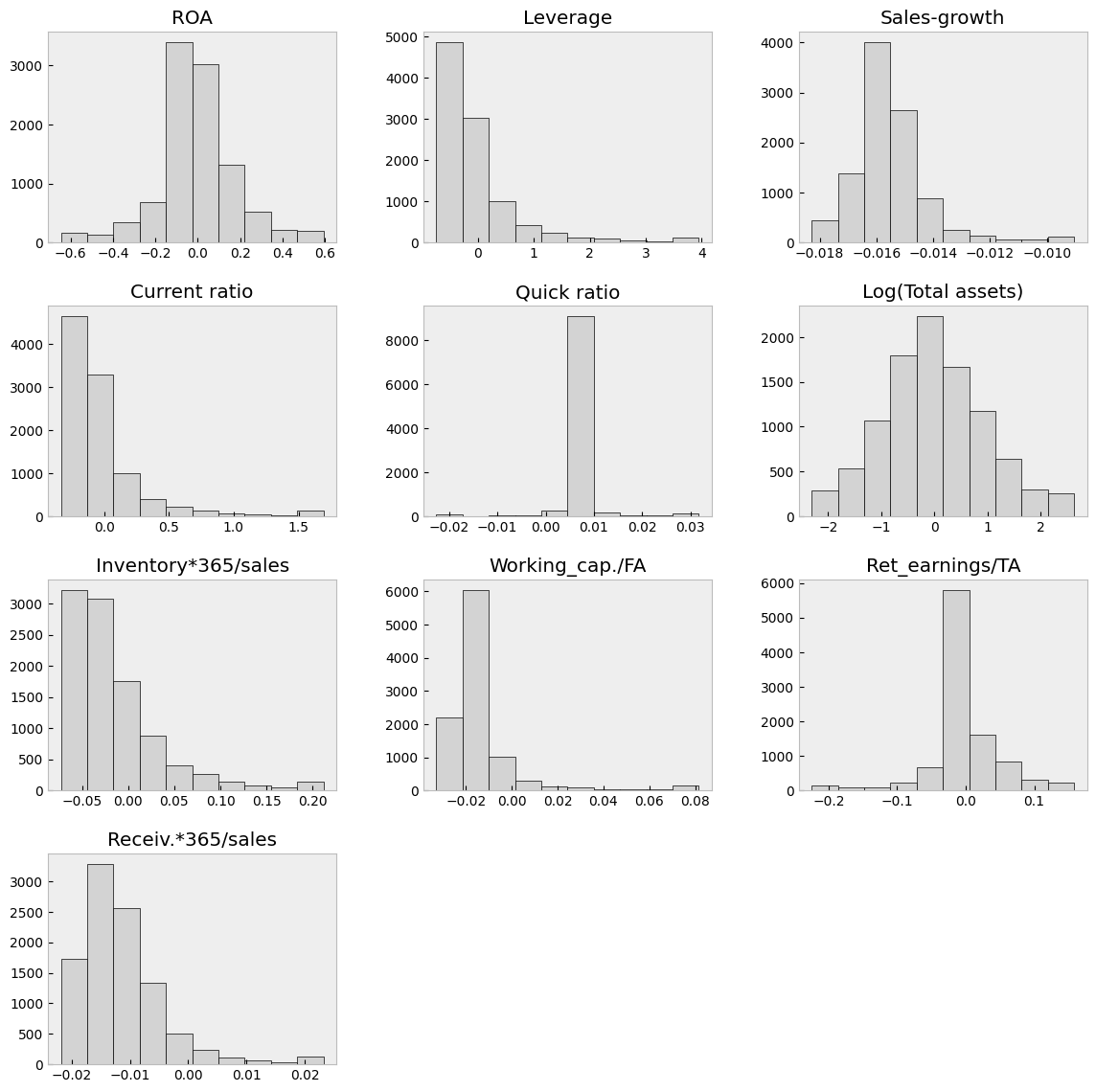
With the clip() method, you can winsorise the data. Here extreme values are moved to 1 % and 99 % quantiles.
table_df = table_df.clip(lower=table_df.quantile(0.01),upper=table_df.quantile(0.99),axis=1)
With hist() you can check the distributions quickly. The most problematic outliers have been removed by winsorisation.
table_df.hist(figsize=(14,14),grid=False,edgecolor='k',color='lightgray')
plt.show()
With corr() you can check the correlations. There is multicollinearity present, but for example with ensemble methods, multicollinearity is much less of a problem.
table_df.corr()
| ROA | Leverage | Sales-growth | Current ratio | Quick ratio | Log(Total assets) | Inventory*365/sales | Working_cap./FA | Ret_earnings/TA | Receiv.*365/sales | |
|---|---|---|---|---|---|---|---|---|---|---|
| ROA | 1.000000 | 0.253631 | 0.198471 | 0.239780 | 0.073774 | -0.022929 | -0.199351 | 0.196581 | 0.482101 | -0.088218 |
| Leverage | 0.253631 | 1.000000 | -0.062703 | 0.678369 | 0.137512 | 0.092470 | 0.017957 | 0.160163 | 0.277234 | -0.007704 |
| Sales-growth | 0.198471 | -0.062703 | 1.000000 | -0.050987 | 0.008612 | 0.124345 | -0.080525 | 0.018245 | 0.008116 | -0.018546 |
| Current ratio | 0.239780 | 0.678369 | -0.050987 | 1.000000 | 0.175938 | -0.055648 | 0.143823 | 0.410471 | 0.169986 | 0.097054 |
| Quick ratio | 0.073774 | 0.137512 | 0.008612 | 0.175938 | 1.000000 | -0.009259 | -0.067865 | 0.095739 | 0.071122 | 0.026820 |
| Log(Total assets) | -0.022929 | 0.092470 | 0.124345 | -0.055648 | -0.009259 | 1.000000 | 0.065786 | -0.164808 | 0.199229 | 0.116596 |
| Inventory*365/sales | -0.199351 | 0.017957 | -0.080525 | 0.143823 | -0.067865 | 0.065786 | 1.000000 | 0.107654 | -0.109237 | 0.154436 |
| Working_cap./FA | 0.196581 | 0.160163 | 0.018245 | 0.410471 | 0.095739 | -0.164808 | 0.107654 | 1.000000 | 0.104543 | 0.167565 |
| Ret_earnings/TA | 0.482101 | 0.277234 | 0.008116 | 0.169986 | 0.071122 | 0.199229 | -0.109237 | 0.104543 | 1.000000 | -0.052223 |
| Receiv.*365/sales | -0.088218 | -0.007704 | -0.018546 | 0.097054 | 0.026820 | 0.116596 | 0.154436 | 0.167565 | -0.052223 | 1.000000 |
The predictors are everything else but ROA, which is our predicted variable.
X = table_df.drop(['ROA'],axis=1)
y = table_df['ROA']
from sklearn.model_selection import train_test_split
Let’s make things difficult for OLS (very small train set). Here we use only 1 % of the data for training to demonstrate the strengths of ridge and lasso regression, when n is close to p.
# Split data into training and test sets
X_train, X_test , y_train, y_test = train_test_split(X, y, test_size=0.99, random_state=1)
len(X_train)
100
9.6.2. Linear model#
Although Scikit-learn is a ML library, it is possible to do a basic linear regression analysis with it.
import sklearn.linear_model as sk_lm
We define our LinearRegression object.
model = sk_lm.LinearRegression()
fit() can be used to fit the data.
model.fit(X_train,y_train)
LinearRegression()In a Jupyter environment, please rerun this cell to show the HTML representation or trust the notebook.
On GitHub, the HTML representation is unable to render, please try loading this page with nbviewer.org.
LinearRegression()
coef_ -attribute has the coefficients of each variable and intercept_ has the intercept of the linear regression model.
model.coef_
array([ 5.00866828e-03, -2.41088156e+01,  1.98032525e-01,  6.53067810e-01,
       -8.16072702e-03, -5.42952699e-01,  1.90808090e+00,  1.53780138e+00,
       -3.16025044e+00])
model.intercept_
np.float64(-0.3776512156922908)
score() can be used to measure the coefficient of determination \(R^2\) of the trained model. How much our variables are explaining of the variation of the predicted variable.
model.score(X_test,y_test)
0.1506799652017382
Mean squared error can be used to the measure the performance. Less is better.
from sklearn.metrics import mean_squared_error
mean_squared_error(y_test,model.predict(X_test))
0.029697082718667278
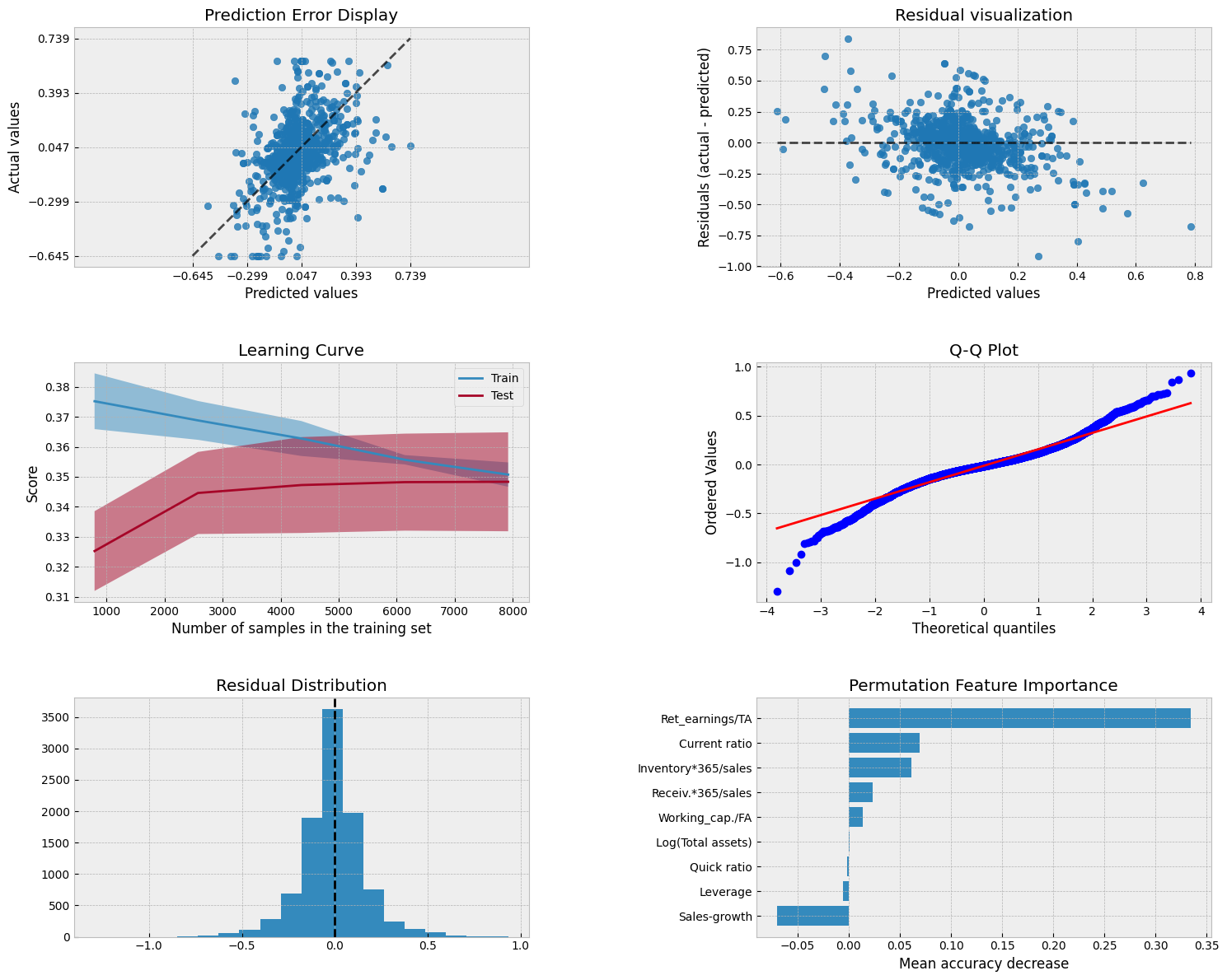
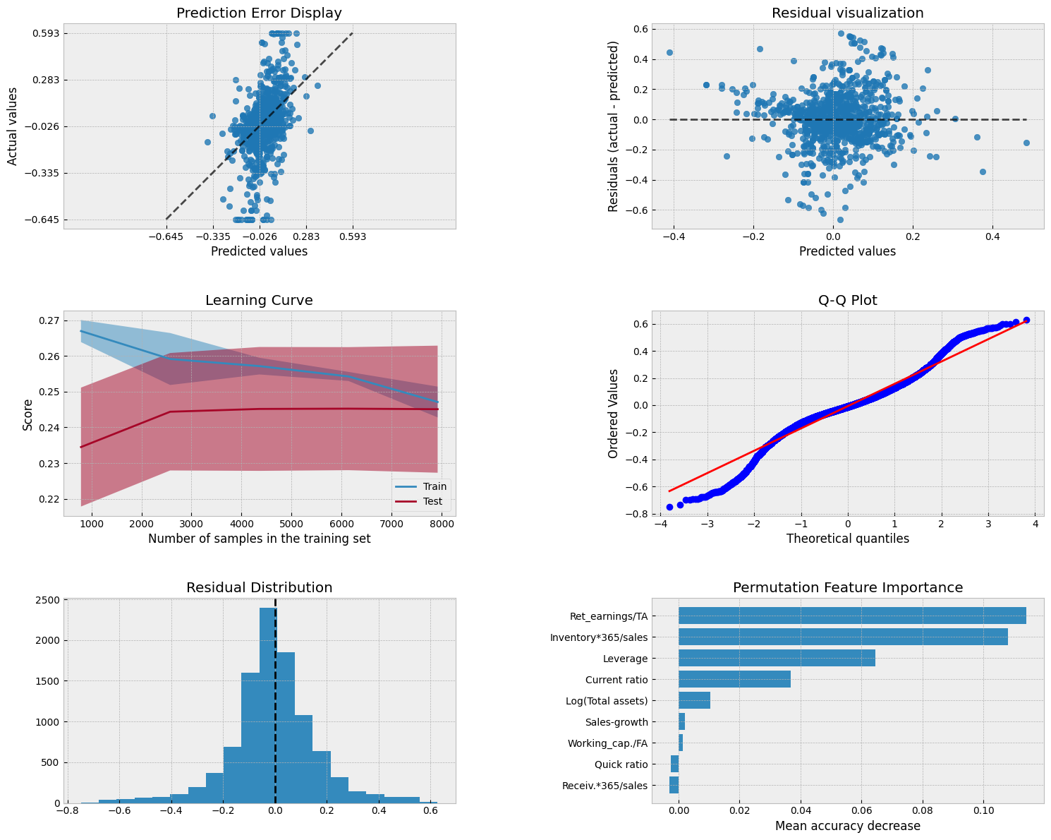
A collection of visualizations for model analysis.
plt.style.use('bmh')
Show code cell source
from sklearn.metrics import PredictionErrorDisplay
from sklearn.model_selection import LearningCurveDisplay
from sklearn.inspection import permutation_importance, PartialDependenceDisplay
from scipy import stats

fig, axs = plt.subplots(3, 2, figsize=(15, 12))
# Prediction Error Display
PredictionErrorDisplay.from_estimator(model, X_test, y_test, kind='actual_vs_predicted',ax=axs[0, 0])
axs[0, 0].set_title('Prediction Error Display')
# Residual visualization
PredictionErrorDisplay.from_estimator(model, X_test, y_test, kind='residual_vs_predicted',ax=axs[0, 1])
axs[0, 1].set_title('Residual visualization')
# Learning Curve
LearningCurveDisplay.from_estimator(model, X_test, y_test, cv=5, ax=axs[1,0])
axs[1, 0].set_title('Learning Curve')
# QQ Plot for normality of residuals
residuals = y_test - model.predict(X_test)
stats.probplot(residuals, plot=axs[1, 1])
axs[1, 1].set_title('Q-Q Plot')
# Residual histogram
axs[2, 0].hist(residuals, bins=20)
axs[2, 0].axvline(x=0, color='k', linestyle='--')
axs[2, 0].set_title('Residual Distribution')
# Permutation importance
result = permutation_importance(model, X_test, y_test, n_repeats=15, random_state=42)
sorted_idx = result.importances_mean.argsort()
feature_names = np.array(X_test.columns)
axs[2, 1].barh(feature_names[sorted_idx], result.importances_mean[sorted_idx])
axs[2, 1].set_title("Permutation Feature Importance")
axs[2, 1].set_xlabel("Mean accuracy decrease")

plt.tight_layout()
plt.subplots_adjust(wspace=0.5, hspace=0.4)
Show code cell source
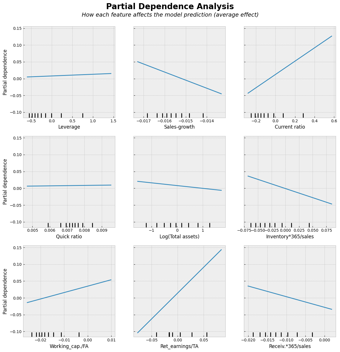
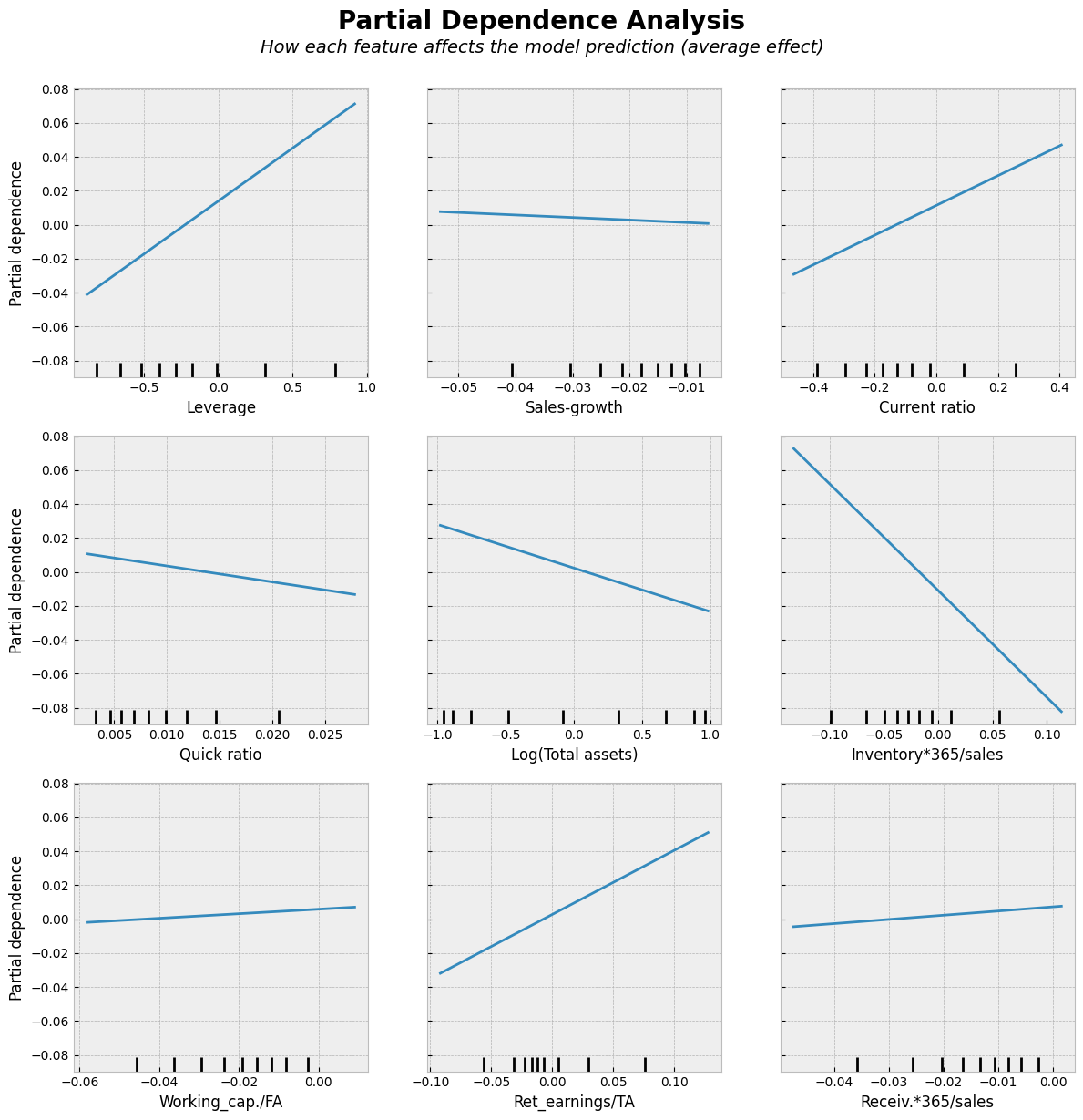
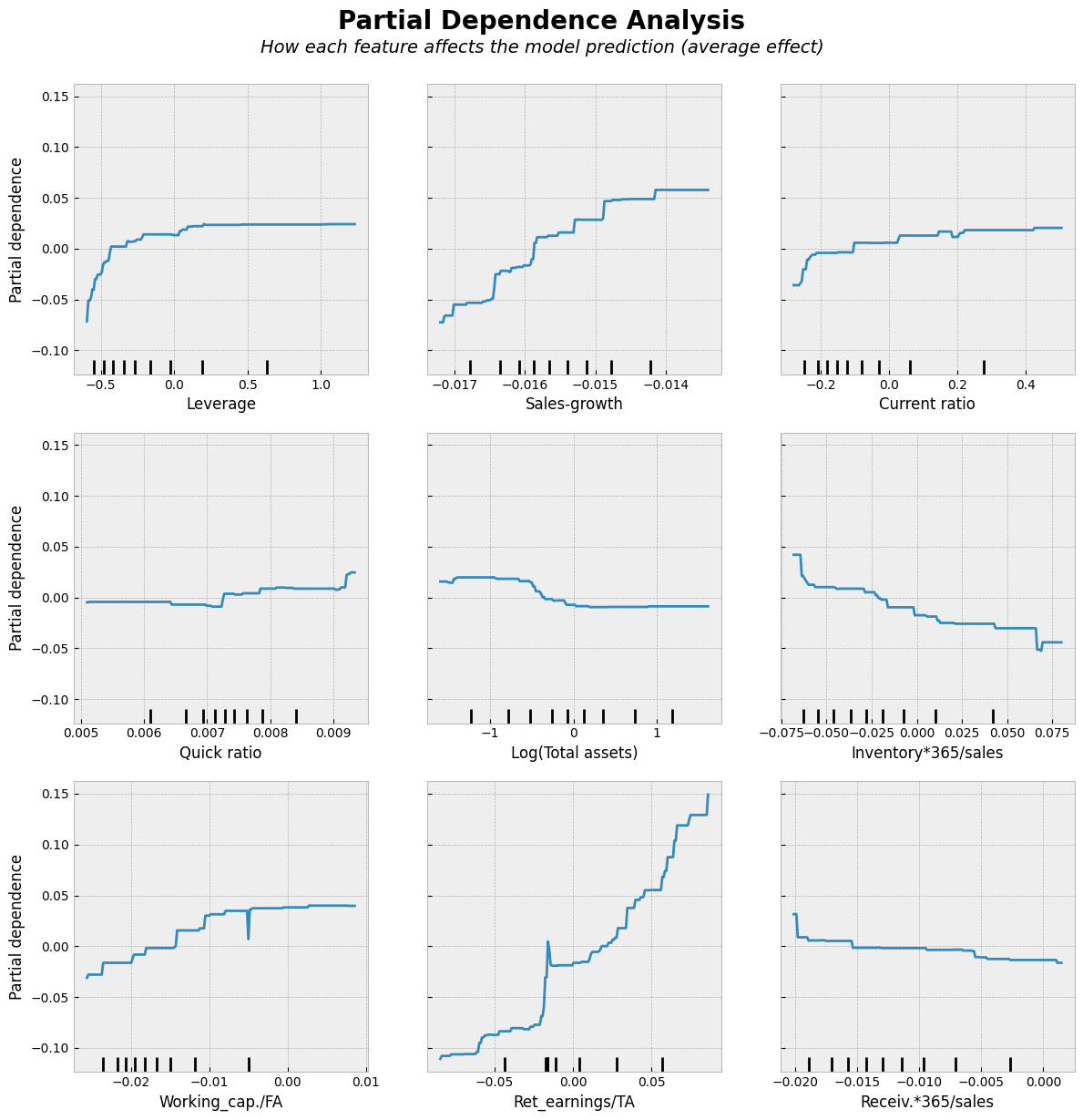
# Partial Dependence Plots
fig, ax = plt.subplots(figsize=(12, 12))
PartialDependenceDisplay.from_estimator(model, X_test, features=X_test.columns,kind='average', ax=ax, n_jobs=-1)
# Add a main title
plt.suptitle("Partial Dependence Analysis", fontsize=20, fontweight='bold', y=1.02)
# Add a subtitle with explanation
fig.text(0.5, 0.98,
         "How each feature affects the model prediction (average effect)",
         ha='center', fontsize=14, fontstyle='italic')
plt.tight_layout()
plt.show()
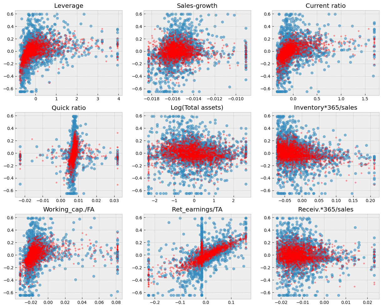
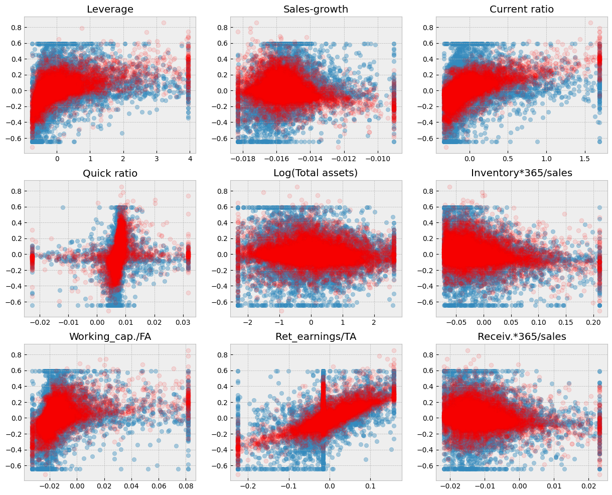
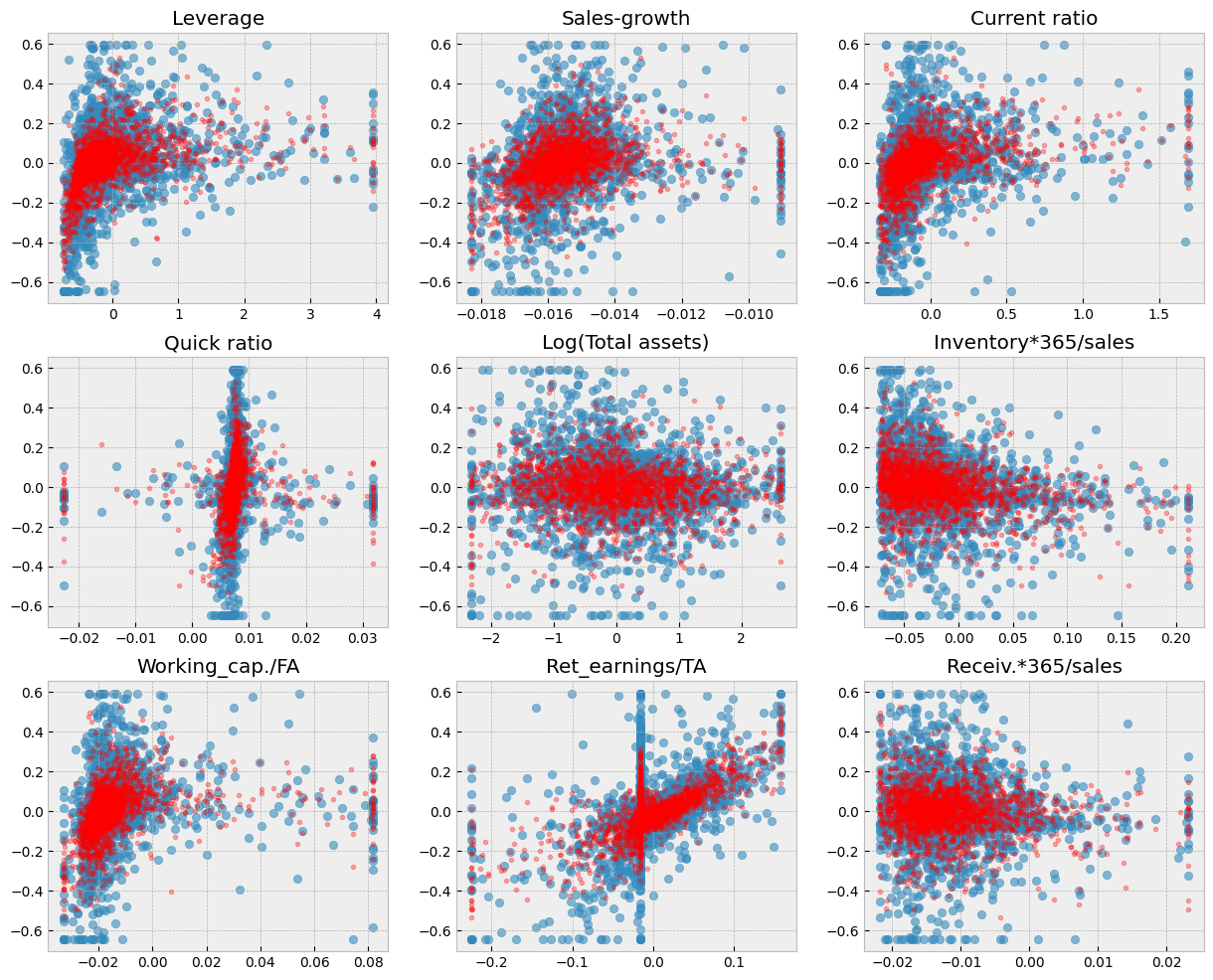
A short code to draw scatter charts between every feature and ROA. The blue dots are the correct values and the red dots are the predictions of the model.
Show code cell source
# Blue dots visualize the true test observations. Red dots visualize the predictions. Separately for each variable.
fig, axs = plt.subplots(3,3,figsize=(15,12))
for ax,feature in zip(axs.flat,X_test.columns):
    ax.scatter(X_test[feature],y_test,alpha=0.4)
    ax.plot(X_test[feature],model.predict(X_test),'ro',alpha=0.1)
    ax.set_title(feature)
plt.subplots_adjust(hspace=0.2)
9.6.3. Ridge regression#
Ridge regression counters overfitting by adding a penalty on the size if the coefficients of the standard linear regression model. So it is a regularisation method.
We can use Scikit-learnn’s Ridge() function. The alpha parameter needs to be set by trial-and-error.
ridge = sk_lm.Ridge(alpha=0.001)
Otherwise similar steps. Define the object, use the fit() function, analyse the results with coef_, intercept_, score() and mean_squared_error(). It is important to normalize input variables when doing Ridge or Lasso regression.
from sklearn.preprocessing import normalize
X_train_norm = normalize(X_train)
X_test_norm = normalize(X_test)
X_train_norm = pd.DataFrame(X_train_norm,columns=X_train.columns)
X_test_norm = pd.DataFrame(X_test_norm,columns=X_test.columns)
ridge.fit(X_train_norm,y_train)
Ridge(alpha=0.001)In a Jupyter environment, please rerun this cell to show the HTML representation or trust the notebook.
On GitHub, the HTML representation is unable to render, please try loading this page with nbviewer.org.
Ridge(alpha=0.001)
ridge.coef_
array([ 0.06235274, -0.14833426,  0.08760418, -0.94299436, -0.02571128,
       -0.62884628,  0.13335426,  0.37800276,  0.24664749])
ridge.intercept_
np.float64(0.020581650904721017)
The coefficient of determination is now slightly better (linear regression ~0.151).
ridge.score(X_test_norm,y_test)
0.1892276652551177
MSE has also improved.
mean_squared_error(y_test,ridge.predict(X_test_norm))
0.02834923480481052
Show code cell source
from sklearn.metrics import PredictionErrorDisplay
from sklearn.model_selection import LearningCurveDisplay
from sklearn.inspection import permutation_importance, PartialDependenceDisplay
from scipy import stats

fig, axs = plt.subplots(3, 2, figsize=(15, 12))
# Prediction Error Display
PredictionErrorDisplay.from_estimator(ridge, X_test_norm, y_test, kind='actual_vs_predicted',ax=axs[0, 0])
axs[0, 0].set_title('Prediction Error Display')
# Residual visualization
PredictionErrorDisplay.from_estimator(ridge, X_test_norm, y_test, kind='residual_vs_predicted',ax=axs[0, 1])
axs[0, 1].set_title('Residual visualization')
# Learning Curve
LearningCurveDisplay.from_estimator(ridge, X_test_norm, y_test, cv=5, ax=axs[1,0])
axs[1, 0].set_title('Learning Curve')
# QQ Plot for normality of residuals
residuals = y_test - ridge.predict(X_test_norm)
stats.probplot(residuals, plot=axs[1, 1])
axs[1, 1].set_title('Q-Q Plot')
# Residual histogram
axs[2, 0].hist(residuals, bins=20)
axs[2, 0].axvline(x=0, color='k', linestyle='--')
axs[2, 0].set_title('Residual Distribution')
# Permutation importance
result = permutation_importance(ridge, X_test_norm, y_test, n_repeats=15, random_state=42)
sorted_idx = result.importances_mean.argsort()
feature_names = np.array(X_test_norm.columns)
axs[2, 1].barh(feature_names[sorted_idx], result.importances_mean[sorted_idx])
axs[2, 1].set_title("Permutation Feature Importance")
axs[2, 1].set_xlabel("Mean accuracy decrease")

plt.tight_layout()
plt.subplots_adjust(wspace=0.5, hspace=0.4)
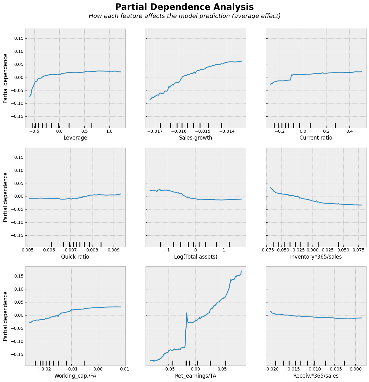
Partial dependence analysis is a simple approach to analyze the nature of the associations between the input variables and the output. Results are similar to linear regression lines. We use them here to make the comparison to the following non-linear models easier.
Show code cell source
# Partial Dependence Plots
fig, ax = plt.subplots(figsize=(12, 12))
PartialDependenceDisplay.from_estimator(ridge, X_test_norm, features=X_test_norm.columns,kind='average', ax=ax, n_jobs=-1)
# Add a main title
plt.suptitle("Partial Dependence Analysis", fontsize=20, fontweight='bold', y=1.02)
# Add a subtitle with explanation
fig.text(0.5, 0.98,
         "How each feature affects the model prediction (average effect)",
         ha='center', fontsize=14, fontstyle='italic')
plt.tight_layout()
plt.show()
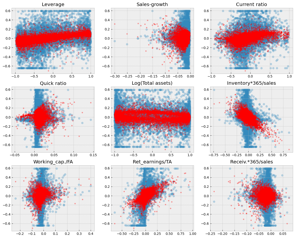
Ridge regression decreases the variation of predictions.
Show code cell source
fig, axs = plt.subplots(3,3,figsize=(15,12))
for ax,feature in zip(axs.flat,X_test_norm.columns):
    ax.scatter(X_test_norm[feature],y_test,alpha=0.3)
    ax.plot(X_test_norm[feature],ridge.predict(X_test_norm),'r.',alpha=0.3)
    ax.set_title(feature)
9.6.4. The LASSO#
Let’s try next the LASSO. It uses stronger regularisation (the absolute values of parameters in the regularisation term). We can use lassoCV() to search for the optimal alpha parameter. There is also similar ridgeCV() function for Ridge regression.
lassocv = sk_lm.LassoCV()
lassocv.fit(X_train_norm,y_train)
LassoCV()In a Jupyter environment, please rerun this cell to show the HTML representation or trust the notebook.
On GitHub, the HTML representation is unable to render, please try loading this page with nbviewer.org.
LassoCV()
Lasso is different in that it decreases the coefficients of variables more easily to zero.
lassocv.coef_
array([ 0.06351159,  0.        ,  0.07928428, -0.        , -0.02369421,
       -0.4455773 ,  0.        ,  0.28427514,  0.        ])
lassocv.intercept_
np.float64(0.011446435033164417)
lassocv.alpha_
np.float64(0.0010012581765732641)
Now the coefficient of determination is slightly better.
lassocv.score(X_test_norm,y_test)
0.19014083670700255
MSE
mean_squared_error(y_test,lassocv.predict(X_test_norm))
0.028317305111606718
Only five variables have some importance.
Show code cell source
from sklearn.metrics import PredictionErrorDisplay
from sklearn.model_selection import LearningCurveDisplay
from sklearn.inspection import permutation_importance, PartialDependenceDisplay
from scipy import stats

fig, axs = plt.subplots(3, 2, figsize=(15, 12))
# Prediction Error Display
PredictionErrorDisplay.from_estimator(lassocv, X_test_norm, y_test, kind='actual_vs_predicted',ax=axs[0, 0])
axs[0, 0].set_title('Prediction Error Display')
# Residual visualization
PredictionErrorDisplay.from_estimator(lassocv, X_test_norm, y_test, kind='residual_vs_predicted',ax=axs[0, 1])
axs[0, 1].set_title('Residual visualization')
# Learning Curve
LearningCurveDisplay.from_estimator(lassocv, X_test_norm, y_test, cv=5, ax=axs[1,0])
axs[1, 0].set_title('Learning Curve')
# QQ Plot for normality of residuals
residuals = y_test - lassocv.predict(X_test_norm)
stats.probplot(residuals, plot=axs[1, 1])
axs[1, 1].set_title('Q-Q Plot')
# Residual histogram
axs[2, 0].hist(residuals, bins=20)
axs[2, 0].axvline(x=0, color='k', linestyle='--')
axs[2, 0].set_title('Residual Distribution')
# Permutation importance
result = permutation_importance(lassocv, X_test_norm, y_test, n_repeats=15, random_state=42)
sorted_idx = result.importances_mean.argsort()
feature_names = np.array(X_test_norm.columns)
axs[2, 1].barh(feature_names[sorted_idx], result.importances_mean[sorted_idx])
axs[2, 1].set_title("Permutation Feature Importance")
axs[2, 1].set_xlabel("Mean accuracy decrease")

plt.tight_layout()
plt.subplots_adjust(wspace=0.5, hspace=0.4)
Four variables have been forced to zero effect.
Show code cell source
# Partial Dependence Plots
fig, ax = plt.subplots(figsize=(12, 12))
PartialDependenceDisplay.from_estimator(lassocv, X_test_norm, features=X_test_norm.columns,kind='average', ax=ax, n_jobs=-1)
# Add a main title
plt.suptitle("Partial Dependence Analysis", fontsize=20, fontweight='bold', y=1.02)
# Add a subtitle with explanation
fig.text(0.5, 0.98,
         "How each feature affects the model prediction (average effect)",
         ha='center', fontsize=14, fontstyle='italic')
plt.tight_layout()
plt.show()
As you can see from the figure below. Regularisation decreases the sizes of parameters and this decreases the variation of predictions.
Show code cell source
fig, axs = plt.subplots(3,3,figsize=(15,12))
for ax,feature in zip(axs.flat,X_test_norm.columns):
    ax.scatter(X_test_norm[feature],y_test,alpha=0.3)
    ax.plot(X_test_norm[feature],lassocv.predict(X_test_norm),'r.',alpha=0.3)
    ax.set_title(feature)
By using larger alpha value, we can force more variables to zero.
lasso_model = sk_lm.Lasso(alpha = 0.004)
lasso_model.fit(X_train_norm,y_train)
Lasso(alpha=0.004)In a Jupyter environment, please rerun this cell to show the HTML representation or trust the notebook.
On GitHub, the HTML representation is unable to render, please try loading this page with nbviewer.org.
Lasso(alpha=0.004)
Now only three coefficients in our model are different from zero.
lasso_model.coef_
array([ 0.07351905, -0.        ,  0.        ,  0.        , -0.02094018,
       -0.        ,  0.        ,  0.0989106 , -0.        ])
lasso_model.intercept_
np.float64(0.016749623054482285)
The score decreases because we are forcing alpha to be too large.
lasso_model.score(X_test_norm,y_test)
0.1018546453284247
mean_squared_error(y_test,lasso_model.predict(X_test_norm))
0.0314042949633279
Now the variation is even smaller.
Show code cell source
fig, axs = plt.subplots(3,3,figsize=(15,12))
for ax,feature in zip(axs.flat,X_test_norm.columns):
    ax.scatter(X_test_norm[feature],y_test,alpha=0.3)
    ax.plot(X_test_norm[feature],lasso_model.predict(X_test_norm),'r.',alpha=0.3)
    ax.set_title(feature)
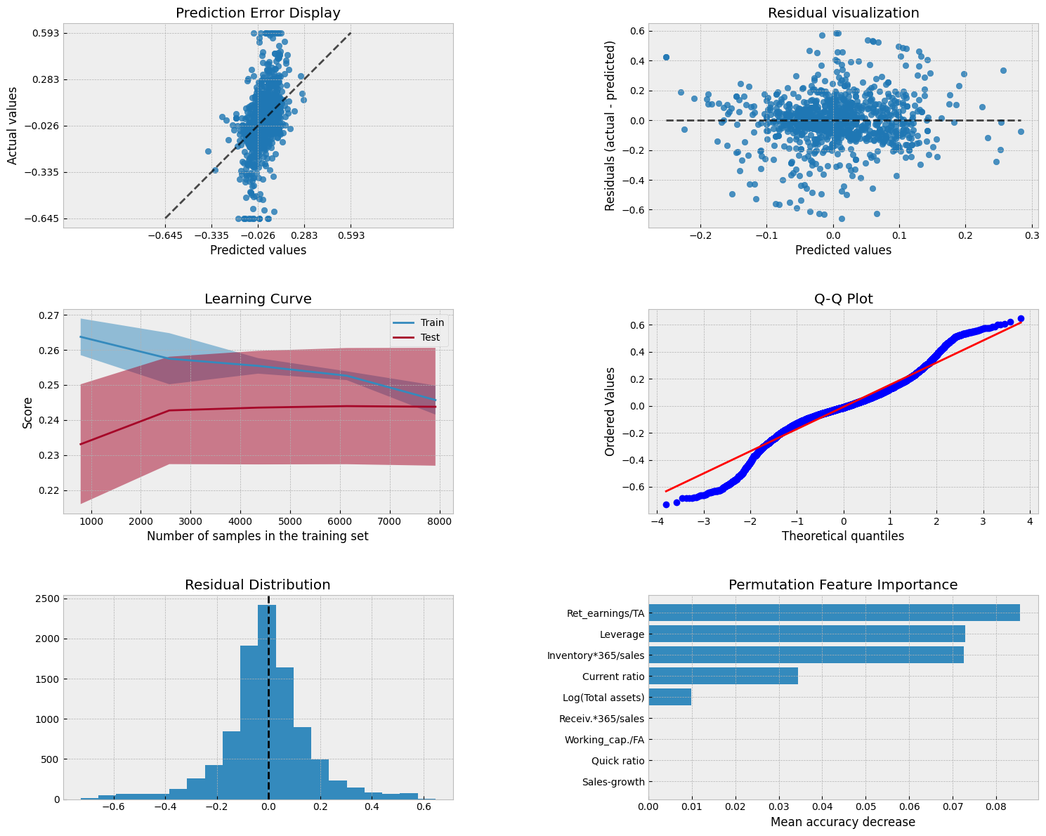
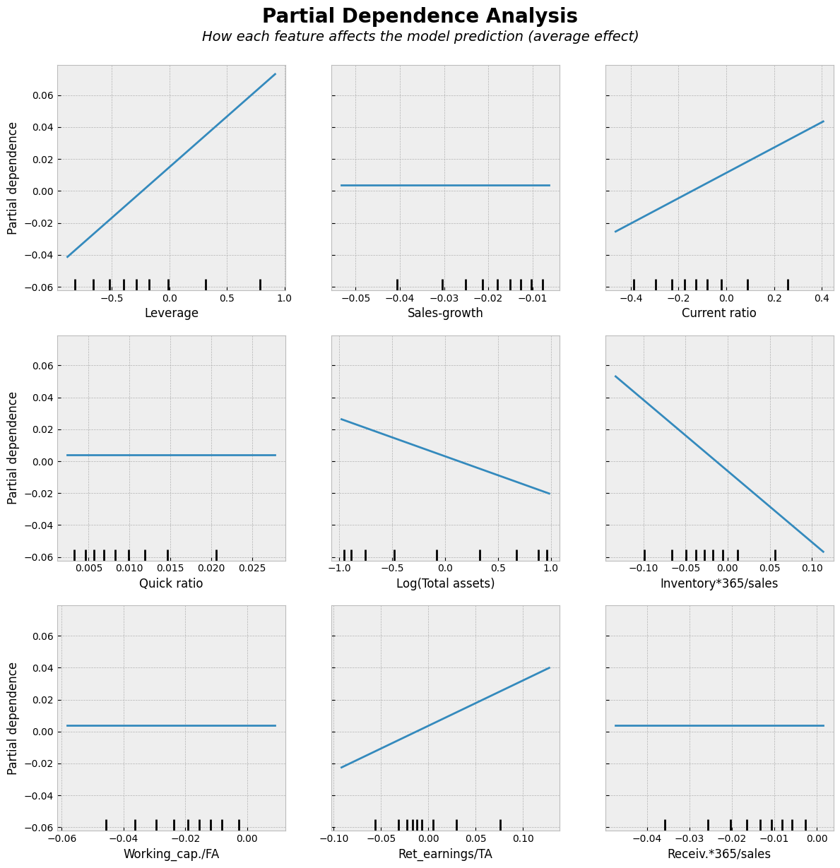
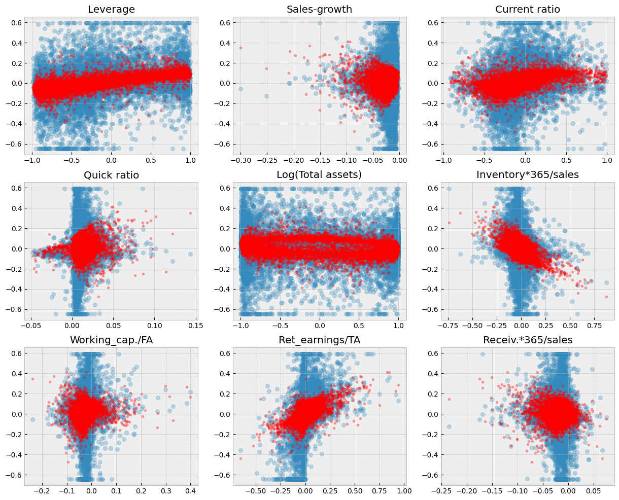
9.6.5. Linear reference model#
In the following, we use a more reasonable division between training and testing datasets. With so large data, there is no need for Ridge or Lasso regularisation and we use a basic linear model as a reference. 80% / 20% -split is commonly used.
# Split data into training and test sets
X_train, X_test , y_train, y_test = train_test_split(X, y, test_size=0.2, random_state=1)
The same steps as before.
ref_model = sk_lm.LinearRegression()
ref_model.fit(X_train,y_train)
LinearRegression()In a Jupyter environment, please rerun this cell to show the HTML representation or trust the notebook.
On GitHub, the HTML representation is unable to render, please try loading this page with nbviewer.org.
LinearRegression()
With 8000 observations (instead of 100) we get a much better model.
ref_model.score(X_test,y_test)
0.35927242049335284
mean_squared_error(y_test,ref_model.predict(X_test))
0.022682881912066605
9.6.6. Random forest#
Random forest has proven to be a very powerful prediction model.
from sklearn.ensemble import RandomForestRegressor
The strength of Scikit-learn is that the steps for building a model are similar for every model. Define an object, fit it to data, analyse the results. There are plenty of parameters in Random Forest. We go with the default ones.
r_forest_model = RandomForestRegressor(random_state=0)
r_forest_model.fit(X_train,y_train)
RandomForestRegressor(random_state=0)In a Jupyter environment, please rerun this cell to show the HTML representation or trust the notebook.
On GitHub, the HTML representation is unable to render, please try loading this page with nbviewer.org.
RandomForestRegressor(random_state=0)
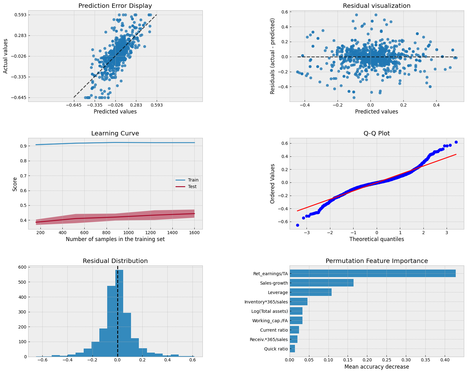
r_forest_model.score(X_test,y_test)
0.5143861482860328
The coefficient of determination and MSE are significantly better with the RF model.
mean_squared_error(y_test,r_forest_model.predict(X_test))
0.01719158345232034
Scikit-Learn has a feature_importances_ attribute to explain the importance of different parameters in explaining the predictions.
pd.DataFrame([X_train.columns,r_forest_model.feature_importances_]).transpose().sort_values(1,ascending=False)
| 0 | 1 | |
|---|---|---|
| 7 | Ret_earnings/TA | 0.325388 |
| 1 | Sales-growth | 0.134614 |
| 0 | Leverage | 0.114859 |
| 4 | Log(Total assets) | 0.087064 |
| 5 | Inventory*365/sales | 0.079201 |
| 6 | Working_cap./FA | 0.070863 |
| 2 | Current ratio | 0.063611 |
| 8 | Receiv.*365/sales | 0.062474 |
| 3 | Quick ratio | 0.061927 |
Show code cell source
from sklearn.metrics import PredictionErrorDisplay
from sklearn.model_selection import LearningCurveDisplay
from sklearn.inspection import permutation_importance, PartialDependenceDisplay
from scipy import stats

fig, axs = plt.subplots(3, 2, figsize=(15, 12))
# Prediction Error Display
PredictionErrorDisplay.from_estimator(r_forest_model, X_test, y_test, kind='actual_vs_predicted',ax=axs[0, 0])
axs[0, 0].set_title('Prediction Error Display')
# Residual visualization
PredictionErrorDisplay.from_estimator(r_forest_model, X_test, y_test, kind='residual_vs_predicted',ax=axs[0, 1])
axs[0, 1].set_title('Residual visualization')
# Learning Curve
LearningCurveDisplay.from_estimator(r_forest_model, X_test, y_test, cv=5, ax=axs[1,0])
axs[1, 0].set_title('Learning Curve')
# QQ Plot for normality of residuals
residuals = y_test - r_forest_model.predict(X_test)
stats.probplot(residuals, plot=axs[1, 1])
axs[1, 1].set_title('Q-Q Plot')
# Residual histogram
axs[2, 0].hist(residuals, bins=20)
axs[2, 0].axvline(x=0, color='k', linestyle='--')
axs[2, 0].set_title('Residual Distribution')
# Permutation importance
result = permutation_importance(r_forest_model, X_test, y_test, n_repeats=15, random_state=42)
sorted_idx = result.importances_mean.argsort()
feature_names = np.array(X_test.columns)
axs[2, 1].barh(feature_names[sorted_idx], result.importances_mean[sorted_idx])
axs[2, 1].set_title("Permutation Feature Importance")
axs[2, 1].set_xlabel("Mean accuracy decrease")

plt.tight_layout()
plt.subplots_adjust(wspace=0.5, hspace=0.4)
Show code cell source
# Partial Dependence Plots
fig, ax = plt.subplots(figsize=(12, 12))
PartialDependenceDisplay.from_estimator(r_forest_model, X_test, features=X_test.columns,kind='average', ax=ax, grid_resolution=200, n_jobs=-1)
# Add a main title
plt.suptitle("Partial Dependence Analysis", fontsize=20, fontweight='bold', y=1.02)
# Add a subtitle with explanation
fig.text(0.5, 0.98,
         "How each feature affects the model prediction (average effect)",
         ha='center', fontsize=14, fontstyle='italic')
plt.tight_layout()
plt.show()
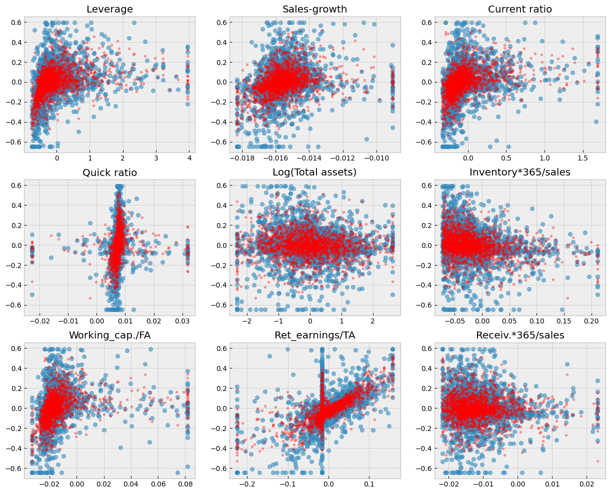
With the RF model, there is a much better fit between the predicted values and the correct test values.
Show code cell source
fig, axs = plt.subplots(3,3,figsize=(15,12))
for ax,feature in zip(axs.flat,X_test.columns):
    ax.scatter(X_test[feature],y_test,alpha=0.6)
    ax.plot(X_test[feature],r_forest_model.predict(X_test),'r.',alpha=0.3)
    ax.set_title(feature)
9.6.7. Gradient boosting#
Random forest and gradient boosting are often the best ensemble models in applications. The gradient boosting model is defined using the same steps.
from sklearn.ensemble import GradientBoostingRegressor
gradient_model = GradientBoostingRegressor(random_state=0)
gradient_model.fit(X_train,y_train)
GradientBoostingRegressor(random_state=0)In a Jupyter environment, please rerun this cell to show the HTML representation or trust the notebook.
On GitHub, the HTML representation is unable to render, please try loading this page with nbviewer.org.
GradientBoostingRegressor(random_state=0)
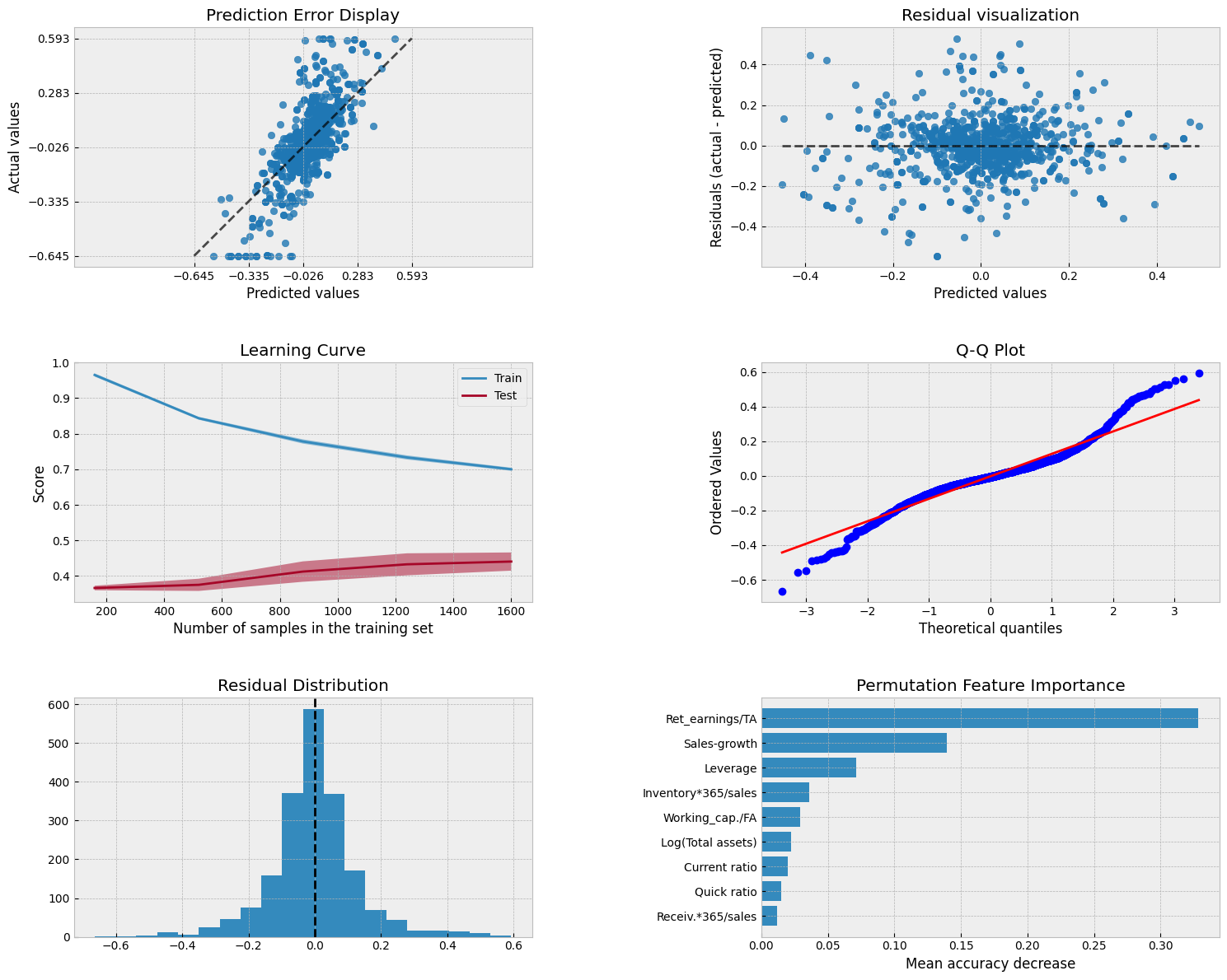
gradient_model.score(X_test,y_test)
0.496573284257973
The coefficient of determination and MSE are significantly better with the RF model.
mean_squared_error(y_test,gradient_model.predict(X_test))
0.017822190131644638
Scikit-Learn has a feature_importances_ attribute to explain the importance of different parameters in explaining the predictions.
pd.DataFrame([X_train.columns,gradient_model.feature_importances_]).transpose().sort_values(1,ascending=False)
| 0 | 1 | |
|---|---|---|
| 7 | Ret_earnings/TA | 0.454625 |
| 1 | Sales-growth | 0.14519 |
| 0 | Leverage | 0.133191 |
| 5 | Inventory*365/sales | 0.055701 |
| 6 | Working_cap./FA | 0.055443 |
| 4 | Log(Total assets) | 0.0507 |
| 2 | Current ratio | 0.046957 |
| 3 | Quick ratio | 0.039347 |
| 8 | Receiv.*365/sales | 0.018845 |
Show code cell source
from sklearn.metrics import PredictionErrorDisplay
from sklearn.model_selection import LearningCurveDisplay
from sklearn.inspection import permutation_importance, PartialDependenceDisplay
from scipy import stats

fig, axs = plt.subplots(3, 2, figsize=(15, 12))
# Prediction Error Display
PredictionErrorDisplay.from_estimator(gradient_model, X_test, y_test, kind='actual_vs_predicted',ax=axs[0, 0])
axs[0, 0].set_title('Prediction Error Display')
# Residual visualization
PredictionErrorDisplay.from_estimator(gradient_model, X_test, y_test, kind='residual_vs_predicted',ax=axs[0, 1])
axs[0, 1].set_title('Residual visualization')
# Learning Curve
LearningCurveDisplay.from_estimator(gradient_model, X_test, y_test, cv=5, ax=axs[1,0])
axs[1, 0].set_title('Learning Curve')
# QQ Plot for normality of residuals
residuals = y_test - gradient_model.predict(X_test)
stats.probplot(residuals, plot=axs[1, 1])
axs[1, 1].set_title('Q-Q Plot')
# Residual histogram
axs[2, 0].hist(residuals, bins=20)
axs[2, 0].axvline(x=0, color='k', linestyle='--')
axs[2, 0].set_title('Residual Distribution')
# Permutation importance
result = permutation_importance(gradient_model, X_test, y_test, n_repeats=15, random_state=42)
sorted_idx = result.importances_mean.argsort()
feature_names = np.array(X_test.columns)
axs[2, 1].barh(feature_names[sorted_idx], result.importances_mean[sorted_idx])
axs[2, 1].set_title("Permutation Feature Importance")
axs[2, 1].set_xlabel("Mean accuracy decrease")

plt.tight_layout()
plt.subplots_adjust(wspace=0.5, hspace=0.4)
Show code cell source
# Partial Dependence Plots
fig, ax = plt.subplots(figsize=(12, 12))
PartialDependenceDisplay.from_estimator(gradient_model, X_test, features=X_test.columns,kind='average', ax=ax, grid_resolution=200, n_jobs=-1)
# Add a main title
plt.suptitle("Partial Dependence Analysis", fontsize=20, fontweight='bold', y=1.02)
# Add a subtitle with explanation
fig.text(0.5, 0.98,
         "How each feature affects the model prediction (average effect)",
         ha='center', fontsize=14, fontstyle='italic')
plt.tight_layout()
plt.show()
Show code cell source
fig, axs = plt.subplots(3,3,figsize=(15,12))
for ax,feature in zip(axs.flat,X_test.columns):
    ax.scatter(X_test[feature],y_test,alpha=0.6)
    ax.plot(X_test[feature],gradient_model.predict(X_test),'r.',alpha=0.3)
    ax.set_title(feature)
9.6.8. Neural networks (multi-layer perceptron)#
from sklearn.neural_network import MLPRegressor
mlp_model = MLPRegressor(hidden_layer_sizes=(100),max_iter=5000)
mlp_model.fit(X_train,y_train)
MLPRegressor(hidden_layer_sizes=100, max_iter=5000)In a Jupyter environment, please rerun this cell to show the HTML representation or trust the notebook.
On GitHub, the HTML representation is unable to render, please try loading this page with nbviewer.org.
MLPRegressor(hidden_layer_sizes=100, max_iter=5000)
mlp_model.score(X_test,y_test)
0.38097833883818955
mean_squared_error(y_test,mlp_model.predict(X_test))
0.021914454270809153
Show code cell source
from sklearn.metrics import PredictionErrorDisplay
from sklearn.model_selection import LearningCurveDisplay
from sklearn.inspection import permutation_importance, PartialDependenceDisplay
from scipy import stats

fig, axs = plt.subplots(3, 2, figsize=(15, 12))
# Prediction Error Display
PredictionErrorDisplay.from_estimator(mlp_model, X_test, y_test, kind='actual_vs_predicted',ax=axs[0, 0])
axs[0, 0].set_title('Prediction Error Display')
# Residual visualization
PredictionErrorDisplay.from_estimator(mlp_model, X_test, y_test, kind='residual_vs_predicted',ax=axs[0, 1])
axs[0, 1].set_title('Residual visualization')
# Learning Curve
LearningCurveDisplay.from_estimator(mlp_model, X_test, y_test, cv=5, ax=axs[1,0])
axs[1, 0].set_title('Learning Curve')
# QQ Plot for normality of residuals
residuals = y_test - mlp_model.predict(X_test)
stats.probplot(residuals, plot=axs[1, 1])
axs[1, 1].set_title('Q-Q Plot')
# Residual histogram
axs[2, 0].hist(residuals, bins=20)
axs[2, 0].axvline(x=0, color='k', linestyle='--')
axs[2, 0].set_title('Residual Distribution')
# Permutation importance
result = permutation_importance(mlp_model, X_test, y_test, n_repeats=15, random_state=42)
sorted_idx = result.importances_mean.argsort()
feature_names = np.array(X_test.columns)
axs[2, 1].barh(feature_names[sorted_idx], result.importances_mean[sorted_idx])
axs[2, 1].set_title("Permutation Feature Importance")
axs[2, 1].set_xlabel("Mean accuracy decrease")

plt.tight_layout()
plt.subplots_adjust(wspace=0.5, hspace=0.4)
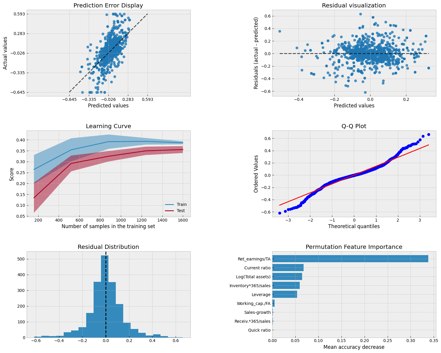
Show code cell source
# Partial Dependence Plots
fig, ax = plt.subplots(figsize=(12, 12))
PartialDependenceDisplay.from_estimator(mlp_model, X_test, features=X_test.columns,kind='average', ax=ax, grid_resolution=200, n_jobs=-1)
# Add a main title
plt.suptitle("Partial Dependence Analysis", fontsize=20, fontweight='bold', y=1.02)
# Add a subtitle with explanation
fig.text(0.5, 0.98,
         "How each feature affects the model prediction (average effect)",
         ha='center', fontsize=14, fontstyle='italic')
plt.tight_layout()
plt.show()
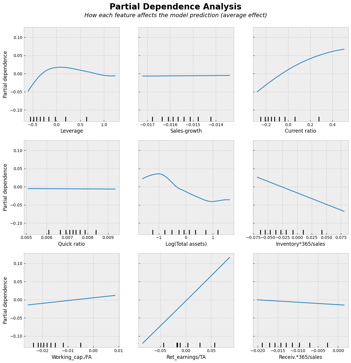
Show code cell source
fig, axs = plt.subplots(3,3,figsize=(15,12))
for ax,feature in zip(axs.flat,X_test.columns):
    ax.scatter(X_test[feature],y_test,alpha=0.6)
    ax.plot(X_test[feature],mlp_model.predict(X_test),'r.',alpha=0.3)
    ax.set_title(feature)