7. Basic statistics and time series analysis with Python#
This chapter shortly introduces the methods and libraries Python has to offer for basic statistics and time series analysis.
Let’s start by analysing what kind statistical functions Numpy has to offer. The selection is somewhat limited and usually it is better to use some other libraries for statistical analysis, like Pandas or Statsmodels. However, sometimes you have to use Numpy for data manipulations. For example, if your accounting datasets are very large, Numpy is the most efficient solution in Python. Therefore, it is also useful to know the basic statistical functions that Numpy has to offer. We will learn more about Numpy in the next chapter. Here we check only the main statistical functions.
import numpy as np
import matplotlib.pyplot as plt
plt.xkcd()
#plt.style.use('bmh')
<matplotlib.pyplot._xkcd at 0x1cecc63ed60>
The following function creates an array of random values from the normal distribution. The mean of the distribution is 0 and the standard deviation (scale) 1. The last parameter (5,3) defines the shape of the array.
array_np = np.random.normal(0,1,(5,3))
array_np
array([[ 1.88147694, -0.23012054,  0.4697334 ],
       [ 1.20887621, -0.59576469,  2.31689053],
       [ 0.83545298,  0.04339869, -1.03295269],
       [-0.32116686, -0.33231894,  0.25805056],
       [-0.10434287, -1.78014454, -0.43249477]])
The default is a statistic calculated from the whole array, but you can also define if you want them calculated for rows or colums.
array_np.mean() # The mean for the whole array
0.14563822735019785
array_np.mean(0) # The mean for the columns
array([ 0.70005928, -0.57899 , 0.31584541])
array_np.mean(1) # The mean for the rows
array([ 0.70702993, 0.97666735, -0.05136701, -0.13181174, -0.77232739])
Numpy also has the function to calculate the sum of the values.
array_np.sum()
2.184573410252968
Standard deviation
array_np.std()
1.0358116382691998
argmin and argmax return the position of the minimum and maximum value. By default, argmin and argmax return the index of a flattened array (transformed to one dimension). You can also define the axis.
array_np.argmin() # The position of the smallest value.
13
array_np.argmin(0) # The position of the largest value in columns.
array([3, 4, 2], dtype=int64)
array_np.argmin(1) # The position of the largest value in rows.
array([1, 1, 2, 1, 1], dtype=int64)
Cumulative sum of the array. cumsum() also flattens arrays by default.
array_np.cumsum()
array([1.88147694, 1.65135639, 2.1210898 , 3.32996601, 2.73420132,
       5.05109185, 5.88654483, 5.92994352, 4.89699082, 4.57582397,
       4.24350503, 4.50155559, 4.39721272, 2.61706818, 2.18457341])
plt.plot(array_np.cumsum())
plt.show()
7.1. Descriptive statistics with Pandas#
Pandas is much more versatile for statistical calculations than Numpy, and should be used if there is no specific reason to use Numpy. Let’s load a more interesting dataset to analyse.
import pandas as pd
stat_df = pd.read_csv('stat_data.csv',index_col=0)
stat_df
| NAME | DIV. YIELD | ROE (%) | R&D/SALES (%) | CoGS/SALES - 5 Y (%) | SG%A/SALES 5Y (%) | ACCOUNTING STANDARD | Accounting Controversies | Basis of EPS data | INDUSTRY GROUP | IBES COUNTRY CODE | |
|---|---|---|---|---|---|---|---|---|---|---|---|
| 0 | APPLE | 0.71 | 55.92 | 4.95 | 56.64 | 6.53 | US standards (GAAP) | N | NaN | 4030.0 | US |
| 1 | SAUDI ARABIAN OIL | 0.21 | 32.25 | NaN | NaN | NaN | IFRS | N | EPS | 5880.0 | FW |
| 2 | MICROSOFT | 1.07 | 40.14 | 13.59 | 26.46 | 19.56 | US standards (GAAP) | N | NaN | 4080.0 | US |
| 3 | AMAZON.COM | 0.00 | 21.95 | 12.29 | 56.82 | 21.28 | US standards (GAAP) | N | NaN | 7091.0 | US |
| 4 | FACEBOOK CLASS A | 0.00 | 19.96 | 21.00 | 7.06 | 20.42 | US standards (GAAP) | N | NaN | 8580.0 | US |
| ... | ... | ... | ... | ... | ... | ... | ... | ... | ... | ... | ... |
| 295 | BHP GROUP | 4.23 | 16.61 | NaN | 45.50 | NaN | IFRS | N | IFRS | 5210.0 | EX |
| 296 | CITIC SECURITIES 'A' | 1.67 | 7.77 | NaN | 10.91 | 27.44 | IFRS | N | EPS | 4395.0 | FC |
| 297 | EDWARDS LIFESCIENCES | 0.00 | 28.73 | 16.09 | 23.33 | 30.22 | US standards (GAAP) | N | NaN | 3440.0 | US |
| 298 | GREE ELECT.APP. 'A' | 2.25 | 24.52 | NaN | 66.35 | 14.94 | Local standards | N | EPS | 3720.0 | FC |
| 299 | HOUSING DEVELOPMENT FINANCE CORPORATION | 1.08 | 18.17 | NaN | 4.74 | 23.90 | Local standards | N | EPS | 4390.0 | FI |
300 rows × 11 columns
stat_df.set_index('NAME',inplace=True) # Set the NAME variable as index of the dataframe
Usually, the default setting with the Pandas statistical functions is that they calculate column statistics. For example, here is the sum function (does not make much sense here).
stat_df.sum()
DIV. YIELD                  695.563
ROE (%)                   40278.820
R&D/SALES (%)              1368.340
CoGS/SALES - 5 Y (%)      11247.840
SG%A/SALES 5Y (%)          5384.550
INDUSTRY GROUP          1521606.000
dtype: float64
With axis=1, you can calculate also row-sums.
stat_df.sum(axis=1)
NAME
APPLE                                      4154.75
SAUDI ARABIAN OIL                          5912.46
MICROSOFT                                  4180.82
AMAZON.COM                                 7203.34
FACEBOOK CLASS A                           8648.44
                                            ...
BHP GROUP                                  5276.34
CITIC SECURITIES 'A'                       4442.79
EDWARDS LIFESCIENCES                       3538.37
GREE ELECT.APP. 'A'                        3828.06
HOUSING DEVELOPMENT FINANCE CORPORATION    4437.89
Length: 300, dtype: float64
There is also a cumulative sum similar to Numpy’s equivalent. Notice that it calculates the cumulative sum series for columns by default.
stat_df[['DIV. YIELD','ROE (%)']].cumsum()
| DIV. YIELD | ROE (%) | |
|---|---|---|
| NAME | ||
| APPLE | 0.710 | 55.92 |
| SAUDI ARABIAN OIL | 0.920 | 88.17 |
| MICROSOFT | 1.990 | 128.31 |
| AMAZON.COM | 1.990 | 150.26 |
| FACEBOOK CLASS A | 1.990 | 170.22 |
| ... | ... | ... |
| BHP GROUP | 690.563 | 40199.63 |
| CITIC SECURITIES 'A' | 692.233 | 40207.40 |
| EDWARDS LIFESCIENCES | 692.233 | 40236.13 |
| GREE ELECT.APP. 'A' | 694.483 | 40260.65 |
| HOUSING DEVELOPMENT FINANCE CORPORATION | 695.563 | 40278.82 |
300 rows × 2 columns
The mean value of the columns. Notice how non-numerical columns are automatically excluded.
stat_df.mean()
DIV. YIELD                 2.318543
ROE (%)                  138.415189
R&D/SALES (%)              8.096686
CoGS/SALES - 5 Y (%)      44.109176
SG%A/SALES 5Y (%)         22.815890
INDUSTRY GROUP          5088.983278
dtype: float64
By default, NA values are excluded. You can prevent that using skipna=False.
stat_df.mean(skipna=False)
DIV. YIELD              2.318543
ROE (%)                      NaN
R&D/SALES (%)                NaN
CoGS/SALES - 5 Y (%)         NaN
SG%A/SALES 5Y (%)            NaN
INDUSTRY GROUP               NaN
dtype: float64
idxmin and idxmax can be used to locate the maximum and minimum values along the specified axis. It does not work with string-values, so we restrict the columns.
stat_df[['DIV. YIELD', 'ROE (%)', 'R&D/SALES (%)',
       'CoGS/SALES - 5 Y (%)', 'SG%A/SALES 5Y (%)']].idxmax()
DIV. YIELD                               BP
ROE (%)                       COLGATE-PALM.
R&D/SALES (%)                VERTEX PHARMS.
CoGS/SALES - 5 Y (%)    CHINA PTL.& CHM.'A'
SG%A/SALES 5Y (%)       SEA 'A' SPN.ADR 1:1
dtype: object
Describe() is the main tool for descriptive statistics.
stat_df.describe()
| DIV. YIELD | ROE (%) | R&D/SALES (%) | CoGS/SALES - 5 Y (%) | SG%A/SALES 5Y (%) | INDUSTRY GROUP | |
|---|---|---|---|---|---|---|
| count | 300.000000 | 291.000000 | 169.000000 | 255.000000 | 236.000000 | 299.000000 |
| mean | 2.318543 | 138.415189 | 8.096686 | 44.109176 | 22.815890 | 5088.983278 |
| std | 2.357387 | 1850.606330 | 8.510284 | 21.754619 | 14.707107 | 2079.357337 |
| min | 0.000000 | -318.250000 | 0.070000 | 0.000000 | 0.800000 | 1320.000000 |
| 25% | 0.580000 | 9.345000 | 1.700000 | 27.620000 | 11.675000 | 3440.000000 |
| 50% | 1.665000 | 16.460000 | 4.950000 | 45.380000 | 20.950000 | 4370.000000 |
| 75% | 3.287500 | 27.415000 | 12.790000 | 60.520000 | 30.167500 | 7030.000000 |
| max | 13.130000 | 31560.000000 | 59.980000 | 87.170000 | 89.880000 | 8592.000000 |
You can also use describe for string-data.
stat_df['ACCOUNTING STANDARD'].describe()
count                     297
unique                      3
top       US standards (GAAP)
freq                      160
Name: ACCOUNTING STANDARD, dtype: object
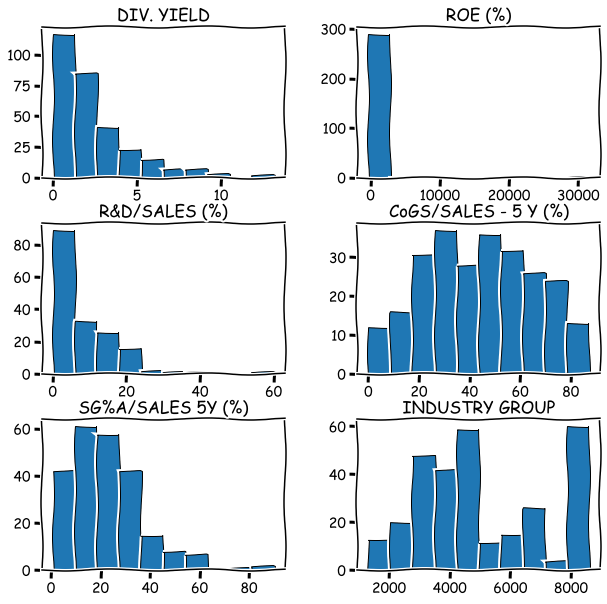
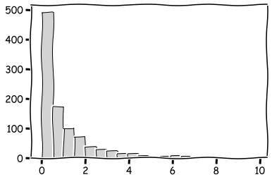
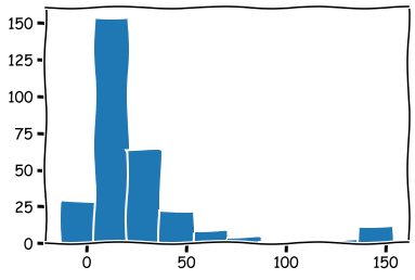
Quick histograms are easy to draw with Pandas hist().
import matplotlib.pyplot as plt
stat_df.hist(figsize=(10,10),grid=False,edgecolor='k')
plt.show()
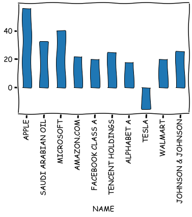
It is also easy to draw bar plots, line plots, etc. from variables.
stat_df.iloc[0:10]['ROE (%)'].plot.bar(grid=False,edgecolor='k')
plt.show()
Pandas also has functions for quantiles, median, mean absolute deviation, variance, st. dev., skewness, kurtosis etc.
stat_df.median()
DIV. YIELD                 1.665
ROE (%)                   16.460
R&D/SALES (%)              4.950
CoGS/SALES - 5 Y (%)      45.380
SG%A/SALES 5Y (%)         20.950
INDUSTRY GROUP          4370.000
dtype: float64
stat_df.std()
DIV. YIELD                 2.357387
ROE (%)                 1850.606330
R&D/SALES (%)              8.510284
CoGS/SALES - 5 Y (%)      21.754619
SG%A/SALES 5Y (%)         14.707107
INDUSTRY GROUP          2079.357337
dtype: float64
stat_df.skew()
DIV. YIELD               1.613739
ROE (%)                 16.995965
R&D/SALES (%)            2.052940
CoGS/SALES - 5 Y (%)    -0.023779
SG%A/SALES 5Y (%)        1.282915
INDUSTRY GROUP           0.433038
dtype: float64
stat_df.kurt()
DIV. YIELD                3.045584
ROE (%)                 289.548386
R&D/SALES (%)             7.757465
CoGS/SALES - 5 Y (%)     -0.895532
SG%A/SALES 5Y (%)         2.793218
INDUSTRY GROUP           -1.026390
dtype: float64
stat_df.mad() # Mean absolute deviation
DIV. YIELD                 1.754535
ROE (%)                  232.701188
R&D/SALES (%)              6.541208
CoGS/SALES - 5 Y (%)      18.349461
SG%A/SALES 5Y (%)         11.128403
INDUSTRY GROUP          1787.992573
dtype: float64
There are also functions for first differences (diff) and percentage changes (pct_change) that are useful for time series. We check them more closely when we discuss time series.
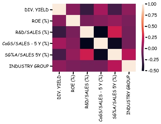
A correlation matrix can be calculated with corr().
stat_df.corr()
| DIV. YIELD | ROE (%) | R&D/SALES (%) | CoGS/SALES - 5 Y (%) | SG%A/SALES 5Y (%) | INDUSTRY GROUP | |
|---|---|---|---|---|---|---|
| DIV. YIELD | 1.000000 | -0.005395 | -0.296876 | 0.090552 | -0.246277 | 0.020287 |
| ROE (%) | -0.005395 | 1.000000 | -0.059943 | -0.018829 | 0.037760 | -0.051351 |
| R&D/SALES (%) | -0.296876 | -0.059943 | 1.000000 | -0.525651 | 0.243388 | -0.076826 |
| CoGS/SALES - 5 Y (%) | 0.090552 | -0.018829 | -0.525651 | 1.000000 | -0.478954 | -0.069946 |
| SG%A/SALES 5Y (%) | -0.246277 | 0.037760 | 0.243388 | -0.478954 | 1.000000 | 0.169234 |
| INDUSTRY GROUP | 0.020287 | -0.051351 | -0.076826 | -0.069946 | 0.169234 | 1.000000 |
Seaborn can be used to visualise the correlation matrix.
import seaborn as sns
sns.heatmap(stat_df.corr())
plt.show()
There is also a function for covariance.
stat_df.cov()
| DIV. YIELD | ROE (%) | R&D/SALES (%) | CoGS/SALES - 5 Y (%) | SG%A/SALES 5Y (%) | INDUSTRY GROUP | |
|---|---|---|---|---|---|---|
| DIV. YIELD | 5.557272 | -2.353205e+01 | -6.218173 | 4.458371 | -8.101883 | 9.944971e+01 |
| ROE (%) | -23.532053 | 3.424744e+06 | -1230.260093 | -815.944421 | 1151.251649 | -1.970465e+05 |
| R&D/SALES (%) | -6.218173 | -1.230260e+03 | 72.424937 | -93.699026 | 30.348468 | -1.296751e+03 |
| CoGS/SALES - 5 Y (%) | 4.458371 | -8.159444e+02 | -93.699026 | 473.263467 | -152.229721 | -3.340919e+03 |
| SG%A/SALES 5Y (%) | -8.101883 | 1.151252e+03 | 30.348468 | -152.229721 | 216.298997 | 5.397233e+03 |
| INDUSTRY GROUP | 99.449713 | -1.970465e+05 | -1296.750542 | -3340.919268 | 5397.233215 | 4.323727e+06 |
If you want to calculate correlations between two dataframes, you can use corr_with().
To collect the unique values of a Pandas series, you can use unique().
stat_df['IBES COUNTRY CODE'].unique()
array(['  US', '  FW', '  FH', '  FA', '  ES', '  FC', '  FK', '  EF',
       '  FJ', '  ED', '  FI', '  EN', '  EX', '  EZ', '  SD', '  CN',
       '  EI', '  EB', '  AA', '  EE', '  KS', nan, '  LB', '  ER',
       '  SN', '  LA', '  SS', '  FL'], dtype=object)
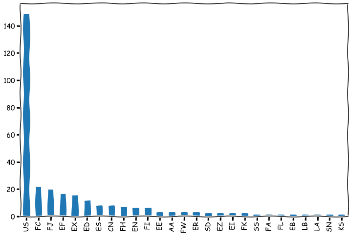
value_counts can be used to collect frequencies of values. Here the counts are presented as a bar chart. Notice how we chain dataframe functions.
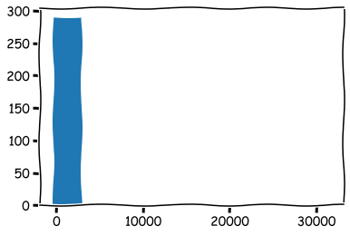
stat_df['IBES COUNTRY CODE'].value_counts().plot.bar(figsize=(12,8),grid=False)
plt.show()
7.2. Probability and statistics functions#
What we mainly need in data analysis from probability theory are random variables and distributions. Numpy has a large collection of random number generators that are located in module numpy.random. There are random number generators for every distribution that you will ever need.
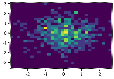
x_np = np.random.normal(size=500) # Create 500 normal random variables with *mean=0* and *std=1*
y_np = np.random.normal(size=500)
plt.hist2d(x_np,y_np,bins=30) # Visualise the joint frequency distribution using 2D-histogram.
plt.show()
hyper_np = np.random.hypergeometric(8,9,12,size=(3,3))
hyper_np
array([[6, 5, 7],
       [7, 4, 6],
       [6, 4, 5]])
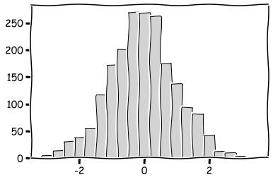
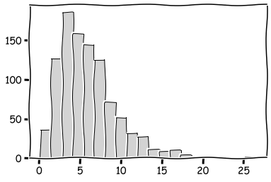
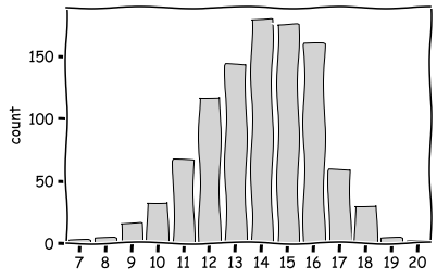
Probably the most important distributions are the standard normal distribution, the chi2 distribution and the binomial distribution.
plt.hist(np.random.normal(size=2000),bins=20,color='lightgray',edgecolor='k')
plt.show()
plt.hist(np.random.chisquare(1,size=1000),bins=20,color='lightgray',edgecolor='k')
plt.show()
plt.hist(np.random.chisquare(6,size=1000),bins=20,color='lightgray',edgecolor='k')
plt.show()
sns.countplot(x=np.random.binomial(20,0.7,size=1000),color='lightgray',edgecolor='k')
plt.show()
It is good to remember that computer-generated random numbers are not truly random numbers. They are so called pseudorandom numbers. It is because they are generated using a deterministic algorithm and a seed value.
7.3. Statistical analysis with statsmodels#
Pandas (and Numpy) has only functions for basic statistical analysis, like descriptive statistics. If you want to do more advanced (traditional) statistical analysis, the statsmodels library is a good option.
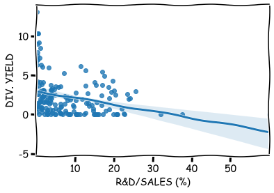
For example, linear regerssion models are very easy to build with statsmodels. Let’s model the dividend yield as a function of the R&D intensity.
import statsmodels.api as sm
import seaborn as sns
Remove the missing values of the endogenous variable.
stat_df.columns
Index(['DIV. YIELD', 'ROE (%)', 'R&D/SALES (%)', 'CoGS/SALES - 5 Y (%)',
       'SG%A/SALES 5Y (%)', 'ACCOUNTING STANDARD', 'Accounting Controversies',
       'Basis of EPS data', 'INDUSTRY GROUP', 'IBES COUNTRY CODE'],
      dtype='object')
reduced_df = stat_df[~stat_df['DIV. YIELD'].isna()]
reduced_df
| DIV. YIELD | ROE (%) | R&D/SALES (%) | CoGS/SALES - 5 Y (%) | SG%A/SALES 5Y (%) | ACCOUNTING STANDARD | Accounting Controversies | Basis of EPS data | INDUSTRY GROUP | IBES COUNTRY CODE | |
|---|---|---|---|---|---|---|---|---|---|---|
| NAME | ||||||||||
| APPLE | 0.71 | 55.92 | 4.95 | 56.64 | 6.53 | US standards (GAAP) | N | NaN | 4030.0 | US |
| SAUDI ARABIAN OIL | 0.21 | 32.25 | NaN | NaN | NaN | IFRS | N | EPS | 5880.0 | FW |
| MICROSOFT | 1.07 | 40.14 | 13.59 | 26.46 | 19.56 | US standards (GAAP) | N | NaN | 4080.0 | US |
| AMAZON.COM | 0.00 | 21.95 | 12.29 | 56.82 | 21.28 | US standards (GAAP) | N | NaN | 7091.0 | US |
| FACEBOOK CLASS A | 0.00 | 19.96 | 21.00 | 7.06 | 20.42 | US standards (GAAP) | N | NaN | 8580.0 | US |
| ... | ... | ... | ... | ... | ... | ... | ... | ... | ... | ... |
| BHP GROUP | 4.23 | 16.61 | NaN | 45.50 | NaN | IFRS | N | IFRS | 5210.0 | EX |
| CITIC SECURITIES 'A' | 1.67 | 7.77 | NaN | 10.91 | 27.44 | IFRS | N | EPS | 4395.0 | FC |
| EDWARDS LIFESCIENCES | 0.00 | 28.73 | 16.09 | 23.33 | 30.22 | US standards (GAAP) | N | NaN | 3440.0 | US |
| GREE ELECT.APP. 'A' | 2.25 | 24.52 | NaN | 66.35 | 14.94 | Local standards | N | EPS | 3720.0 | FC |
| HOUSING DEVELOPMENT FINANCE CORPORATION | 1.08 | 18.17 | NaN | 4.74 | 23.90 | Local standards | N | EPS | 4390.0 | FI |
300 rows × 10 columns
One curiosity with statsmodels is that you need to add constant to the x-variables.
x = sm.add_constant(reduced_df['R&D/SALES (%)'])
model = sm.OLS(reduced_df['DIV. YIELD'],x,missing='drop')
results = model.fit()
The parameters and t-values of the model.
results.params
const            2.987641
R&D/SALES (%)   -0.085857
dtype: float64
results.tvalues
const            11.920297
R&D/SALES (%)    -4.017612
dtype: float64
With summary(), you can output all the key regression results.
results.summary()
| Dep. Variable: | DIV. YIELD | R-squared: | 0.088 |
|---|---|---|---|
| Model: | OLS | Adj. R-squared: | 0.083 |
| Method: | Least Squares | F-statistic: | 16.14 |
| Date: | Tue, 02 Mar 2021 | Prob (F-statistic): | 8.87e-05 |
| Time: | 10:59:21 | Log-Likelihood: | -383.71 |
| No. Observations: | 169 | AIC: | 771.4 |
| Df Residuals: | 167 | BIC: | 777.7 |
| Df Model: | 1 | ||
| Covariance Type: | nonrobust |
| coef | std err | t | P>|t| | [0.025 | 0.975] | |
|---|---|---|---|---|---|---|
| const | 2.9876 | 0.251 | 11.920 | 0.000 | 2.493 | 3.482 |
| R&D/SALES (%) | -0.0859 | 0.021 | -4.018 | 0.000 | -0.128 | -0.044 |
| Omnibus: | 55.164 | Durbin-Watson: | 2.035 |
|---|---|---|---|
| Prob(Omnibus): | 0.000 | Jarque-Bera (JB): | 111.976 |
| Skew: | 1.519 | Prob(JB): | 4.84e-25 |
| Kurtosis: | 5.583 | Cond. No. | 16.3 |
Notes:
[1] Standard Errors assume that the covariance matrix of the errors is correctly specified.
results.summary2() # Different format for the results.
| Model: | OLS | Adj. R-squared: | 0.083 |
| Dependent Variable: | DIV. YIELD | AIC: | 771.4227 |
| Date: | 2021-03-02 10:59 | BIC: | 777.6824 |
| No. Observations: | 169 | Log-Likelihood: | -383.71 |
| Df Model: | 1 | F-statistic: | 16.14 |
| Df Residuals: | 167 | Prob (F-statistic): | 8.87e-05 |
| R-squared: | 0.088 | Scale: | 5.5566 |
| Coef. | Std.Err. | t | P>|t| | [0.025 | 0.975] | |
|---|---|---|---|---|---|---|
| const | 2.9876 | 0.2506 | 11.9203 | 0.0000 | 2.4928 | 3.4825 |
| R&D/SALES (%) | -0.0859 | 0.0214 | -4.0176 | 0.0001 | -0.1280 | -0.0437 |
| Omnibus: | 55.164 | Durbin-Watson: | 2.035 |
| Prob(Omnibus): | 0.000 | Jarque-Bera (JB): | 111.976 |
| Skew: | 1.519 | Prob(JB): | 0.000 |
| Kurtosis: | 5.583 | Condition No.: | 16 |
Regplot can be usd to plot the model over observations.
sns.regplot(x='R&D/SALES (%)',y='DIV. YIELD',data=reduced_df)
plt.show()
It is easy to add dummy-variables to your model using the Pandas get_dummes() -function. For more than two categories, it creates more than one dummmy-variables.
Create a new variable acc_dummy that has a value one if the company has accounting controversies.
reduced_df['acc_dummy'] = pd.get_dummies(stat_df['Accounting Controversies'],drop_first=True)
x = sm.add_constant(reduced_df[['R&D/SALES (%)','acc_dummy']])
Let’s chance also the dependent variable to ROE.
model = sm.OLS(reduced_df['ROE (%)'],x,missing='drop')
results = model.fit()
results.summary()
| Dep. Variable: | ROE (%) | R-squared: | 0.004 |
|---|---|---|---|
| Model: | OLS | Adj. R-squared: | -0.008 |
| Method: | Least Squares | F-statistic: | 0.3493 |
| Date: | Tue, 02 Mar 2021 | Prob (F-statistic): | 0.706 |
| Time: | 10:59:26 | Log-Likelihood: | -1521.4 |
| No. Observations: | 165 | AIC: | 3049. |
| Df Residuals: | 162 | BIC: | 3058. |
| Df Model: | 2 | ||
| Covariance Type: | nonrobust |
| coef | std err | t | P>|t| | [0.025 | 0.975] | |
|---|---|---|---|---|---|---|
| const | 386.3556 | 273.551 | 1.412 | 0.160 | -153.830 | 926.542 |
| R&D/SALES (%) | -18.6428 | 23.255 | -0.802 | 0.424 | -64.564 | 27.279 |
| acc_dummy | -324.4416 | 960.810 | -0.338 | 0.736 | -2221.768 | 1572.885 |
| Omnibus: | 359.716 | Durbin-Watson: | 2.010 |
|---|---|---|---|
| Prob(Omnibus): | 0.000 | Jarque-Bera (JB): | 176047.571 |
| Skew: | 12.611 | Prob(JB): | 0.00 |
| Kurtosis: | 161.021 | Cond. No. | 57.9 |
Notes:
[1] Standard Errors assume that the covariance matrix of the errors is correctly specified.
As you can see, there is something wrong. If you observed the histograms carefully, you’d seen that there is a clear outlier in ROE values.
reduced_df['ROE (%)'].hist(grid=False)
<AxesSubplot:>
reduced_df['ROE (%)'].describe()
count      291.000000
mean       138.415189
std       1850.606330
min       -318.250000
25%          9.345000
50%         16.460000
75%         27.415000
max      31560.000000
Name: ROE (%), dtype: float64
A maximum value of 31560! We can remove it, or we can winsorise the data. Let’s winsorise.
reduced_df['ROE (%)'].clip(lower = reduced_df['ROE (%)'].quantile(0.025),
                           upper = reduced_df['ROE (%)'].quantile(0.975),inplace=True)
reduced_df['ROE (%)'].hist(grid=False)
plt.show()
Let’s try to build the regression model again.
x = sm.add_constant(reduced_df[['R&D/SALES (%)','acc_dummy']])
model = sm.OLS(reduced_df['ROE (%)'],x,missing='drop')
results = model.fit()
results.summary()
| Dep. Variable: | ROE (%) | R-squared: | 0.016 |
|---|---|---|---|
| Model: | OLS | Adj. R-squared: | 0.004 |
| Method: | Least Squares | F-statistic: | 1.307 |
| Date: | Tue, 02 Mar 2021 | Prob (F-statistic): | 0.273 |
| Time: | 10:59:31 | Log-Likelihood: | -801.47 |
| No. Observations: | 165 | AIC: | 1609. |
| Df Residuals: | 162 | BIC: | 1618. |
| Df Model: | 2 | ||
| Covariance Type: | nonrobust |
| coef | std err | t | P>|t| | [0.025 | 0.975] | |
|---|---|---|---|---|---|---|
| const | 24.0008 | 3.485 | 6.888 | 0.000 | 17.120 | 30.882 |
| R&D/SALES (%) | 0.2424 | 0.296 | 0.818 | 0.414 | -0.343 | 0.827 |
| acc_dummy | -15.6371 | 12.239 | -1.278 | 0.203 | -39.807 | 8.532 |
| Omnibus: | 113.723 | Durbin-Watson: | 2.167 |
|---|---|---|---|
| Prob(Omnibus): | 0.000 | Jarque-Bera (JB): | 671.865 |
| Skew: | 2.677 | Prob(JB): | 1.28e-146 |
| Kurtosis: | 11.310 | Cond. No. | 57.9 |
Notes:
[1] Standard Errors assume that the covariance matrix of the errors is correctly specified.
Although accounting controversies has a negative coefficient, it is not statisticall significant.
Statsmodels is a very comprehensive statistical library. It has modules for nonparametric statistics, generalised linear models, robust regression and time series analysis. We do not go into more details of Statsmodels at this point. If you want to learn more, check the Statsmodels documentation: www.statsmodels.org/stable/index.html
7.4. Statistical analysis with scipy.stats#
Another option for statistical analysis in Python is the stats module of Scipy. It has many functions that are not included in other statistical libraries. However, Scipy does not handle automatically nan-values. Accounting data almost always has missing values, thus, they need to be manually handled, which is a bit annoying.
Like Numpy, it has an extensive range of random number generators and probability distributions. It also has a long list of statistical tests.
import scipy.stats as ss
In SciPy, random variables with different distributions are presented as classes, which have methods for random number generation, computing the PDF, CDF and inverse CDF, fitting parameters and computing moments.
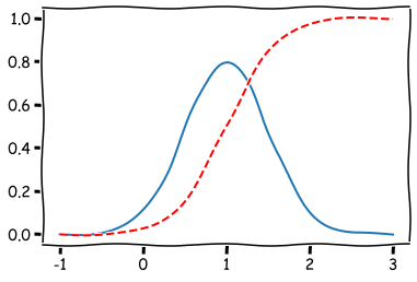
norm_rv = ss.norm(loc=1.0, scale=0.5)
Expected value
norm_rv.expect()
1.0000000000000002
The value of probability distribution function at 0.
norm_rv.pdf(0.)
0.10798193302637613
The value of cumulative distribution function at 1.
norm_rv.cdf(1.)
0.5
Standard deviation
norm_rv.std()
0.5
The visualisation of the pdf and cdf of the RV.
plt.plot(np.linspace(-1,3,100),[norm_rv.pdf(x) for x in np.linspace(-1,3,100)])
plt.plot(np.linspace(-1,3,100),[norm_rv.cdf(x) for x in np.linspace(-1,3,100)],'r--')
plt.show()
The list of distributions in Scipy is long. Here you can read more about them: docs.scipy.org/doc/scipy/reference/stats.html
There are many functions for descriptive statistics. The full list can be found also from the link above.
ss.describe(stat_df['DIV. YIELD'])
DescribeResult(nobs=300, minmax=(0.0, 13.13), mean=2.3185433333333334, variance=5.557272148617614, skewness=1.6056590920933027, kurtosis=2.975127168101123)
ss.describe(stat_df['ROE (%)'],nan_policy='omit') # Omit missing values
DescribeResult(nobs=291, minmax=(masked_array(data=-318.25,
             mask=False,
       fill_value=1e+20), masked_array(data=31560.,
             mask=False,
       fill_value=1e+20)), mean=138.41518900343644, variance=3424743.7884616023, skewness=masked_array(data=16.90823148,
             mask=False,
       fill_value=1e+20), kurtosis=284.5766560561788)
With trimmed mean, we can define the limits to the values of a variable from which the mean is calculated. There are trimmed versions for many other statistics too.
ss.tmean(stat_df['ROE (%)'].dropna(),limits=(-50,50))
16.574942965779467
Standard error of the mean.
ss.sem(stat_df['DIV. YIELD'])
0.1361037857496699
Bayesian confidence intervals.
ss.bayes_mvs(stat_df['DIV. YIELD'])
(Mean(statistic=2.3185433333333334, minmax=(2.0939767460292535, 2.5431099206374133)),
 Variance(statistic=5.594694856689113, minmax=(4.8824225544086, 6.392205754936627)),
 Std_dev(statistic=2.3633205707178084, minmax=(2.2096204548312364, 2.528281185892231)))
Interquantile range
ss.iqr(stat_df['DIV. YIELD'])
2.7075
The list of correlation functions is also extensive. The functions also return the p-value from the signficance test.
temp_df = stat_df[['DIV. YIELD','SG%A/SALES 5Y (%)']].dropna()
The output of SciPy is a bit ascetic. The first value is the correlation coefficient and the second value is the p-value.
Pearson’s correlation coefficient
ss.pearsonr(temp_df['DIV. YIELD'],temp_df['SG%A/SALES 5Y (%)'])
(-0.24627736138733555, 0.00013219335560399939)
Spearman’s rank correlation coefficient
ss.spearmanr(temp_df['DIV. YIELD'],temp_df['SG%A/SALES 5Y (%)'])
SpearmanrResult(correlation=-0.14763581111674745, pvalue=0.02330319841753993)
There are many statistical tests included. Let’s divide our data to US companies and others to test the Scipy ttest()
us_df = stat_df[stat_df['IBES COUNTRY CODE'] == '  US'] # US
nonus_df = stat_df[~(stat_df['IBES COUNTRY CODE'] == 'US')] # Non-US (notice the tilde symbol)
This test assumes equal variance for both groups. The result implies that the (mean) dividend yield is higher in non-US companies.
ss.ttest_ind(us_df['DIV. YIELD'],nonus_df['DIV. YIELD'],nan_policy='omit')
Ttest_indResult(statistic=-2.53873471415298, pvalue=0.011463548320684814)
There are functions for many other statistical tasks, like transformations, statistical distnaces, contigency tables. Check the Scipy homepage for more details.
7.5. Time series#
Time series analysis is an important topic in accounting. Python and Pandas has many functions for time series analysis. Time series data has usually fixed frequency, which means that data points occur at regular intervals. Time series can also be irregular, which can potentially make the analysis very difficult. Luckily, Python/Pandas simplifies things considerably.
7.5.1. Datetime#
Python has modules for date/time -handling by default, the most important being datetime.
from datetime import datetime
datetime.now() # Date and time now
datetime.datetime(2021, 3, 2, 10, 59, 43, 813494)
datetime.now().year
2021
datetime.now().second
44
You can calculate with the datetime objects.
difference = datetime(2020,10,10) - datetime(1,1,1)
difference
datetime.timedelta(days=737707)
difference.days
737707
You can use timedelta to transform datetime objects.
from datetime import timedelta
date1 = datetime(2020,1,1)
The first argument of timedelta is days.
date1 + timedelta(12)
datetime.datetime(2020, 1, 13, 0, 0)
Dates can be easily turned into string using the Python str() function.
str(date1)
'2020-01-01 00:00:00'
If you want to specify the date/time -format, you can use the strftime method of the datetime object.
date2 = datetime(2015,3,18)
date2.strftime('%Y - %m - %d : Week number %W')
'2015 - 03 - 18 : Week number 11'
There is also an opposite method, strptime(), that turns a string into a datetime object.
sample_data = 'Year: 2012, Month: 10, Day: 12'

datetime.strptime(sample_data, 'Year: %Y, Month: %m, Day: %d')
datetime.datetime(2012, 10, 12, 0, 0)
As you can see, you can strip the date information efficiently, if you know the the format of your date-string. There is also a great non-standard library that can be used to automatically strip date from many different date representations.
from dateutil.parser import parse
parse('Dec 8, 2009')
datetime.datetime(2009, 12, 8, 0, 0)
parse('11th of March, 2018')
datetime.datetime(2018, 3, 11, 0, 0)
You have to be careful with the following syntax.
parse('8/3/2015')
datetime.datetime(2015, 8, 3, 0, 0)
parse('8/3/2015',dayfirst = True)
datetime.datetime(2015, 3, 8, 0, 0)
The most important Pandas function for handling dates is to_datetime. We will see many applications of it in the following, but let’s first load an interesting time series.
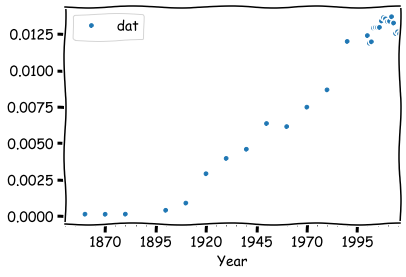
The data contains accountants and auditors as a percent of the US labor force 1850 to 2016. This data is a little bit difficult, because the frequency is irregular. The first datapoints have a ten-year interval, and from 2000 onwards the interval is one year.
times_df =pd.read_csv('https://vincentarelbundock.github.io/Rdatasets/csv/Ecdat/AccountantsAuditorsPct.csv')
times_df.head()
| Unnamed: 0 | dat | |
|---|---|---|
| 0 | 1850 | 0.000133 |
| 1 | 1860 | 0.000147 |
| 2 | 1870 | 0.000142 |
| 3 | 1880 | 0.000150 |
| 4 | 1900 | 0.000414 |
times_df.rename({'Unnamed: 0':'Year'},axis=1,inplace=True) # Correct the name of the year variable
times_df.head()
| Year | dat | |
|---|---|---|
| 0 | 1850 | 0.000133 |
| 1 | 1860 | 0.000147 |
| 2 | 1870 | 0.000142 |
| 3 | 1880 | 0.000150 |
| 4 | 1900 | 0.000414 |
With to_datetime, we can transform the years as datetime objects.
times_df['Year'] = pd.to_datetime(times_df['Year'],format = '%Y')
times_df.head()
| Year | dat | |
|---|---|---|
| 0 | 1850-01-01 | 0.000133 |
| 1 | 1860-01-01 | 0.000147 |
| 2 | 1870-01-01 | 0.000142 |
| 3 | 1880-01-01 | 0.000150 |
| 4 | 1900-01-01 | 0.000414 |
Plotting and other things are much easier, if we set the dates as the index.
times_df.set_index('Year',inplace=True)
There is a special object in Pandas for indices that have datetime objects, Datetimeindex.
type(times_df.index)
pandas.core.indexes.datetimes.DatetimeIndex
You can pick up the timestamp from an index value.
time_stamp = times_df.index[8]
time_stamp
Timestamp('1940-01-01 00:00:00')
Now you can pick up values with these timestamps.
times_df.loc[time_stamp]
dat    0.0046
Name: 1940-01-01 00:00:00, dtype: float64
Actually, you can also use date strings. Pandas will automatically transform it.
times_df.loc['1980']
| dat | |
|---|---|
| Year | |
| 1980-01-01 | 0.008672 |
Slicing works also.
times_df.loc['2010':]
| dat | |
|---|---|
| Year | |
| 2010-01-01 | 0.013358 |
| 2011-01-01 | 0.013382 |
| 2012-01-01 | 0.013687 |
| 2013-01-01 | 0.013253 |
| 2014-01-01 | 0.012542 |
| 2015-01-01 | 0.012652 |
| 2016-01-01 | 0.012518 |
Plotting is easy with the Pandas’ built-in functions.
times_df.plot()
plt.show()
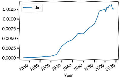
Everything works nicely, although we have a dataset with irregular frequency.
If we want, we can transform the series into a fixed frequency time series using resample..
times_df.head(15)
| dat | |
|---|---|
| Year | |
| 1850-01-01 | 0.000133 |
| 1860-01-01 | 0.000147 |
| 1870-01-01 | 0.000142 |
| 1880-01-01 | 0.000150 |
| 1900-01-01 | 0.000414 |
| 1910-01-01 | 0.000908 |
| 1920-01-01 | 0.002922 |
| 1930-01-01 | 0.003971 |
| 1940-01-01 | 0.004600 |
| 1950-01-01 | 0.006363 |
| 1960-01-01 | 0.006152 |
| 1970-01-01 | 0.007486 |
| 1980-01-01 | 0.008672 |
| 1990-01-01 | 0.011992 |
| 2000-01-01 | 0.012393 |
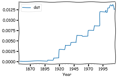
Using yearly resampling adds missing values, because for most of the interval we are increasing the frequency.
times_df.resample('Y').mean().head(15)
| dat | |
|---|---|
| Year | |
| 1850-12-31 | 0.000133 |
| 1851-12-31 | NaN |
| 1852-12-31 | NaN |
| 1853-12-31 | NaN |
| 1854-12-31 | NaN |
| 1855-12-31 | NaN |
| 1856-12-31 | NaN |
| 1857-12-31 | NaN |
| 1858-12-31 | NaN |
| 1859-12-31 | NaN |
| 1860-12-31 | 0.000147 |
| 1861-12-31 | NaN |
| 1862-12-31 | NaN |
| 1863-12-31 | NaN |
| 1864-12-31 | NaN |
times_df.resample('Y').mean().plot(style = '.')
plt.show()
If we want, we can fill the missing values with fillna.
times_df.resample('Y').ffill().head(15)
| dat | |
|---|---|
| Year | |
| 1850-12-31 | 0.000133 |
| 1851-12-31 | 0.000133 |
| 1852-12-31 | 0.000133 |
| 1853-12-31 | 0.000133 |
| 1854-12-31 | 0.000133 |
| 1855-12-31 | 0.000133 |
| 1856-12-31 | 0.000133 |
| 1857-12-31 | 0.000133 |
| 1858-12-31 | 0.000133 |
| 1859-12-31 | 0.000133 |
| 1860-12-31 | 0.000147 |
| 1861-12-31 | 0.000147 |
| 1862-12-31 | 0.000147 |
| 1863-12-31 | 0.000147 |
| 1864-12-31 | 0.000147 |
times_df.resample('Y').ffill().plot()
plt.show()
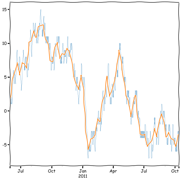
We can also decrease the frequency and decide how the original data is aggregated. Let’s simulate a stock price using a random walk series.
sample_period = pd.date_range('2010-06-1', periods = 500, freq='D')

temp_np = np.random.randint(0,2,500)

temp_np = np.where(temp_np > 0,1,-1)
rwalk_df = pd.Series(np.cumsum(temp_np), index=sample_period)
rwalk_df.head(15)
2010-06-01    1
2010-06-02    2
2010-06-03    1
2010-06-04    2
2010-06-05    1
2010-06-06    2
2010-06-07    3
2010-06-08    4
2010-06-09    5
2010-06-10    6
2010-06-11    5
2010-06-12    4
2010-06-13    5
2010-06-14    6
2010-06-15    5
Freq: D, dtype: int32
Resample as weekly data where the daily values are aggregated together with mean().
rwalk_df.resample('W').mean()
2010-06-06    1.500000
2010-06-13    4.571429
2010-06-20    5.857143
2010-06-27    7.142857
2010-07-04    5.285714
                ...
2011-09-18   -3.142857
2011-09-25   -4.142857
2011-10-02   -4.285714
2011-10-09   -5.285714
2011-10-16   -3.500000
Freq: W-SUN, Length: 72, dtype: float64
rwalk_df.plot(linewidth=0.5)
rwalk_df.resample('W').mean().plot(figsize=(10,10))
plt.show()
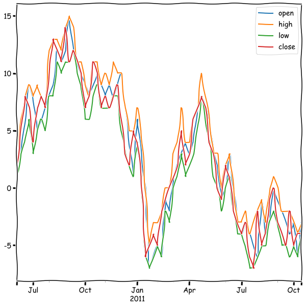
A very common way to aggregate data in finance, is open-high-low-close.
rwalk_df.resample('W').ohlc().tail()
| open | high | low | close | |
|---|---|---|---|---|
| 2011-09-18 | -3 | -2 | -5 | -5 |
| 2011-09-25 | -4 | -2 | -6 | -2 |
| 2011-10-02 | -3 | -3 | -5 | -5 |
| 2011-10-09 | -6 | -4 | -6 | -4 |
| 2011-10-16 | -3 | -3 | -4 | -4 |
rwalk_df.resample('W').ohlc().plot(figsize=(10,10))
plt.show()
A very important topic in time series analysis is filtering with moving windows.
With rolling, we can easily create a moving average from a time series.
rwalk_df.plot(linewidth=0.5)
rwalk_df.rolling(25).mean().plot()
plt.show()
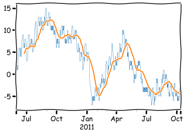
As you can see, by default the function calculates the average only when all values are awailable, and therefore, there are missing values at the beginning. You can avoid this with the min_periods parameter. With the center parameter, you can remove the lag in the average:
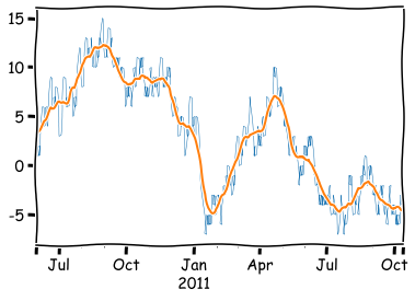
rwalk_df.plot(linewidth=0.5)
rwalk_df.rolling(25,min_periods=1,center=True).mean().plot()
plt.show()
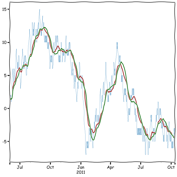
Very often, the moving average is calculated using an exponentially weighted filter. Pandas has the ewm function for that.
rwalk_df.plot(linewidth=0.5)
rwalk_df.ewm(span = 25,min_periods=1).mean().plot(color='darkred',figsize=(10,10))
rwalk_df.rolling(25,min_periods=1).mean().plot(color='darkgreen')
plt.show()
With rolling, we can even calculate correlations from aggregates. Let’s load a more interesting data for that.
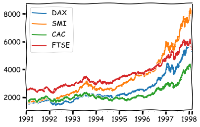
euro_df = pd.read_csv('https://vincentarelbundock.github.io/Rdatasets/csv/datasets/EuStockMarkets.csv',index_col=0)
freg=’B’ means business day frequency. Here is the full list aliases for frequencies: Offset aliases
euro_df.index = pd.date_range('1991-01-01', '1998-02-16', freq='B')
euro_df.plot()
plt.show()
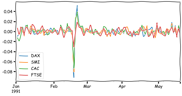
The returns of stock indices.
euro_ret_df = euro_df.pct_change()
euro_ret_df.iloc[:100].plot(figsize=(10,5))
plt.show()
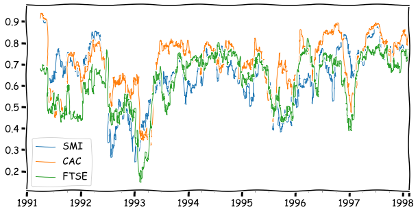
The correlation between DAX and the other indices calculated from a 64-day window.
euro_ret_df['DAX'].rolling(64).corr(euro_ret_df[['SMI','CAC','FTSE']]).plot(linewidth=1,figsize=(10,5))
<AxesSubplot:>
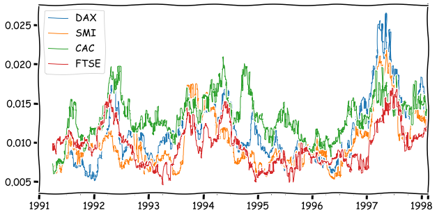
With apply, you can even define your own functions to calculate an aggregate value from windows. The following calculates an interquartile range from the window.
inter_quart = lambda x: np.quantile(x,0.75)-np.quantile(x,0.25)
euro_ret_df.rolling(64).apply(inter_quart).plot(linewidth=1,figsize=(10,5))
plt.show()
Time series analysis in Pandas is a vast topic, and we have only scratched a surface. If you want to learn more, check pandas.pydata.org/pandas-docs/stable/user_guide/timeseries.html
7.5.2. ARIMA models#
In this section, I will shortly introduce ARIMA models. They assume that in a time series the present valua depends on the previous values (AR = autoregressive). They also include moving averages (MA). “I” in the name means that the modeled time series is the n:th difference of the original time series (I = integrated):
Let’s build an ARIMA model for the euro dataset.
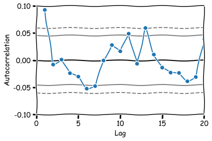
One essential tool to assess how the data depends on the previous values and select a model that reflects this is the sample autocorrelation function. The sample ACF will provide us with an estimate of the ACF and suggests a time series model suitable for representing the data’s dependence. For example, a sample ACF close to zero for all nonzero lags suggests that an appropriate model for the data might be iid noise.
from pandas.plotting import autocorrelation_plot
Lags 1, 6, 11 and 13 appear to be statistically signficant.
autocorrelation_plot(euro_ret_df['FTSE'][1:],marker='o')
plt.xlim(0,20)
plt.ylim(-0.1,0.1)
plt.show()
from statsmodels.tsa.arima.model import ARIMA
Let’s separate the last 100 observations from the data for testing.
train_set, test_set = euro_df['FTSE'][:-100].to_list(), euro_df['FTSE'][-100:].to_list()
Based on the ACF plot, 13 lags, integrated=1 (first difference of the original series) and first order moving average.
model = ARIMA(train_set, order=(13,1,1))
model_fit = model.fit()
model_fit.summary()
| Dep. Variable: | y | No. Observations: | 1760 |
|---|---|---|---|
| Model: | ARIMA(13, 1, 1) | Log Likelihood | -8345.813 |
| Date: | Wed, 24 Feb 2021 | AIC | 16721.627 |
| Time: | 14:01:39 | BIC | 16803.714 |
| Sample: | 0 | HQIC | 16751.964 |
| - 1760 | |||
| Covariance Type: | opg |
| coef | std err | z | P>|z| | [0.025 | 0.975] | |
|---|---|---|---|---|---|---|
| ar.L1 | 0.3538 | 0.359 | 0.985 | 0.325 | -0.350 | 1.058 |
| ar.L2 | -0.0475 | 0.043 | -1.097 | 0.273 | -0.132 | 0.037 |
| ar.L3 | 0.0187 | 0.019 | 0.975 | 0.330 | -0.019 | 0.056 |
| ar.L4 | -0.0326 | 0.021 | -1.531 | 0.126 | -0.074 | 0.009 |
| ar.L5 | -0.0324 | 0.022 | -1.461 | 0.144 | -0.076 | 0.011 |
| ar.L6 | -0.0331 | 0.023 | -1.461 | 0.144 | -0.078 | 0.011 |
| ar.L7 | -0.0292 | 0.028 | -1.055 | 0.292 | -0.084 | 0.025 |
| ar.L8 | 0.0376 | 0.025 | 1.504 | 0.133 | -0.011 | 0.087 |
| ar.L9 | 0.0543 | 0.023 | 2.414 | 0.016 | 0.010 | 0.098 |
| ar.L10 | -0.0099 | 0.029 | -0.344 | 0.731 | -0.066 | 0.046 |
| ar.L11 | 0.0572 | 0.019 | 2.956 | 0.003 | 0.019 | 0.095 |
| ar.L12 | -0.0438 | 0.029 | -1.498 | 0.134 | -0.101 | 0.014 |
| ar.L13 | 0.0529 | 0.020 | 2.594 | 0.009 | 0.013 | 0.093 |
| ma.L1 | -0.2452 | 0.358 | -0.684 | 0.494 | -0.947 | 0.457 |
| sigma2 | 773.8240 | 16.100 | 48.063 | 0.000 | 742.269 | 805.380 |
| Ljung-Box (L1) (Q): | 0.02 | Jarque-Bera (JB): | 1049.11 |
|---|---|---|---|
| Prob(Q): | 0.87 | Prob(JB): | 0.00 |
| Heteroskedasticity (H): | 2.90 | Skew: | 0.05 |
| Prob(H) (two-sided): | 0.00 | Kurtosis: | 6.78 |
Warnings:
[1] Covariance matrix calculated using the outer product of gradients (complex-step).
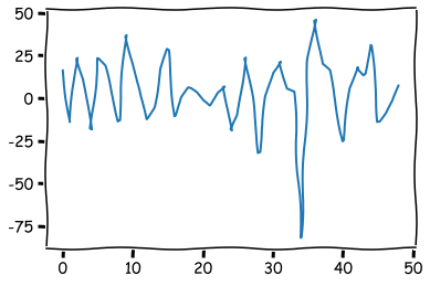
The residuals of the model (difference between the prediction and the true value).
plt.plot(model_fit.resid[1:50])
plt.show()
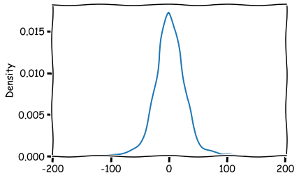
The distribution of the residuals.
sns.kdeplot(model_fit.resid[1:])
plt.show()
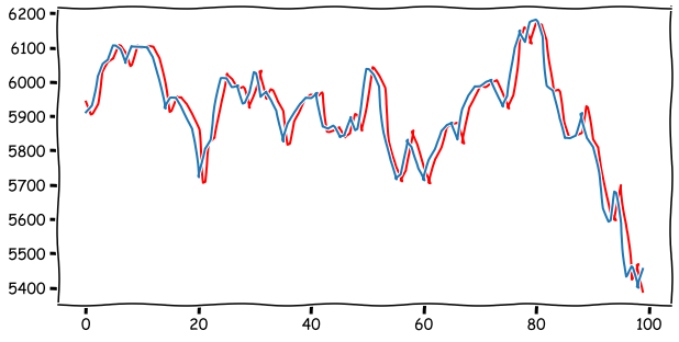
Prediction 100 steps forward and comparison to real values. As you can see from the plot below, the prediction is heavily based on the current value. The best prediction for tomorrow is the current value.
temp_set = train_set
predictions = []
for step in range(len(test_set)):
    model=ARIMA(temp_set, order=(5,1,1))
    results = model.fit()
    prediction = results.forecast()[0]
    predictions.append(prediction)
    temp_set.append(test_set[step])
plt.figure(figsize=(10,5))
plt.plot(predictions,color='red')
plt.plot(test_set)
plt.show()
A comprehensive list of model diagnostics can be plotted with plot_diagnostics.
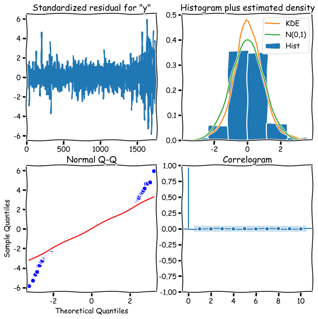
model_fit.plot_diagnostics(figsize=(10,10))