2. Decision making example - gradient boosting and a collection of interpretation metrics
In this example, we will train an Xgboost-model to a collection of financial figures from S&P1500 companies. Then, we will use a set of interpretation metrics to analyse our results.
Let’s start by loading our data. For that, we need the pandas library that has a convenient function to read csv-files.
import pandas as pd
index_col=0 defines the location of an index column. This csv-file is not available anywhere. If you want to repeat the analysis, create a csv-file that has companies as rows and different financial figures as columns.
master_df = pd.read_csv('FINAL_FIGURES_PANEL.csv',index_col=0)
Our example data is not the best one. It has many missing values and even some inf-values. To make further analysis easier, I set pandas to consider inf-values as nan-values.
pd.options.mode.use_inf_as_na = True
We build a model where we try to predict Tobin’s Q using other financial figures from companies. Therefore we should remove those instances that do not have a Tobin’s Q value. With loc we can locate instances, in this case, those instances that have a missing value (isna() tells that) in the Tobin’s Q variable. Because we removed some instances, the index is now all messed up. With reset_index() we can set it back to a sequential row of numbers.
master_df = master_df.loc[~master_df['TobinQ'].isna()]
master_df.reset_index(inplace=True,drop=True)
Below, we apply winsorisation to the data. An explanation from Wikipedia: “Winsorisation is the transformation of statistics to set all outliers to a specified percentile of the data; for example, a 90% winsorisation would see all data below the 5th percentile set to the 5th percentile, and data above the 95th percentile set to the 95th percentile.
master_df['TobinQ'].clip(lower=master_df['TobinQ'].quantile(0.05), upper=master_df['TobinQ'].quantile(0.95),inplace = True)
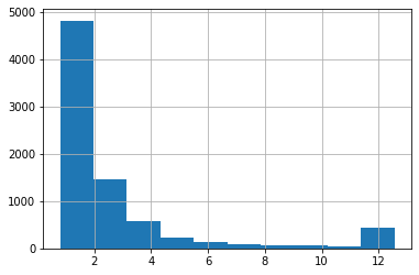
With pandas, we can quickly draw a histogram of a variable. Here is Tobin’s Q. The higher frequency of values around twelve is caused by winsorisation.
master_df['TobinQ'].hist()
<matplotlib.axes._subplots.AxesSubplot at 0x7f34e95ec460>
Our dataframe has many variables. However, there are very similar variables, and we use only part of them to get meaningful results.
master_df.columns
Index(['CIK', 'Name', 'Year', 'TOTAL ASSETS (U.S.$)', 'COMMON EQUITY (U.S.$)',
       'MARKET CAPITALIZATION (U.S.$)', 'NET SALES OR REVENUES (U.S.$)',
       'NET INCOME (U.S.$)', 'EARNINGS PER SHARE',
       'EARNINGS BEF INTEREST & TAXES', 'DIVIDEND YIELD - CLOSE',
       'NET SALES/REVENUES -1YR ANN GR', 'NET INCOME - 1 YR ANNUAL GROWT',
       'RETURN ON EQUITY - TOTAL (%)', 'RETURN ON ASSETS',
       'RETURN ON INVESTED CAPITAL', 'SELLING, GENERAL & ADM / SALES',
       'RESEARCH & DEVELOPMENT/SALES', 'OPERATING PROFIT MARGIN',
       'TOTAL DEBT % TOTAL CAPITAL/STD', 'QUICK RATIO', 'CURRENT RATIO',
       'BRANDS, PATENTS - NET', 'BRANDS, PATENTS - ACCUM AMORT',
       'BRANDS, PATENTS - GROSS', 'EMPLOYEES',
       'EMPLOYEES - 1 YR ANNUAL GROWTH', 'SALES PER EMPLOYEE',
       'ASSETS PER EMPLOYEE', 'CURRENT LIABILITIES-TOTAL', 'TOTAL LIABILITIES',
       'TOTAL INVESTMENT RETURN', 'PRICE/BOOK VALUE RATIO - CLOSE',
       'PRICE VOLATILITY', 'FOREIGN ASSETS % TOTAL ASSETS',
       'FOREIGN SALES % TOTAL SALES', 'FOREIGN INCOME % TOTAL INCOME',
       'FOREIGN RETURN ON ASSETS', 'FOREIGN INCOME MARGIN', 'EXPORTS',
       'PROVSION FOR RISKS & CHARGES', 'WORKING CAPITAL', 'RETAINED EARNINGS',
       'ACCOUNTS PAYABLE/SALES', 'CASH FLOW/SALES', 'COST OF GOODS SOLD/SALES',
       'TobinQ', 'AltmanZ'],
      dtype='object')
As predictors, we pick the following variables. There are still highly correlated variables. One good aspect of tree-based boosting methods is that multicollinearity is much less of an issue.
features = ['Year', 'DIVIDEND YIELD - CLOSE',
       'NET SALES/REVENUES -1YR ANN GR', 'NET INCOME - 1 YR ANNUAL GROWT',
       'RETURN ON EQUITY - TOTAL (%)', 'RETURN ON ASSETS',
       'RETURN ON INVESTED CAPITAL', 'SELLING, GENERAL & ADM / SALES',
       'RESEARCH & DEVELOPMENT/SALES', 'OPERATING PROFIT MARGIN',
       'TOTAL DEBT % TOTAL CAPITAL/STD', 'QUICK RATIO', 'CURRENT RATIO',
       'TOTAL INVESTMENT RETURN',
       'PRICE VOLATILITY', 'FOREIGN ASSETS % TOTAL ASSETS',
       'FOREIGN SALES % TOTAL SALES', 'FOREIGN INCOME % TOTAL INCOME',
       'FOREIGN RETURN ON ASSETS', 'FOREIGN INCOME MARGIN',
       'ACCOUNTS PAYABLE/SALES', 'CASH FLOW/SALES', 'COST OF GOODS SOLD/SALES']
We temporarily move the predictor variables to another dataframe for winsorisation.
features_df = master_df[features]
features_df.clip(lower=features_df.quantile(0.05), upper=features_df.quantile(0.95), axis = 1,inplace = True)
We move back the winsorised predictor variables to master_df.
master_df[features] = features_df
With the pandas function describe(), we can easily calculate basic statistics for the features.
master_df[features].describe().transpose()
| count | mean | std | min | 25% | 50% | 75% | max | |
|---|---|---|---|---|---|---|---|---|
| Year | 7921.0 | 2005.090393 | 7.337131 | 1994.0000 | 1999.0000 | 2005.0000 | 2011.00000 | 2018.00000 |
| DIVIDEND YIELD - CLOSE | 7893.0 | 0.486829 | 0.910837 | 0.0000 | 0.0000 | 0.0000 | 0.58000 | 2.96000 |
| NET SALES/REVENUES -1YR ANN GR | 7579.0 | 11.159821 | 30.259285 | -38.0540 | -5.7000 | 6.4700 | 22.32500 | 91.86900 |
| NET INCOME - 1 YR ANNUAL GROWT | 3815.0 | 45.183943 | 112.854050 | -75.5250 | -18.8100 | 15.1100 | 62.18500 | 406.44900 |
| RETURN ON EQUITY - TOTAL (%) | 6862.0 | -4.885381 | 38.409156 | -123.8240 | -9.7600 | 7.0200 | 16.31750 | 37.71850 |
| RETURN ON ASSETS | 7687.0 | -9.839917 | 37.518729 | -140.5340 | -9.0950 | 3.9300 | 8.73000 | 18.58700 |
| RETURN ON INVESTED CAPITAL | 7305.0 | -6.064327 | 34.695127 | -116.9260 | -8.8900 | 5.8600 | 12.79000 | 27.58000 |
| SELLING, GENERAL & ADM / SALES | 7640.0 | 36.152825 | 41.764955 | 8.5995 | 15.5675 | 22.2400 | 33.48500 | 185.97300 |
| RESEARCH & DEVELOPMENT/SALES | 6635.0 | 10.029486 | 11.853524 | 0.0000 | 1.9100 | 5.3800 | 13.65500 | 46.55100 |
| OPERATING PROFIT MARGIN | 7694.0 | -14.559555 | 61.399007 | -243.9660 | -5.0300 | 5.6200 | 11.09750 | 21.11800 |
| TOTAL DEBT % TOTAL CAPITAL/STD | 7793.0 | 25.006322 | 25.731029 | 0.0000 | 0.2700 | 18.7800 | 40.74000 | 85.84800 |
| QUICK RATIO | 7863.0 | 1.782639 | 1.444924 | 0.2100 | 0.8500 | 1.2900 | 2.20000 | 5.85000 |
| CURRENT RATIO | 7894.0 | 2.607263 | 1.719357 | 0.3800 | 1.4600 | 2.1400 | 3.24000 | 7.14700 |
| TOTAL INVESTMENT RETURN | 7601.0 | 11.283903 | 56.890718 | -73.2100 | -28.4400 | 3.7400 | 39.06000 | 151.91000 |
| PRICE VOLATILITY | 6706.0 | 40.259398 | 15.117033 | 19.5625 | 27.2300 | 38.3300 | 50.27750 | 71.87250 |
| FOREIGN ASSETS % TOTAL ASSETS | 6078.0 | 11.155938 | 14.960890 | 0.0000 | 0.0000 | 4.2800 | 16.06000 | 50.85600 |
| FOREIGN SALES % TOTAL SALES | 6762.0 | 32.920694 | 25.527471 | 0.0000 | 7.2425 | 33.2500 | 52.00000 | 81.54850 |
| FOREIGN INCOME % TOTAL INCOME | 5593.0 | 19.151371 | 32.119147 | -18.9100 | 0.0000 | 0.0000 | 32.89000 | 104.02600 |
| FOREIGN RETURN ON ASSETS | 3705.0 | 35.858306 | 77.912989 | -47.2420 | 0.0000 | 8.0300 | 32.59000 | 298.70400 |
| FOREIGN INCOME MARGIN | 3977.0 | 5.135768 | 8.061430 | -10.5760 | 0.0000 | 3.7700 | 9.97000 | 23.01800 |
| ACCOUNTS PAYABLE/SALES | 7676.0 | 10.580265 | 8.139577 | 3.1700 | 5.7580 | 8.0695 | 11.80325 | 37.66225 |
| CASH FLOW/SALES | 7702.0 | -6.902811 | 45.553832 | -176.3760 | -0.4175 | 7.4300 | 12.15000 | 22.85950 |
| COST OF GOODS SOLD/SALES | 7672.0 | 60.270517 | 16.469725 | 23.0600 | 50.3575 | 62.9800 | 72.51000 | 85.28350 |
Tobin’s Q to the y_df dataframe.
y_df = master_df['TobinQ']
The features to the x_df dataframe.
x_df = master_df[features]
2.1. Gradient boosting
Xgboost is implemented as a Python library, which we import here and name it xgb.
import xgboost as xgb
Xgboost uses its’ own data structure, called DMatrix. It speeds up calculations significantly and saves memory. We feed the data as pandas dataframes. The data can also be numpy arrays. nthread = -1 tells Xgboost to use all the cores available for calculations.
dtrain = xgb.DMatrix(x_df, label=y_df, nthread = -1)
Next, we need to define the parameters of the xgboost model. This is a very difficult task and more like black magic than science. You can easily play with different hyperparameter settings for days, and still finding combinations that improve the performance. And here is only part of the parameters! More info about the parameters is here: xgboost.readthedocs.io/en/latest/parameter.html
m_depth = 5
eta = 0.1
ssample = 0.8
col_tree = 0.8
m_child_w = 3
gam = 1.
objective = 'reg:squarederror'
param = {'max_depth': m_depth, 'eta': eta, 'subsample': ssample,
         'colsample_bytree': col_tree, 'min_child_weight' : m_child_w, 'gamma' : gam,'objective' : objective}
Xgboost has a function for cross-validation. We use here 5 folds. The metric is mean absolute error.
temp = xgb.cv(param,dtrain,num_boost_round=1500,nfold=5,seed=10,metrics='mae')
To plot how our mae is decreasing, we load Matplotlib.
import matplotlib.pyplot as plt
There are indications for overfitting, but let’s proceed. Around 800 rounds (decision trees), the validation error is minimum, so let’s use that.
fig, axs = plt.subplots(1,2,figsize=(12,6),squeeze=True)
axs[0].plot(temp['test-mae-mean'][400:1500],'r--')
axs[1].plot(temp['train-mae-mean'][400:1500],'b--')
[<matplotlib.lines.Line2D at 0x7f34c84afc40>]
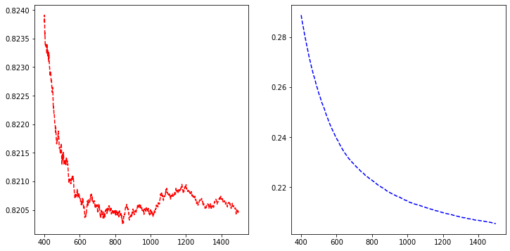
b_rounds = 800
train() is used for training. We feed the parameters, the data in a DMAtrix format and the number of boosting rounds to the function.
bst = xgb.train(param,dtrain,num_boost_round=b_rounds)
2.2. SHAP
Now we have our model trained, and we can start analysing it. Let’s start with SHAP github.com/slundberg/shap
import shap
j=0
shap.initjs()

We define a SHAP tree-explainer and use the data to calculate the SHAP values.
explainerXGB = shap.TreeExplainer(bst)
shap_values_XGB_test = explainerXGB.shap_values(x_df,y_df)
SHAP has many convenient functions for model analysis.
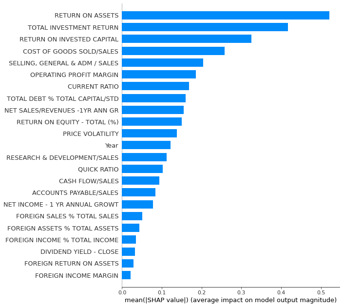
Summary_plot with plot_type = ‘bar’ for a quick feature importance analysis. However, for global importance analysis, you should use SAGE instead, because SHAP is prone to errors with the least important features.
shap.summary_plot(shap_values_XGB_test,x_df,plot_type='bar',max_display=30)
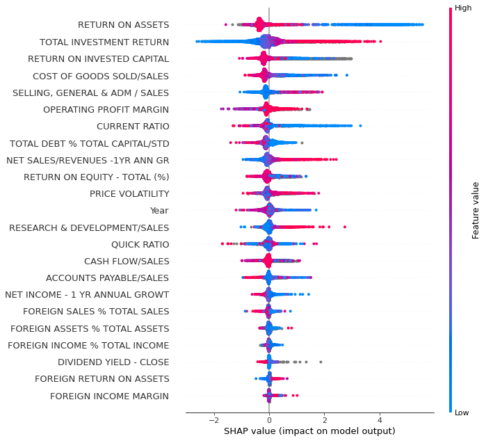
With plot_type = ‘dot’ we get a much more detailed plot.
shap.summary_plot(shap_values_XGB_test,x_df,plot_type='dot',max_display=30)
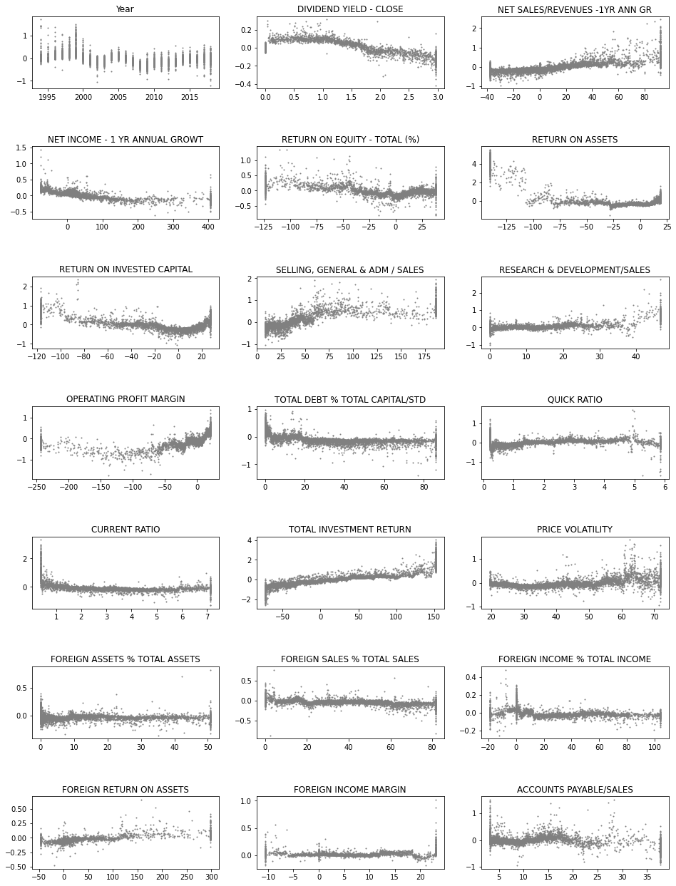
Next, we use the SHAP values to build up 2D scatter graphs for every feature. They shows the effect of a feature for the prediction for every instance.
fig, axs = plt.subplots(7,3,figsize=(16,22),squeeze=True)
ind = 0
for ax in axs.flat:
    feat = bst.feature_names[ind]
    ax.scatter(x_df[feat],shap_values_XGB_test[:,ind],s=1,color='gray')
#    ax.set_ylim([-0.2,0.2])
    ax.set_title(feat)
    ind+=1
plt.subplots_adjust(hspace=0.8)
plt.savefig('shap_sc.png')
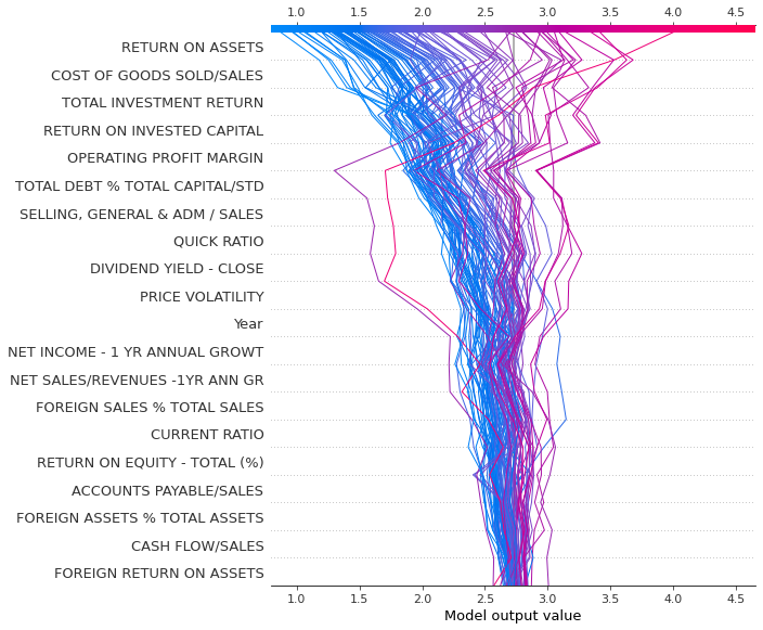
Decision_plot() is interesting as it shows how the prediction is formed from the contributions of different features.
shap.decision_plot(explainerXGB.expected_value,shap_values_XGB_test[0:100],features)
Force_plot is similar to decision_plot. We plot only the first 100 instances because it would be very slow to draw a force_plot with all the instances.
shap.force_plot(explainerXGB.expected_value,shap_values_XGB_test[0:100],features,figsize=(20,10))
Have you run `initjs()` in this notebook? If this notebook was from another user you must also trust this notebook (File -> Trust notebook). If you are viewing this notebook on github the Javascript has been stripped for security. If you are using JupyterLab this error is because a JupyterLab extension has not yet been written.
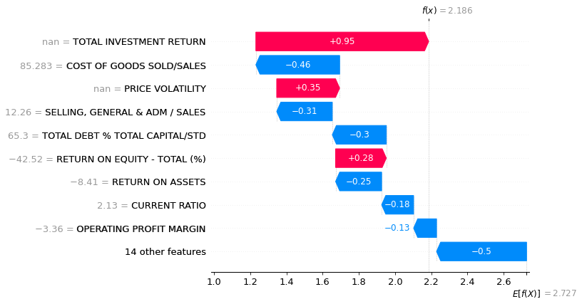
Waterfall_plot is great when you want to analyse one instance.
shap.waterfall_plot(explainerXGB.expected_value,shap_values_XGB_test[2000],x_df.iloc[2000],features)
2.3. Other interpretation methods
For the following methods, we need to use the Xgboost’s Scikit-learn wrapper XGBRegressor() to make our Xgboost model to be compatible with the Scikit-learn ecosystem.
m_depth = 5
eta = 0.1
ssample = 0.8
col_tree = 0.8
m_child_w = 3
gam = 1.
objective = 'reg:squarederror'
param = {'max_depth': m_depth, 'eta': eta, 'subsample': ssample,
         'colsample_bytree': col_tree, 'min_child_weight' : m_child_w, 'gamma' : gam,'objective' : objective}
Our xgboost model as a Scikit-learn model.
best_xgb_model = xgb.XGBRegressor(colsample_bytree=col_tree, gamma=gam,
                                  learning_rate=eta, max_depth=m_depth,
                                  min_child_weight=m_child_w, n_estimators=800, subsample=ssample)
fit() is used to train a model in Scikit.
best_xgb_model.fit(x_df,y_df)
XGBRegressor(base_score=0.5, booster=None, colsample_bylevel=1,
             colsample_bynode=1, colsample_bytree=0.8, gamma=1.0, gpu_id=-1,
             importance_type='gain', interaction_constraints=None,
             learning_rate=0.1, max_delta_step=0, max_depth=5,
             min_child_weight=3, missing=nan, monotone_constraints=None,
             n_estimators=800, n_jobs=0, num_parallel_tree=1, random_state=0,
             reg_alpha=0, reg_lambda=1, scale_pos_weight=1, subsample=0.8,
             tree_method=None, validate_parameters=False, verbosity=None)
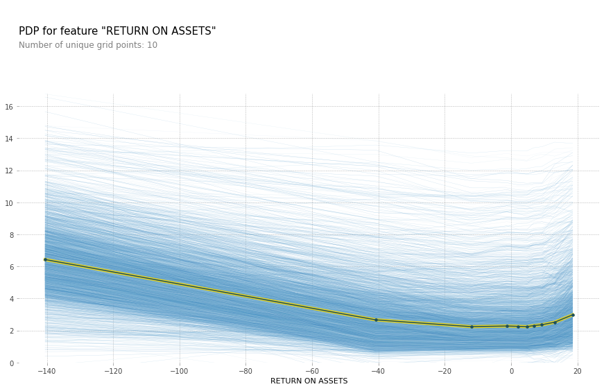
pdpbox library has a function for partial dependence plot and individual conditional expectations: github.com/SauceCat/PDPbox
from pdpbox import pdp
Here is a code to draw a partial dependence plot and individual conditional expectations. features[5] is the feature Return on Assets. These methods do not like missing values in features, so we fill missing values with zeroes. Not a theoretically valid approach, but…
plt.rcParams["figure.figsize"] = (20,20)
pdp_prep = pdp.pdp_isolate(best_xgb_model,x_df.fillna(0),features,features[5])
fig, axes = pdp.pdp_plot(pdp_prep, features[5],center=False, plot_lines=True,frac_to_plot=0.5)
plt.savefig('ICE.png')
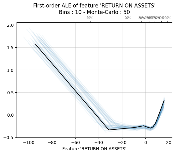
ALEPython has functions for ALE plots: github.com/blent-ai/ALEPython
import ale
plt.rcdefaults()
ale.ale_plot(best_xgb_model,x_df.fillna(0),features[5],monte_carlo=True)
plt.savefig('ale.png')
<Figure size 640x480 with 0 Axes>